https://www.youtube.com/watch?v=H4ZyzmEyuqQ (how to make a title sequence)
https://www.youtube.com/watch?v=2IoVLB1shwI (art of the title sequence)
https://www.youtube.com/watch?v=S6I-h7aQ2n4
Research
Dexter
https://www.youtube.com/watch?v=BIqBQWB7IUM
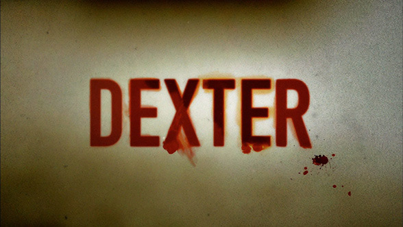
The opening sequence involved a lot of extreme lose ups accompanied by intense sounds that make the audience feel uncomfortable and tense.The first shot is of Dexter killing a mosquito, straight away, he is a killer which creates a sense of irony once the audience understand the plot of the programme. Throughout the sequence, there is a common theme of violence through the use of blood and things that resemble blood. The cutting of the meat in a the wrapping is signifying a body bag and also bears resemblance of human skin. The t-shirt being pulled over his head depicts the idea of suffocation. Whilst watching the sequence, we as the audience are aware of what the programme is going to entail and that is why I think it is a good and effective title sequence.
Stranger Things
https://www.youtube.com/watch?v=-RcPZdihrp4
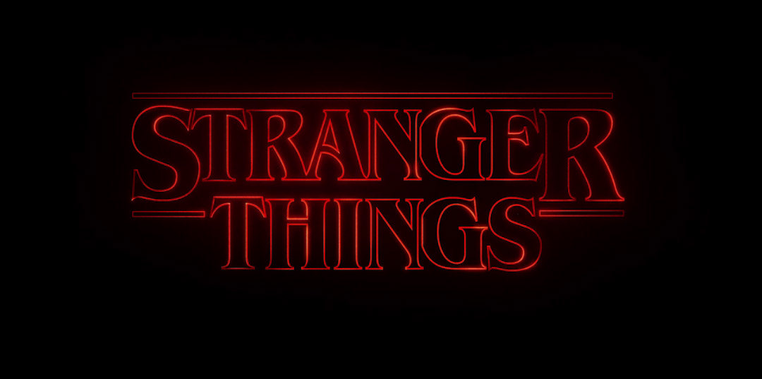
The kinetic typography in this sequence creates a sense of space. Large, hollow type drifts through a void, slowly assembling, its glowing red edges cutting through the darkness as smaller credits fade in and out. It feels as though we are in isolated in another world with nothing around us, just darkness. This idea is relevant to the programme as the character gets stuck in a dark parallel universe. The disjointed type getting set along with the music imbues it with this real sense of unease.
Clique
https://vimeo.com/302795145
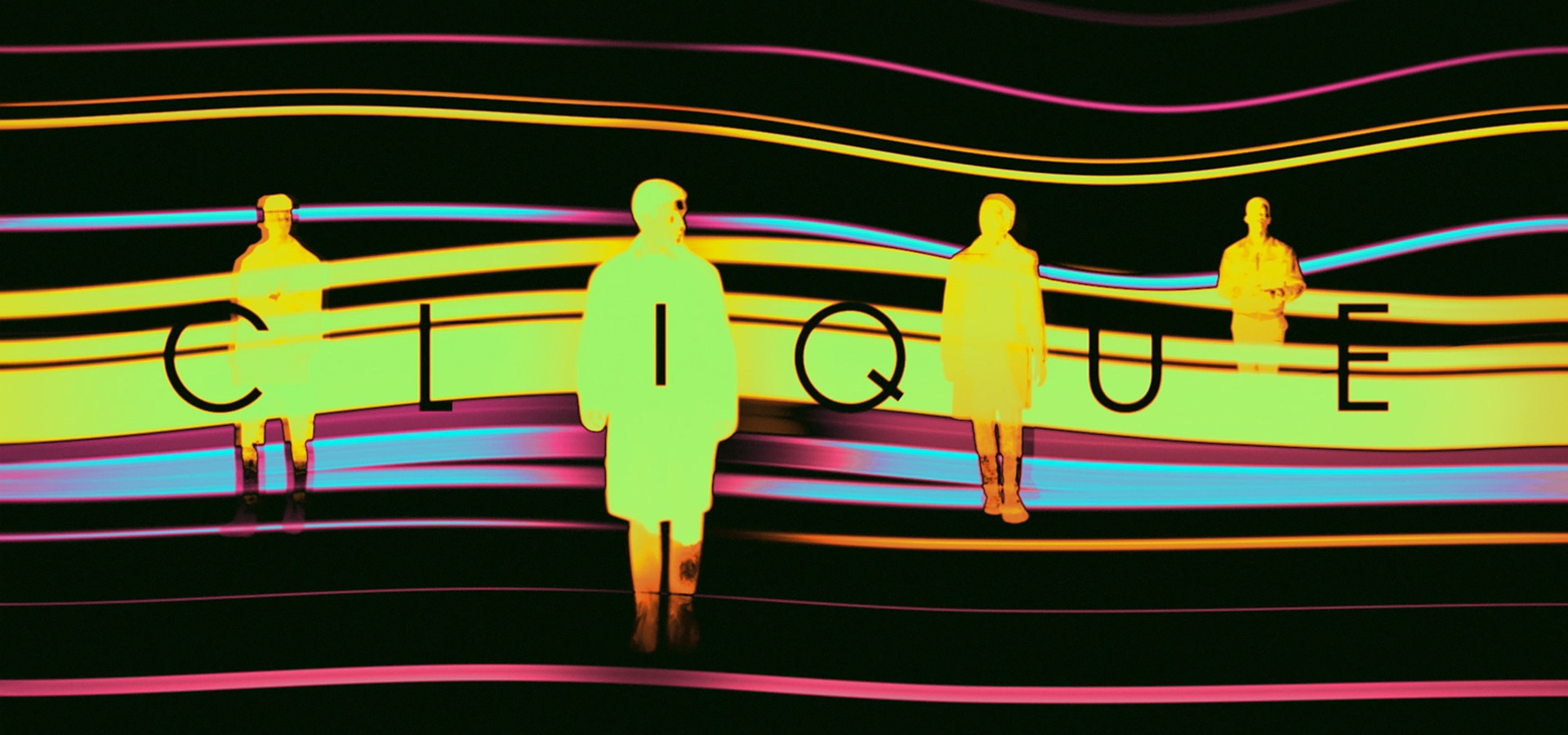
The sequence starts as a black screen to primarily focus on the lyrics 'When the world don't wanna know'. The choice of lyrics create a sense of mystery and secrecy. The sequence introduces a very confusing, hypnotic background, briefly showing faces and figures which also reinforces the mystery and confusion. The sequence ends with the title amongst 4 figures that all fade away and disappear. From the sequence, it is clear the programme is going to involve some sort of mystery and people keeping secrets.
The Mighty Boosh
https://www.youtube.com/watch?v=l8iKxpZeGwA
From watching the title sequence, it is clear the programme is going to be very wacky and humorous. the sequence involved lots of hand drawn illustrations, colour and imagery, all very fast moving into the next drawing. Certain lyrics are reinforced into the graphics, moving in and back out of frame at the same speed as the audio. I quite like the playfulness of this title sequence and how it may seem messy and childish but once the programme has been watched, the sequence is very well suited to the theme of the show.
Casino Royale
https://www.youtube.com/watch?v=A1AMUmkj-ck
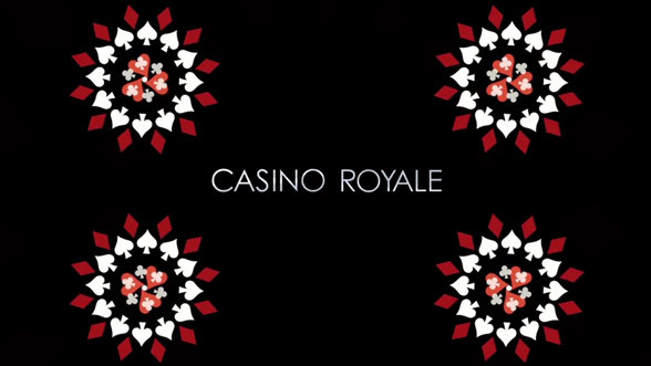
The title sequence is very mysterious and builds tension for the audience. The colour palette throughout the sequence is predominantly red, black and white. The reds depict danger and have connotations of blood which would suggest that the film will involve a lot of violence and death. the colours also resemble playing cards which along with the name implies the film has a theme of casinos and betting; a film related to crime or corruption.
The man with the golden arm
https://www.youtube.com/watch?v=sS76whmt5Yc
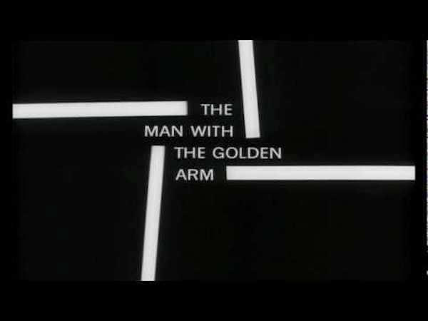
This title sequence uses white lines alongside jazzy music to create rhythm. The white line then turns into a jagged arm shape. This arm in the German Expressionist style was a symbol of heroin addiction which was easily recognisable. The film was about drug addiction. The arm being in its jagged form expressed the disjointed, jarring existence of the drug addict.
The work of Saul Bass has strong and apparent influences of bauhaus and constructivism which was popular during the time this title sequence was made.
Concept Ideas
Concept 1
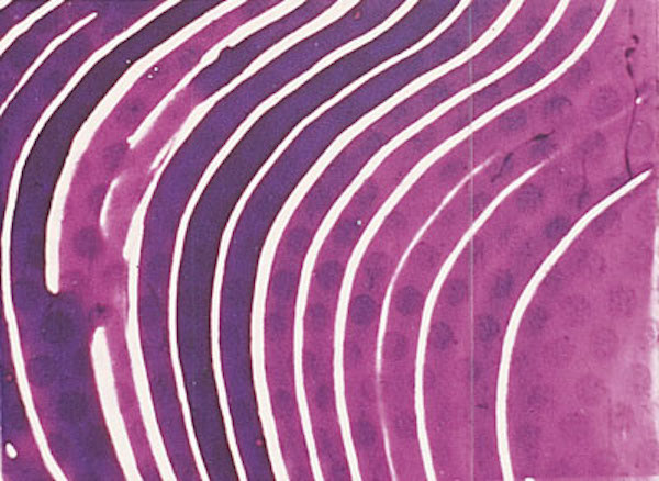
Len Lye, A Colour Box 1935.
I would quite like to redesign 'The mighty Boosh' title sequence using inspiration from the work of Len Lye. The playful and quite random feel of his work would depict the wackiness of the show itself. 'The mighty boosh' was set around the 1990's era so the current sequence uses an overload of bright colours in all its wacky illustrations, if I were to modernise the work of Lye, I think that the bright, hypnotic colours and movements of his work would really suit as a new title sequence.
Concept 2
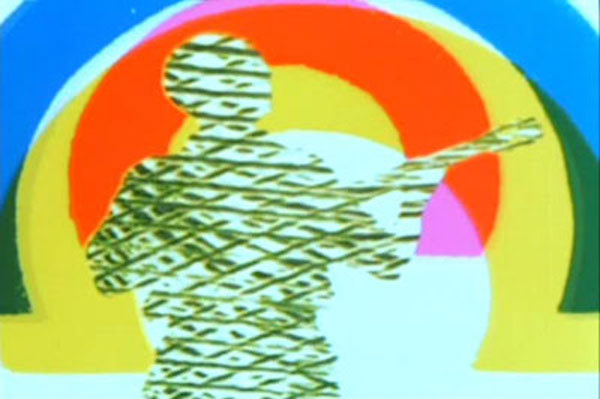
Len Lye, Rainbow Dance 1936.
Alternatively, I also thought that a title sequence inspired by Len Lye would suit a redesign for 'Clique'. Both use hypnotic backgrounds and confusing but intriguing shapes and movements which I could use to portray the secrecy and mystery of 'Clique'.
Concept 3
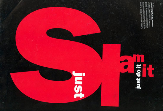
Neville Brody, Nike
I think that the constructivist influence of the work of Neville Brody and Saul Bass would suit the theme of the film 'Trainspotting'. I would like to redesign the title sequence for this, being inspired by Saul Bass' 'The man with the golden arm' as they have similar themes throughout the film. The disjointed and abrupt appearance of constructivist influenced work would really work well to portray the theme of heroin use within 'Trainspotting'.
Concept 4
Artistic Movement Research
Bauhaus
As the Bauhaus was a combination of crafts and arts, its nature and concept was regarded as something completely new back in 1919. Today, the historical Bauhaus is the most influential educational establishment in the fields of architecture, art and design. The Bauhaus existed from 1919 to 1933 and today the world considers it to be the home of the avant-guard of classical modern style in all fields of liberal and applied arts. The school of bauhaus were the first school to introduce graphic design and stress the importance of purpose-driven design as much as fine arts.
Bauhaus in typography
Herbert Bayer (1900-1985) was an Austrian-American painter, photographer and typographer. He firstly joined the Bauhaus as a student and, after some years, he was named director of the printing and advertising department. In 1925, when Gropius instructed Bayer to create a new font, he started working on the creation of a new “Universal Typeface”. It wasn’t a typeface designed only for school appearances: Bayer actually wanted to make it useful for the whole society.
Even today, it still looks sharp and impossibly modern for it’s vintage and shows all the class Bauhaus type characteristics. The font came together with the simplicity and linearity of geometric features and it was characterized by the lack of “serifs” and useless adornments.
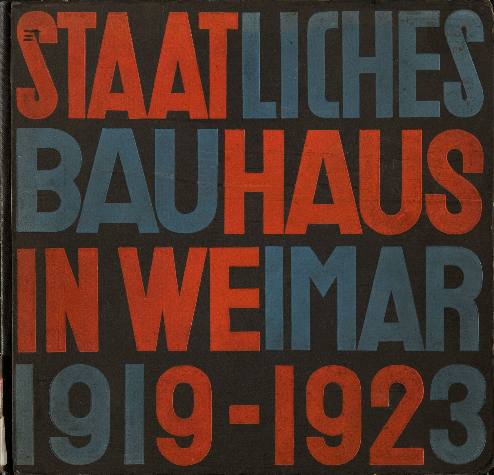
https://de.m.wikipedia.org/wiki/Datei:StaatlichesBauhaus_Vorderdeckel.jpg
Constructivism
Constructivism was a particularly austere branch of abstract art founded by Vladimir Tatlin and Alexander Rodchenko in Russia around 1915. The tools and techniques of the more traditional, figurative painting and art styles were replaced with “constructed” photomontages and strong typography. Russian Constructivism characteristically had minimal color palettes, often just red, black and sometimes yellow. They frequently had diagonal elements with circular and angled type and images. The resulting work was extremely dramatic, containing layered images coupled with powerful type treatments. This work was exciting, often jolting, and even shocking, which was in line with their goal to change society.
El Lissitzky (Lazar Markovich Lissitzky) 1890–1941
This Russian-born painter, designer, and typographer is associated with both the Suprematist and the Constructivist movements. He studied engineering and architecture in addition to art, giving him a very linear, logical approach to all that he did. His work was highly abstracted with minimal color, geometric shapes, and in some cases, deep symbolism. As with all Constructivists, he believed art should be used as an agent of change.
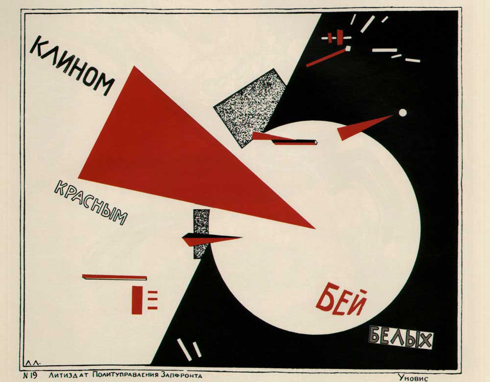
http://3v6x691yvn532gp2411ezrib-wpengine.netdna-ssl.com/wp-content/uploads/2017/09/F.jpg
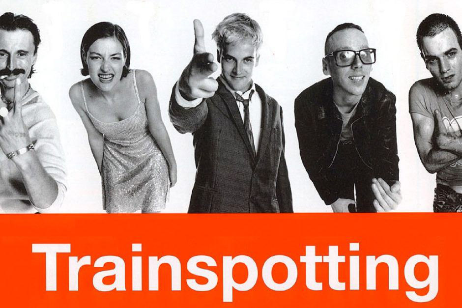
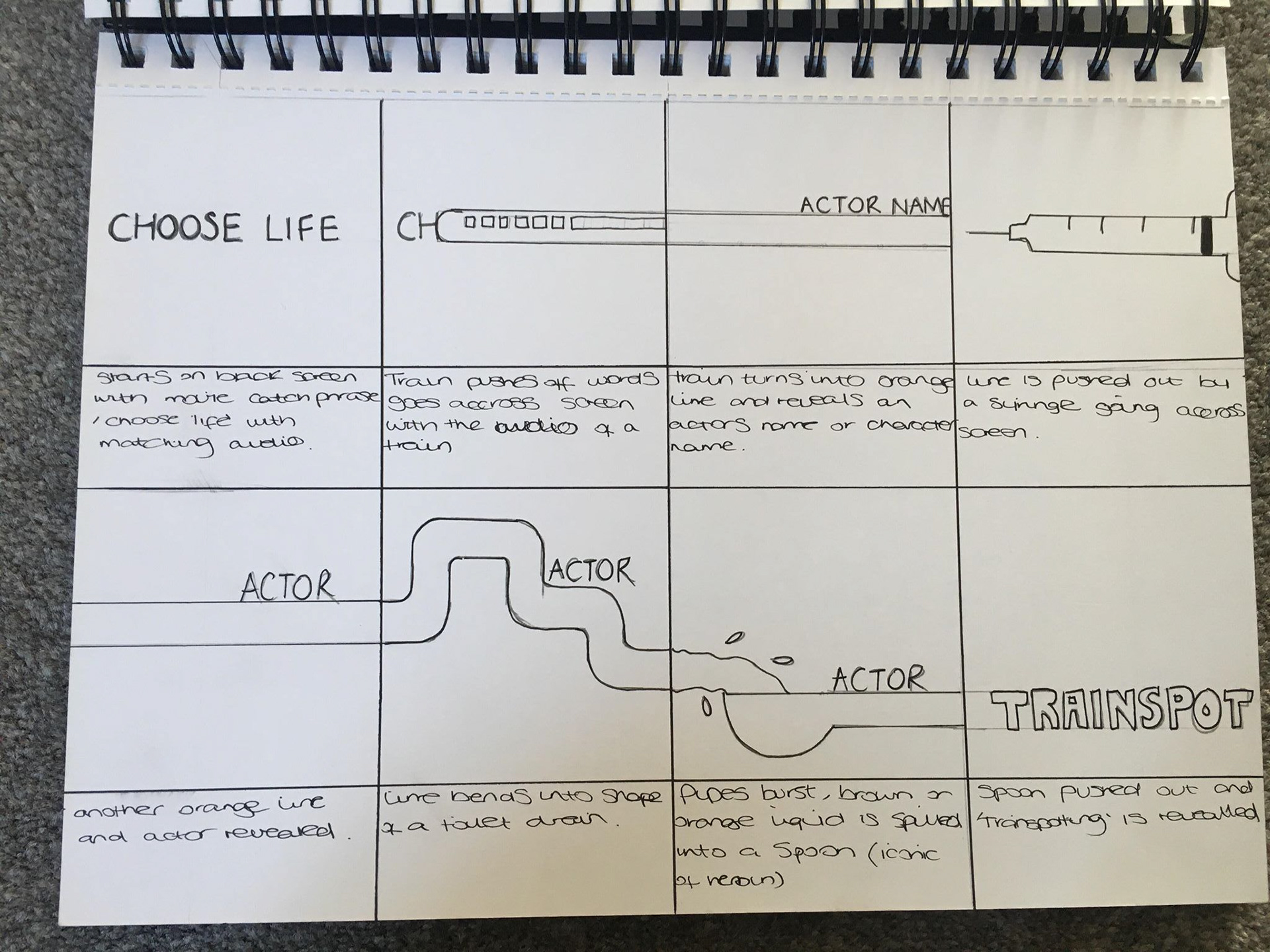
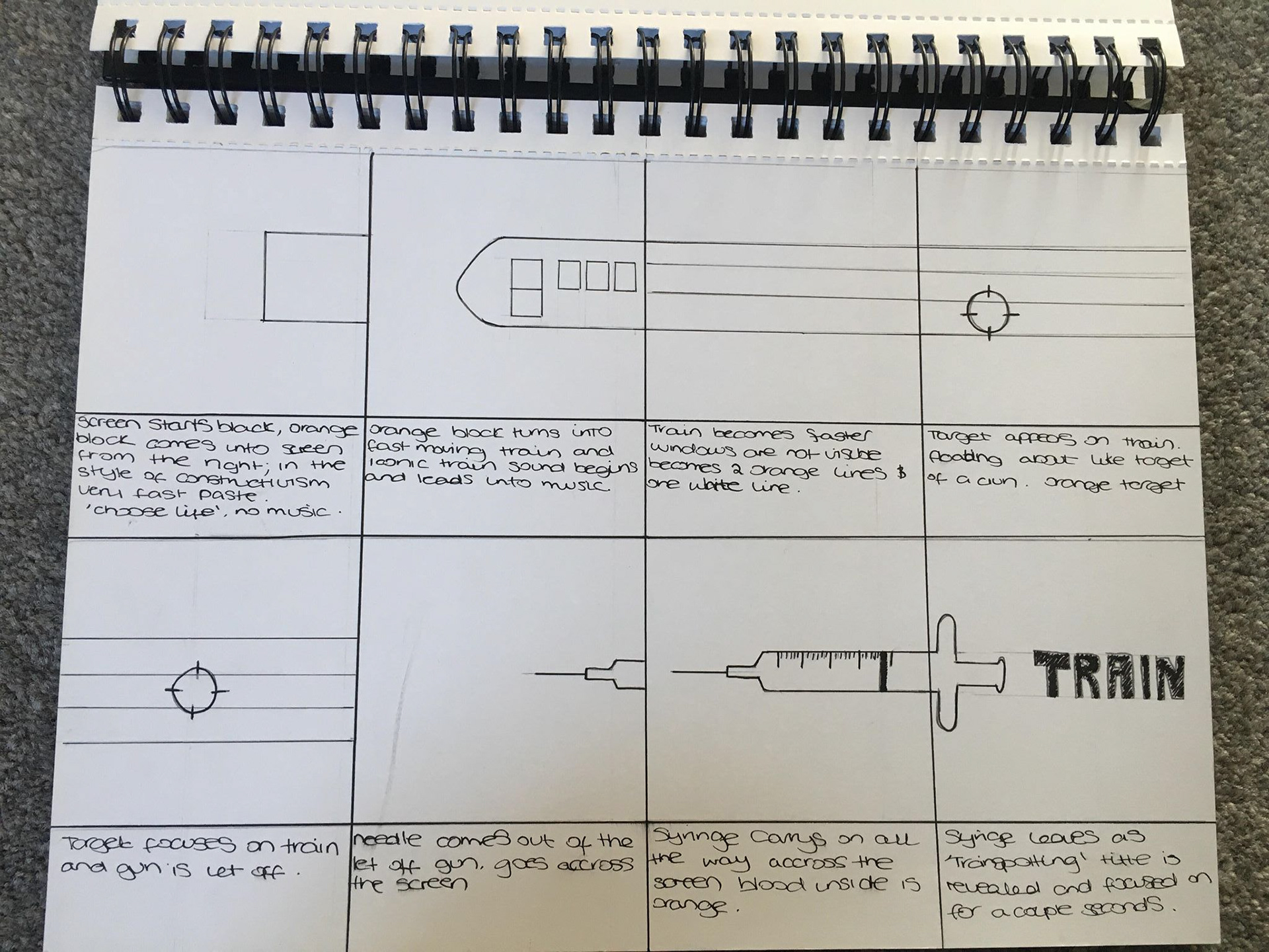
Trainspotting
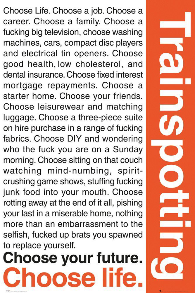
Current title sequence: https://www.youtube.com/watch?v=IMYZh76wRTY Full: https://www.youtube.com/watch?v=BLMxoDZDHDk
About the film
(1996) Ewan McGregor, Robert Carlyle, Ewen Bremner, Jonny Lee Miller and Kelly Macdonald star in Danny Boyle's audaciously innovative and darkly comedic Film4 drama about addiction, scams and survival. Upon its release in 1996 it was condemned by critics and Daily Mailcrusaders who deemed it irresponsible and accused it of glamorising drug use. But Trainspotting is a horse of a different colour, a film that uses electrifying style, unflinching empathy and coruscating language to give voice to a generation trapped in the margins.
Set in the late 1980s, Trainspotting takes place in a time when Scotland was caught in a vice grip of high unemployment and a so-called “heroin epidemic” which nearly led to a national outbreak of HIV/AIDS.
Symbols & Motifs used in Trainspotting
Trainspotting: Trainspotting is a well known hobby people do in which a person stands at a vantage point near train tracks and documents the train numbers as they go past. Although the activity itself isn't focused on within the film, it is used as a symbol for the idea that the characters are sitting around doing nothing, watching their lives go past, accomplishing nothing.
Needles and Blood: The film features graphic images of the characters injecting heroin. The needle sucks the blood out of Renton’s arm, as if it is sucking the life out of him. The film also highlights issues of HIV transmission which has been known to be spread through needles between drug uses.
Feces:Feces is shown repeatedly in the film, and symbolizes the biological decay that heroin leads to. We first see it in “The Worst Toilet in Scotland,” as it encroaches on Renton’s personal space, while he tries to cleanse himself of it. Later the explosion of feces that Spud causes in Gail’s family home foreshadows his return to drugs, and the feces smeared on the walls of Tommy’s apartment indicates the way that heroin finally got a hold of Tommy, and began to make him waste away.
Colour palette

For my title sequence, I'd like to stick with the three predominant colours of black, white and a bright, burnt orange. I think keeping the colour palette the same as that in the movie posters and advertising will reduce confusion. The colours are also very powerful and the contrast between the black and white next to the bright orange may be symbolic of the disconnect you get with heroin use, putting a barrier between what is real and what isn't. The colour orange also has connotations of freedom and happiness which are reasons behind why people go to drugs.
Bibliography
http://www.bauhaus-movement.com/en/ https://study.com/academy/lesson/the-bauhaus-movement-in-graphic-design-impact-application.html https://www.gradesaver.com/trainspotting-film/study-guide/symbols-allegory-motifs https://www.bourncreative.com/meaning-of-the-color-orange/