The Brief
VBAT | Superunion
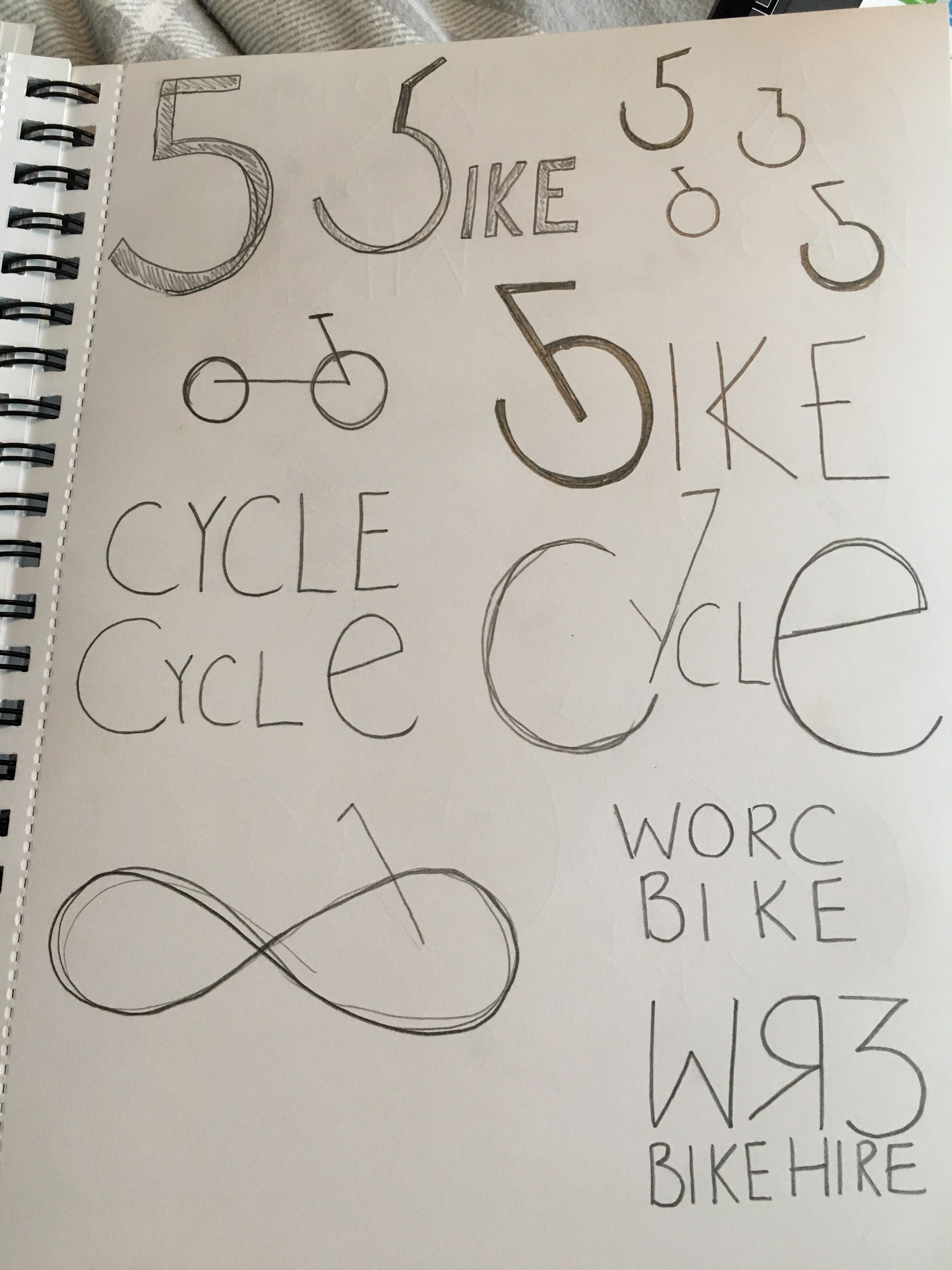
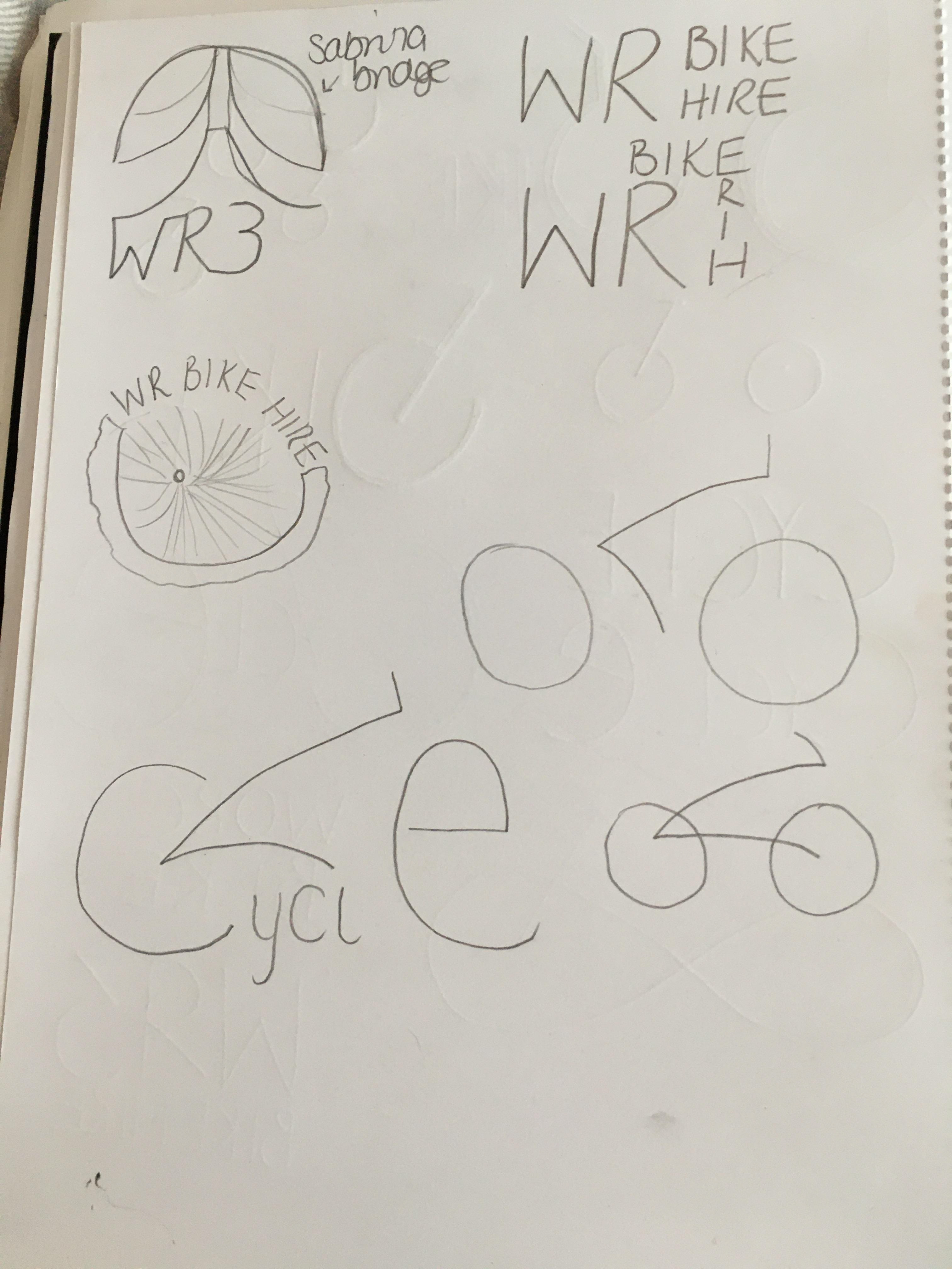
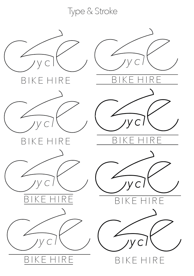
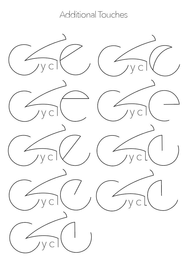
Brand a bike hire scheme in your city
Using either a GPS, dock based or monthly lease like scheme, I will brand the identity of a local bike hire situated in Worcester. Keeping both tourists and locals in mind, I will create a name and logo for my bike scheme along with supporting brand materials such as a bike wrap, stand and wayfinding. I will also take into consideration how I can incorporate sponsorship whilst branding my bike hire scheme.
Worcester
WhilsTextt branding my bike hire scheme, I want to create focus on why people would want to to bike around Worcester, exploring what makes the city so popular.
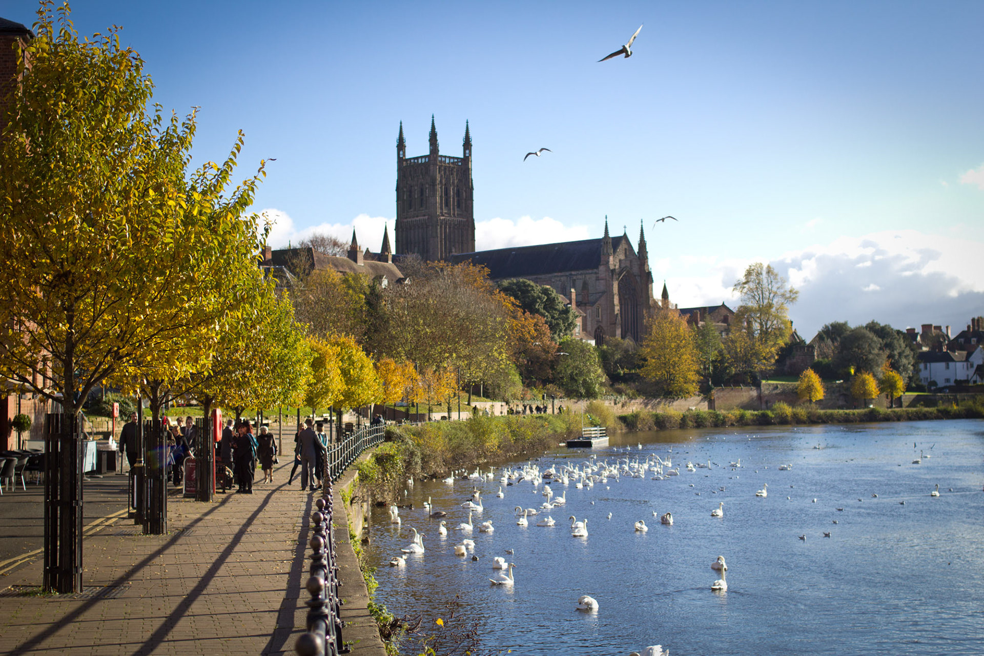
"Worcester is a beautiful Cathedral and University City with a fascinating history of industry, a wealth of interesting architecture, top class sports teams and venues, an unrivalled selection of high street names and independent boutiques and a vibrant programme of events." https://www.visitworcestershire.org/worcester/
Worcester is best known for it's Anglican cathedral but is also situated on the river severn with beautiful buildings dating back to 1721. Sabrina Footbridge is a crossing on the river sever that can't be crossed in car. There are many places like this, so by depicting places like this within my branding, it will hopefully encourage people to chose cycling over cars, to see the parts of Worcester they don't usually see.
Existing Bike Hire Schemes
When Researching into existing bike hire schemes, it became apparent that there is a lacking of bike hire schemes in Worcester. Other than 'Woo Bike Share', a university run scheme for students and staff, there isn't many, if any, other hire schemes that are available to the general public.
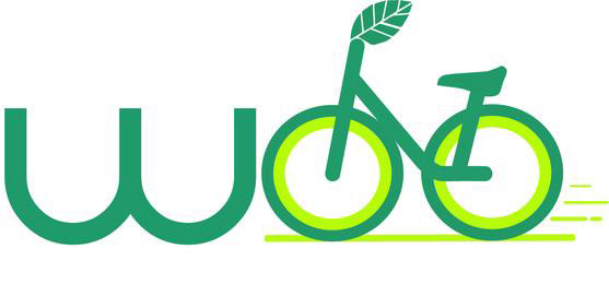
Woo Bike share is a bike share scheme in Worcester. It is set up so that individuals pay an annual membership price, the bikes are then picked up from a pickup location and can be hired for up to 7 days. Woo Bikes is for staff and students only, encouraging them to bike between campuses rather than drive.
"Cycling is a convenient low cost way to get healthier and happier. Riding an e-bike is great fun. Cycling 2 miles takes about 15 minutes, making it one of the quickest ways to get between University of Worcester campuses and through the city." University of Worcester
Their logo makes use of the colour green which depicts the environmental benefits choosing riding a bike over driving. They also use a leaf in placement of a bike handle which creates the same impact. I really like the use of a bike within the logo, it conveys a clear understanding to the audience what the company do and offer without having to actually use the words 'bikes' or 'bike hire'. I would like to take this into consideration when designing my own bike hire scheme.
See Woo Bike share at: https://www.worcester.ac.uk/about/sustainability/what-we-do/transport-and-travel/bike-share.aspx
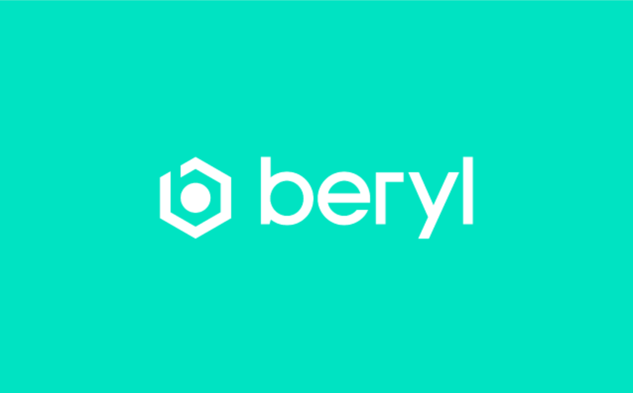
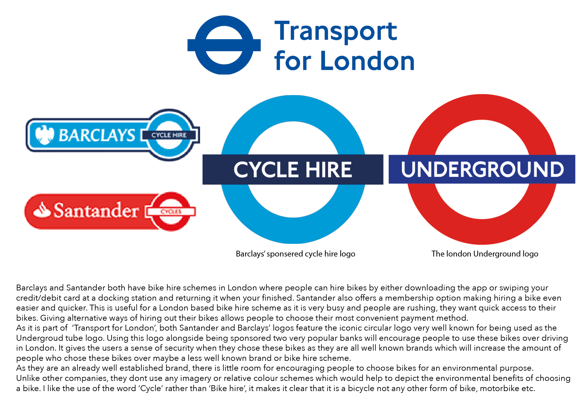
Beryl is a bike hire company with schemes all around the world - London, New York and Montreal. Designed in London in 2012, they have been tackling the "challenges of offering bike share as a viable mobility solution" beryl and removing "the barriers that exist to cycling in cities." beryl. Their key focuses are improving the safety of riding a bike in busy cities alongside encouraging a "green city"
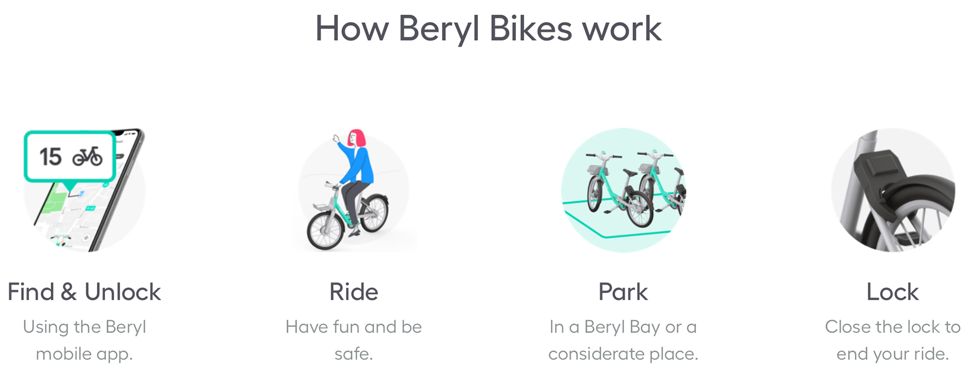
They function by using a GPS run scheme where bikes are located by using their own app where you can then unlock the bike and lock it back up once you are done in a 'beryl bay'.
They use a bold, solid turquoise colour as their brand colour which is used on their logo and throughout their brand identity. The colour is used on their app to locate their bikes. It is also used on the bike itself to make the bikes branded and easily recognisable. I like the colour choice as they have taken the semiotics of green and blues conveying the environment but developed this further to create a more modern, recognisable colour whilst still keeping that environmentally friendly connotation.
Their logo is quite simple. It uses a modern, san-serif typeface which is quite sharp and jagged. It is easy to read and is used throughout the rest of the brand identity such as the website and app. The logo also features a shape which could potentially resemble a bike wheel using the same features as the brand typeface. I like this as again it is taking the typical imagery of bikes and environment and developing a more modern, iconic shape.
Existing Logo Research