What is Graphic Information Design?
Graphic design combined with information design focuses on visualizing concepts and data to enhance human understanding of complex and vital knowledge.
Graphic design (or information architecture or technical writing, etc.) is to information design as geometry (or algebra or calculus, etc.) is to mathematics.
Information design addresses high level information problems to provide the most possible clarity, understanding and effectiveness.
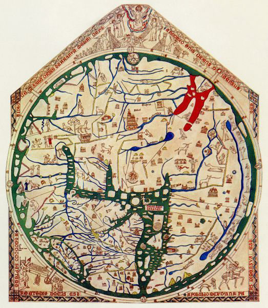
The Mappa Mundi.
Great world maps were an English speciality in the Middle Ages and were drawn on cloth, walls or animal skin. Only the Mappa Mundi in Hereford has survived and is believed to be the world’s largest medieval map.
The Mappa Mundi interpreted the world in spiritual as well as geographical terms. It included Biblical illustrations as well as portrayals of Classical learning and legend. As pictorial descriptions of the outside world, this impressive map was also educational; it was used for teaching natural history and classical legends, and reinforcing religious beliefs.
The continents are illustrated with drawings of cities and towns, classical mythology (the Minotaur is depicted on the map), Biblical events, plants, animals (including camels, elephants and lions), birds (including parrots and a phoenix) and people. The top of the map shows Christ sitting at the Day of Judgement, flanked by angels.
https://www.historic-uk.com/HistoryUK/HistoryofEngland/The-Hereford-Mappa-Mundi/
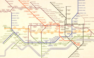
Harry Beck's Tube Map.
Now recognised across the world, the Tube map was originally the brainchild of Underground electrical draughtsman, Harry Beck, who produced this imaginative and beautifully simple design back in 1933.
Rather than emphasising distance and geographical accuracy, like other maps, Beck based his on the circuit diagrams he drew for his day job; stripping the sprawling Tube network down to a neat diagram of coloured, criss-crossing lines.
While it was no longer possible to tell the distance or precise geographic location of stations at a glance in his design, Beck reasoned that this was unimportant. What passengers needed to know was how to get from one station to another as efficiently as possible and where to change between lines.
https://tfl.gov.uk/corporate/about-tfl/culture-and-heritage/art-and-design/harry-becks-tube-map
http://www.bbc.com/culture/story/20150720-the-london-underground-map-the-design-that-shaped-a-city

Wayfinding
'Wayfinding' is a specialist design area that combines science, psychology, semiotics and graphic design skills. Wayfinding has the function to inform people of the surroundings in the (unfamiliar) build environment, it is important to show information at strategic points to guide people into the right directions.
An effective wayfinding system is based on human behavior and consists of the following characteristics:
-Do not make them think:
Create a comprehensive, clear and consistent visual communication system with concise messaging.
Create a comprehensive, clear and consistent visual communication system with concise messaging.
-Show only what is needed:
Show information what relevant is to the space, location and / or navigation path.
Show information what relevant is to the space, location and / or navigation path.
-Remove excessive information:
Remove unnecessary elements to create a clear visual environment ahead.
Remove unnecessary elements to create a clear visual environment ahead.
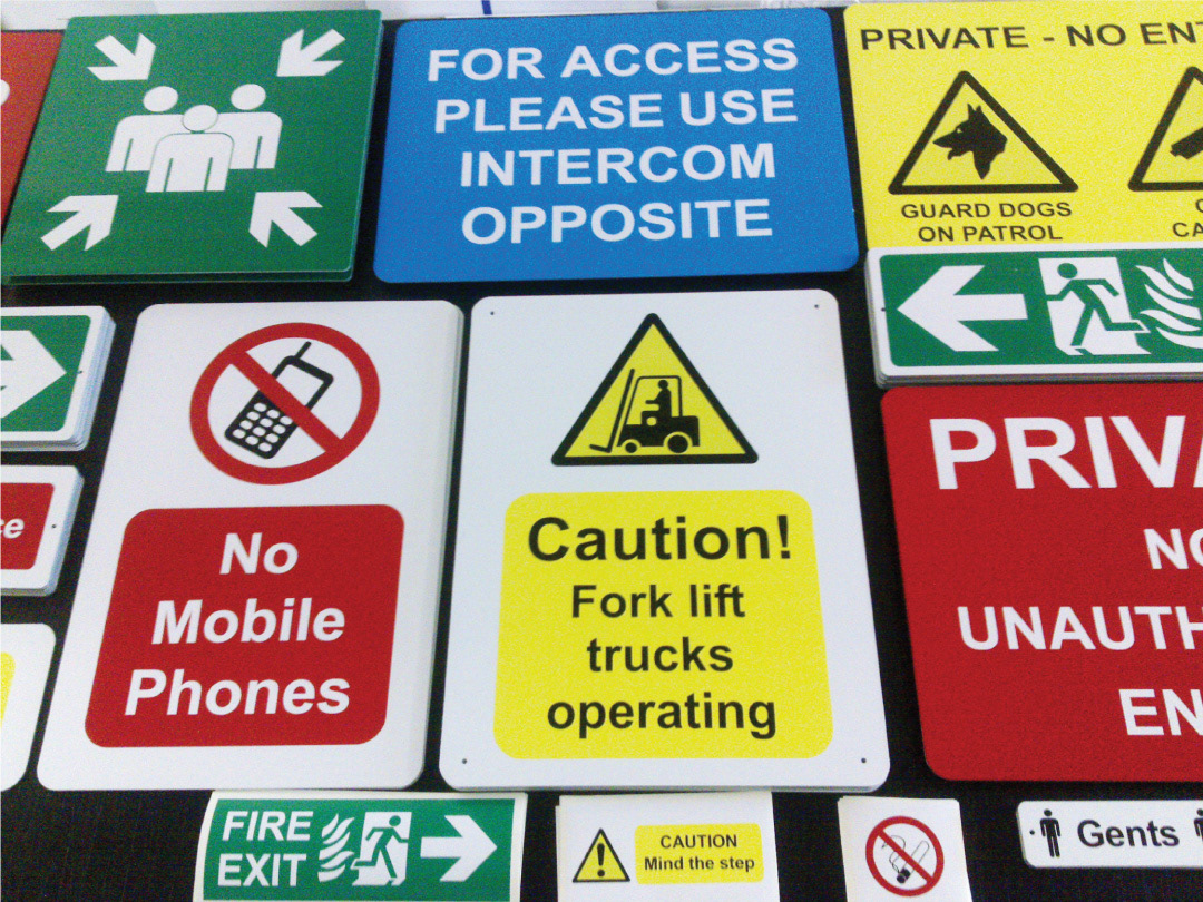
Types of Signage
Orientational: Maps, exploded views, plans, landmarks.
Informational: Timetables, industrial estate boards.
Directional: Navigation systems- airports, hospitals.
Identification: Labeling devices i.e certain buildings, works of art.
Statutory (regulatory): rules, safety, legal notices, fire regulations etc.
Ornamental: banners, flags, commemorative plaques.
Road Signage
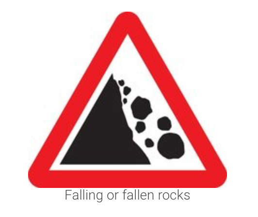

Like Wayfinding signs, road signs essentially do the same job of informing the audience. But, unlike signs in airports or shopping centres, people don't have the time to stop and read road signs. Road signs are designed to be glanced at, not studied. They need to convey the maximum amount of information using the minimum amount of content.
Herbet Spencer drove from central London to Heathrow airport and took pictures of every road sign he saw along the way. The photos showed how confusing signs were at the time - each one used different typefaces, symbols and colours. The number of cars on the road was increasing and it was obvious that Britain needed an understandable and easy to read system of road signs.
“What do I want to know, trying to read a sign at speed?” Jock Kinneir.
The government gave this huge project to the graphic designer Jock Kinneir and his assistant Margaret Calvert who had just finished creating the signs for the UK motorway system. By carefully coordinating lettering, colours, shapes and symbols, the pair created a system that has inspired modern road signs around the world. Pictures instead of words were used on many signs.
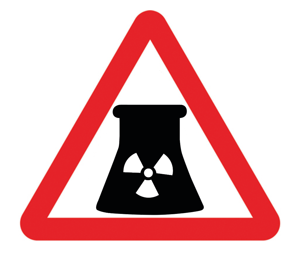
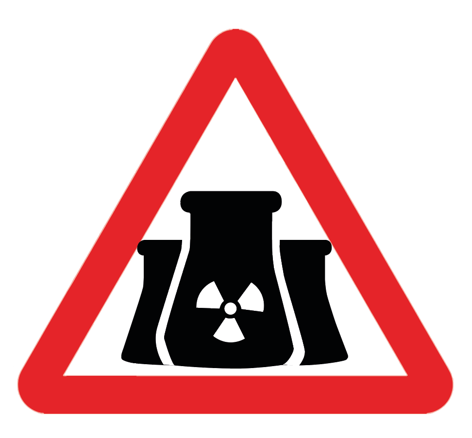
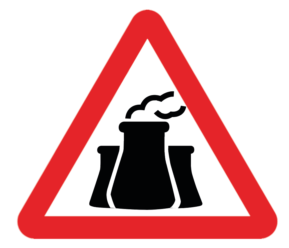
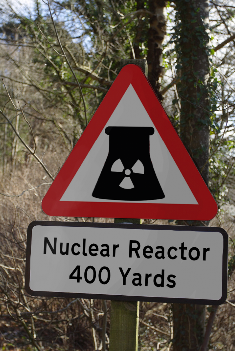
From research and knowledge from driving, I found that warning signs are typically presented in a bright red sign. Red is a colour that has grown to connote danger which may be why it has been used for warning signs on the road, alongside other warning signs such as fire directions. Orange and yellow are associated with positivity and are used for roadworks information signs to encourage frustrated drivers to think beyond the current delays. Motorway signs are blue as the colour suggests harmony, relaxation and consideration of others; ideal for motorways where high speeds and busy rush hours can result in serious accidents if road users are stressed and aggressive. Warning signs are also presented in a triangle which creates the brain to associate the sharp corners with danger. It is also apparent that warning signs use clear and very quick to understand pictograms in order for drivers and users to recognise the dangers ahead.

When researching for this task, I had to google what an actual nuclear power plant looked like. Once I recognised the shape of the building, and started to think of my initial concepts for this road sign design, it came apparent to me that other people may not know what the buildings typically look like so I would have to find another way to portray the danger of them. This is why I decided to include a well-established 'toxic' sign within the road sign to allow people to know what type of building they are coming to.
The typeface developed for directional signs in the late 1950s, appropriately named “Transport” which I used in this mock up, has been designed to be as legible as possible even while travelling past the sign at 70 miles per hour. Road signs had previously used upper case exclusively but it was realised that using both upper and lower case was much more effective in aiding word recognition. This is because most of what we read day to day is in mixed case and our brains are more familiar with the word shapes.
When you read a word you’re not actually reading every letter; your brain is tuning in to the overall shape of the word and recognising it. This happens much faster with lower case and the end result is a highly effective and user friendly wayfinding system.
When you read a word you’re not actually reading every letter; your brain is tuning in to the overall shape of the word and recognising it. This happens much faster with lower case and the end result is a highly effective and user friendly wayfinding system.
Analysis
After analysing my final design, I found that my road sign may not be as effective as I hoped. At a first glance, the shape of what I used to portray a nuclear building may be seen as a beaker used in chemical experiments. If I were to redesign this, I would experiment with how to change the shape of the building slightly to not resemble to glass container but still keep the similar shape.
The Brief: Tudor House Museum
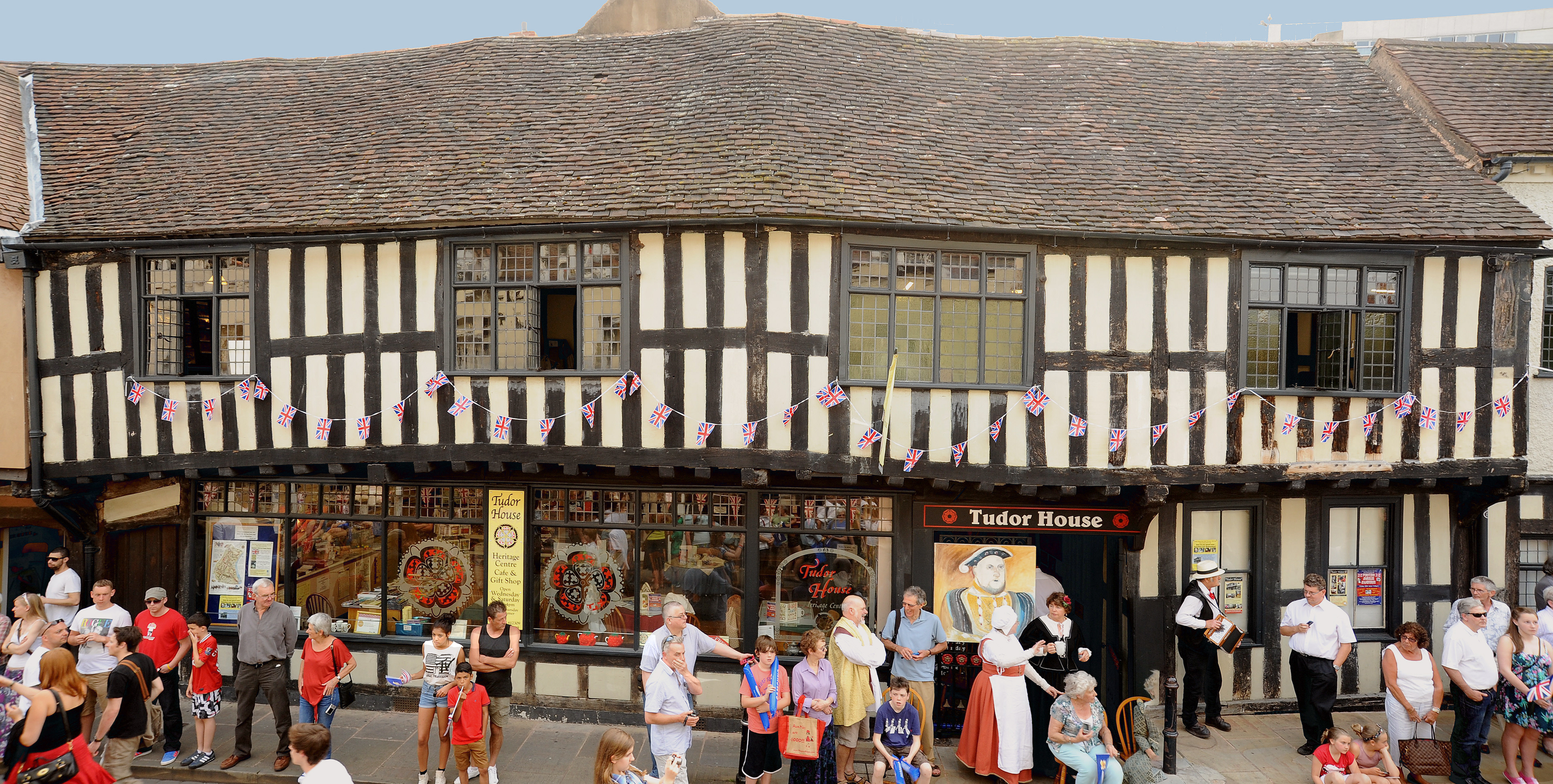
About Tudor House Museum
The Tudor house is a non-profitable organisation, they do not receive any funding from the government and it is completely free of charge to enter. Their main audience consist of families, young people and retired couples although also have a secondary audience of tourists of Worcester and school trips. They offer room guides for all ages, as well as ones in Spanish, French and German.
The Tudor house aim to rediscover the lost story of how people lived and worked in the Tudor times, especially the city's weaving heritage. They also showcase a lot of educational information about the World War II.
Tudor Design Research
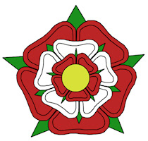
The Tudor period spanned the reigns of five monarchs, from Henry VII in 1485 to the death of Elizabeth I in 1603. It marked an age of prosperity, money from expanding trade, and the gift of land to royal favourites enabling them to build lavish houses. Dark oak panelling, rich velvet fabrics and wooden four-poster beds are all part of the Tudor style of interior décor. Tudors were well known for their colours of dark brown, gold, red and green.
The Tudor House Museum's website design uses a rich green and red design throughout, accompanied by dark browns enforced throughout photographs. The contrast really attracts peoples attention and the colours instantly enforce the Tudor times and the well established Tudor rose.
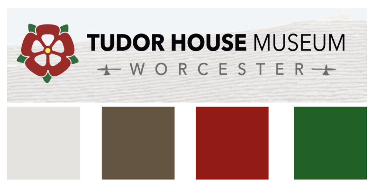
current colour palette
Existing information graphics & signage in the museum.
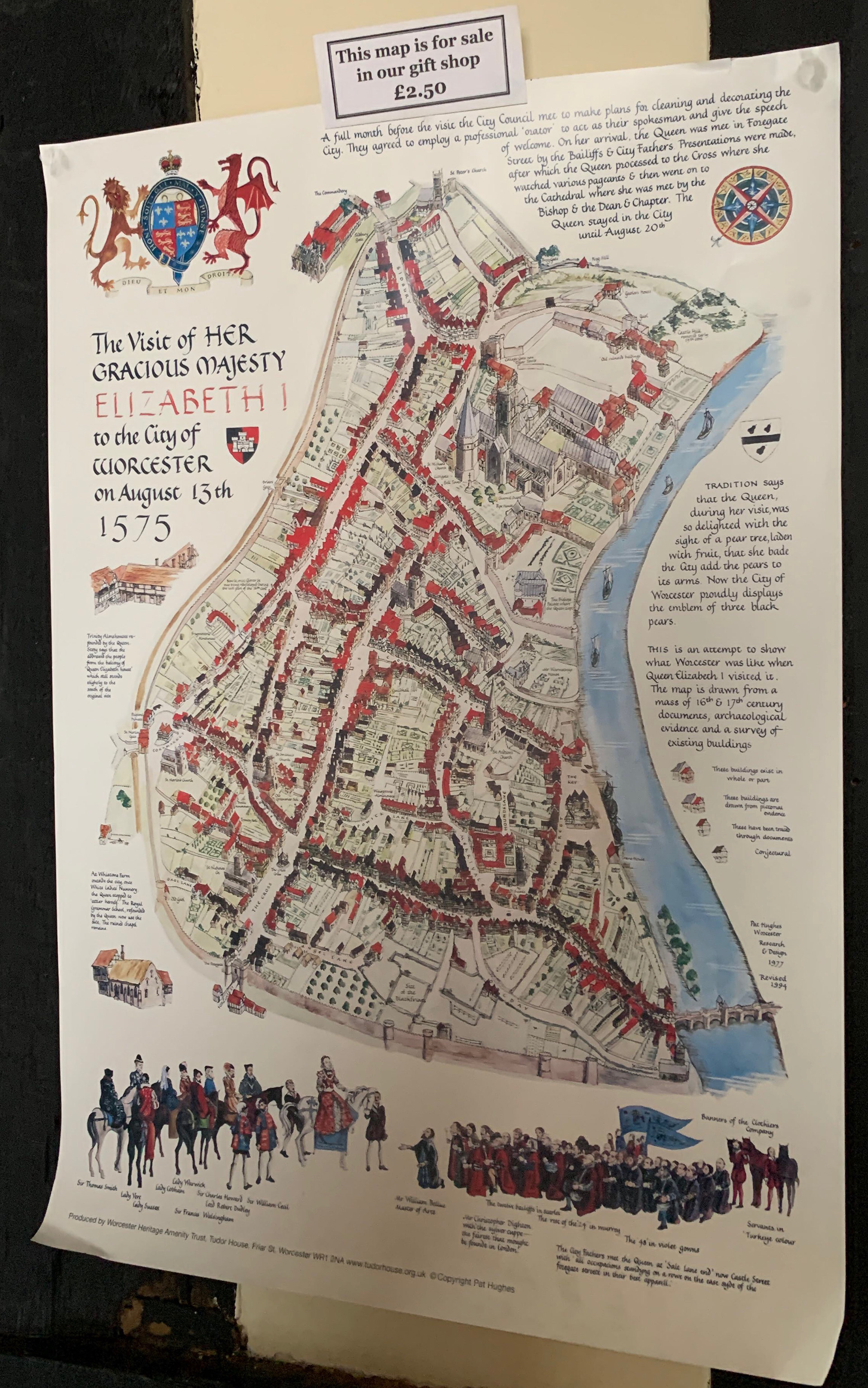

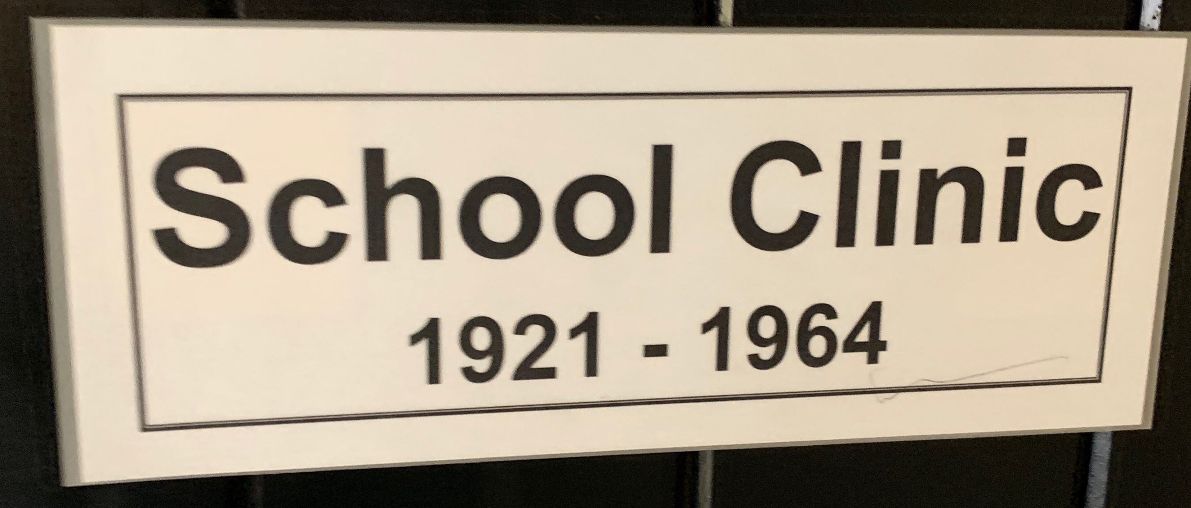
The existing signage used throughout the museum is quite basic and low budget, consisting of laminated paper and sometimes just painted paper. Although some involve Tudor inspired borders and patterns, the majority are quite boring and don't appeal to the audience or create any inspiration to read the detail. On the room name signs, they have used a simple, sans-serif typeface which is easy to read but still lacks character. there are my other typefaces used around the building swell which causes a lack of identity throughout the museum and causes a disjointed feel.
Research into other museum information graphics
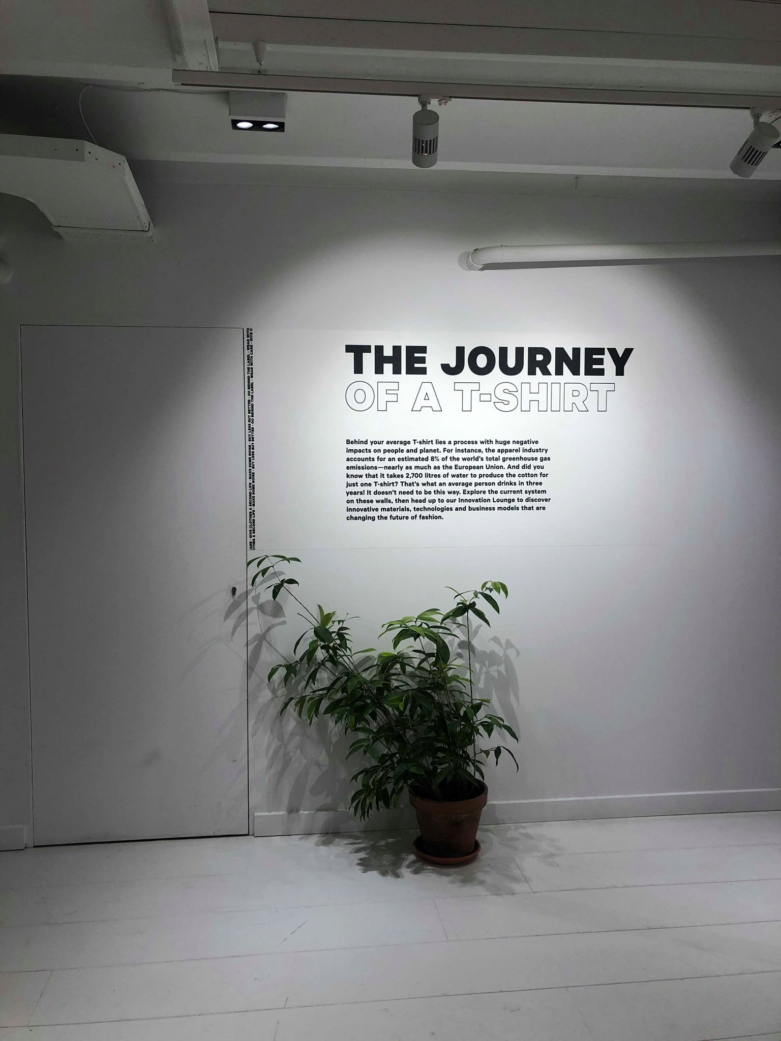
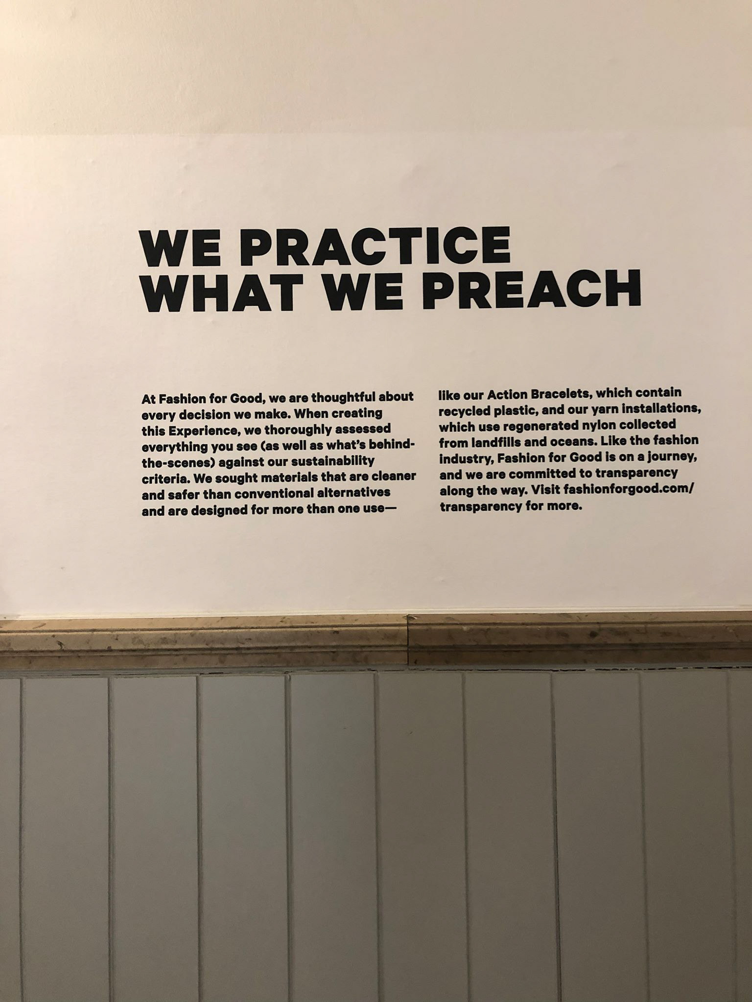
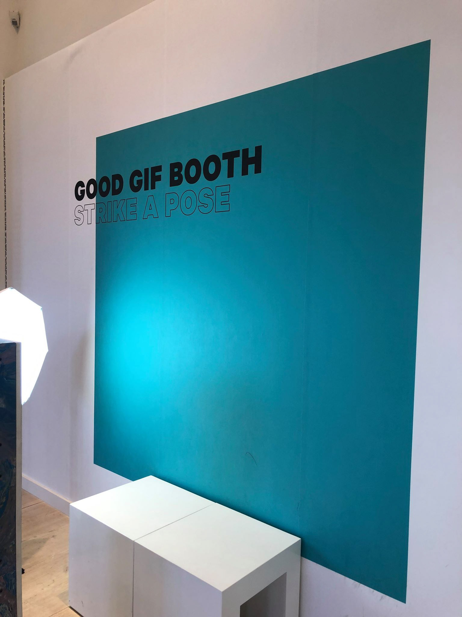
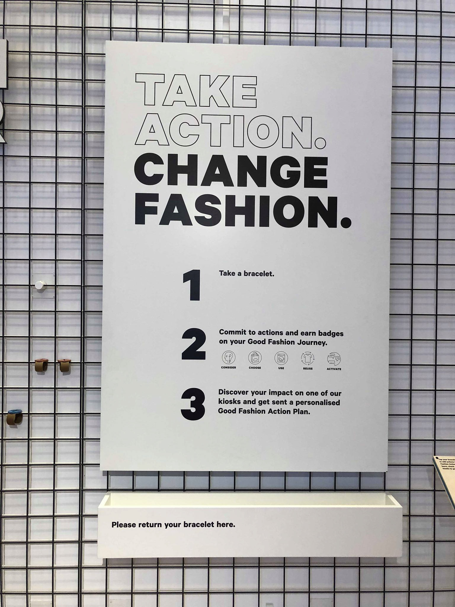
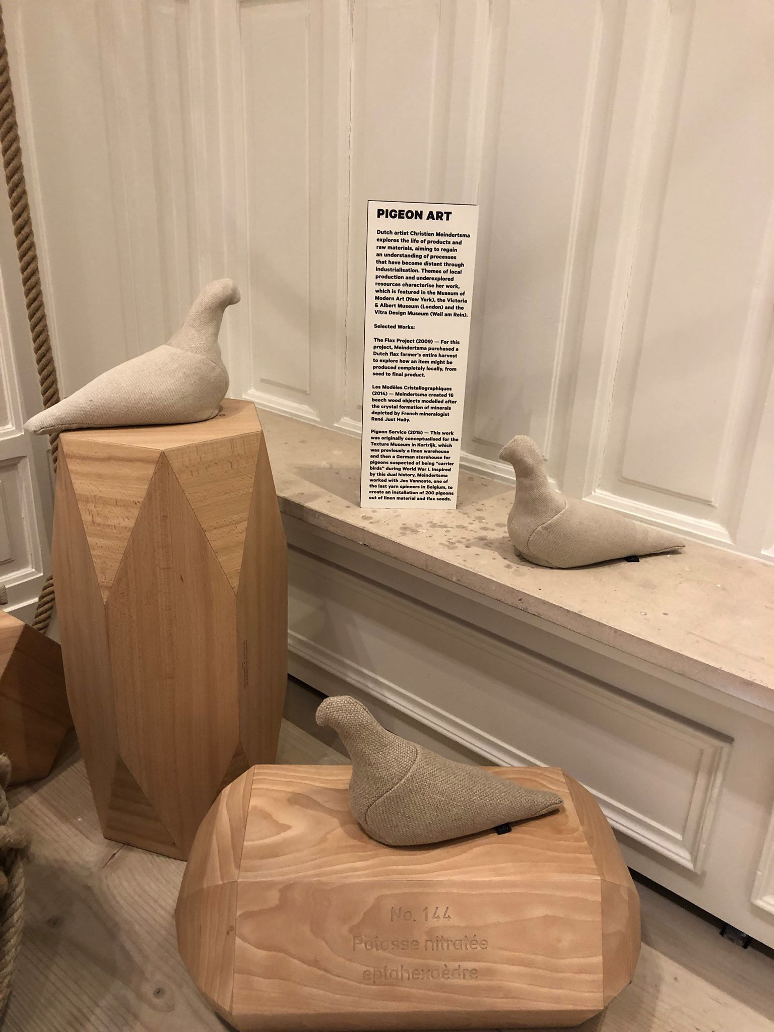
Whilst on a trip to Amsterdam, I went to the 'Fashion for Good' museum where I found really affective infographics.
The three images above I found were really simple yet effective as they are easy to read and also eye-catching to the audience. The information on them are in small, easy to digest paragraphs which are not off putting when walking around the museum. This then encourages people to read and take in information. The lighting in the first photo to spotlight key information is a really effective way of creating attraction without overpowering the actual information.
The signage throughout the museum uses one main typeface and experiments with fonts in that family, e.g; the headings consist of a bold, solid font accompanied by the same typeface in a outline form. This allows a easy to read heading as the typeface is clear and bold yet makes the visuals more attractive and playful.
When thinking about designing for the 'Tudor House Museum', this could be a really effective way of supplying information as the designs are painted straight onto the wall, keeping cost down for the non-profitable organisation. The typefaces and colours used could also be adapted to suit each specific room which would create a sense of identity throughout the whole museum rather than just designing for each single room individually.
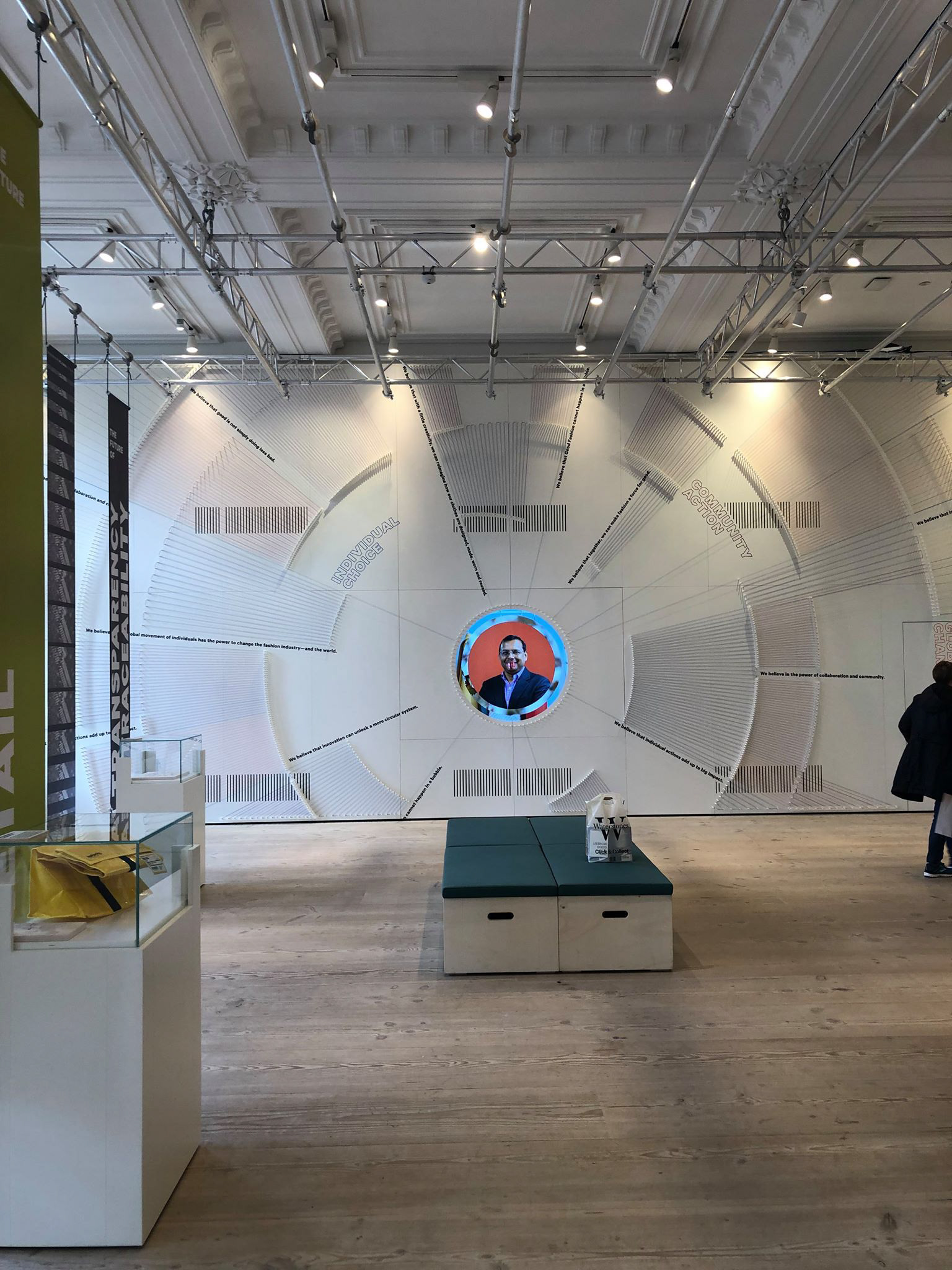
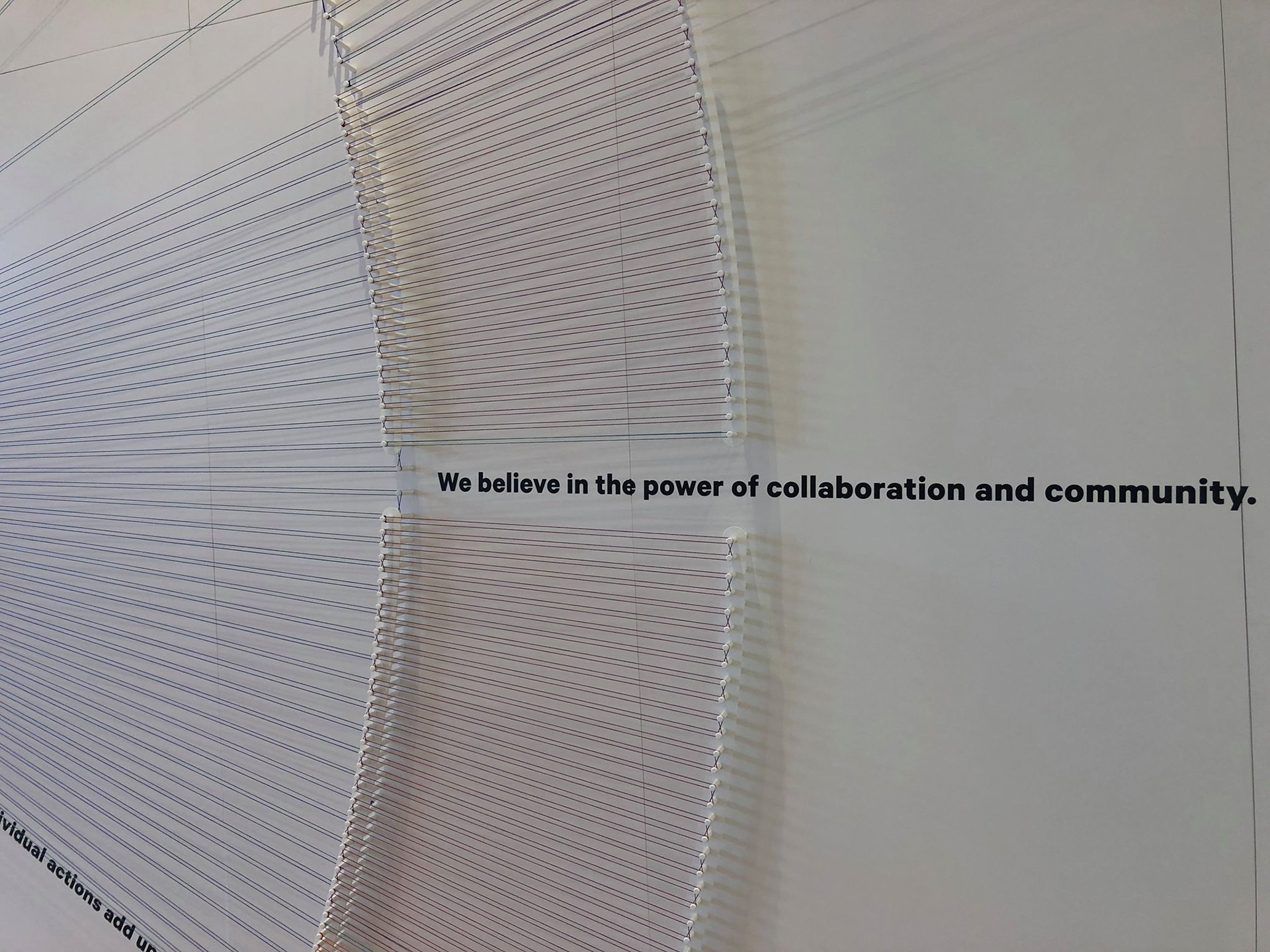
In the museum, the final room features a huge interactive infographic covering the whole wall where small sentences of information are featured to convey what the museum believe in and work to achieve. The wall feature is made entirely of thread, alongside another plaque with a beautiful artwork on, to reinforce what the museum are working towards which encourages interest of the audience. Although these design are quite modernistic and wouldn't suit the current visuals of the 'Tudor House Museum', the idea of using other materials rather than just paper and ink to attract the attention of the audience to read information may be affective when coming to designing my own work.
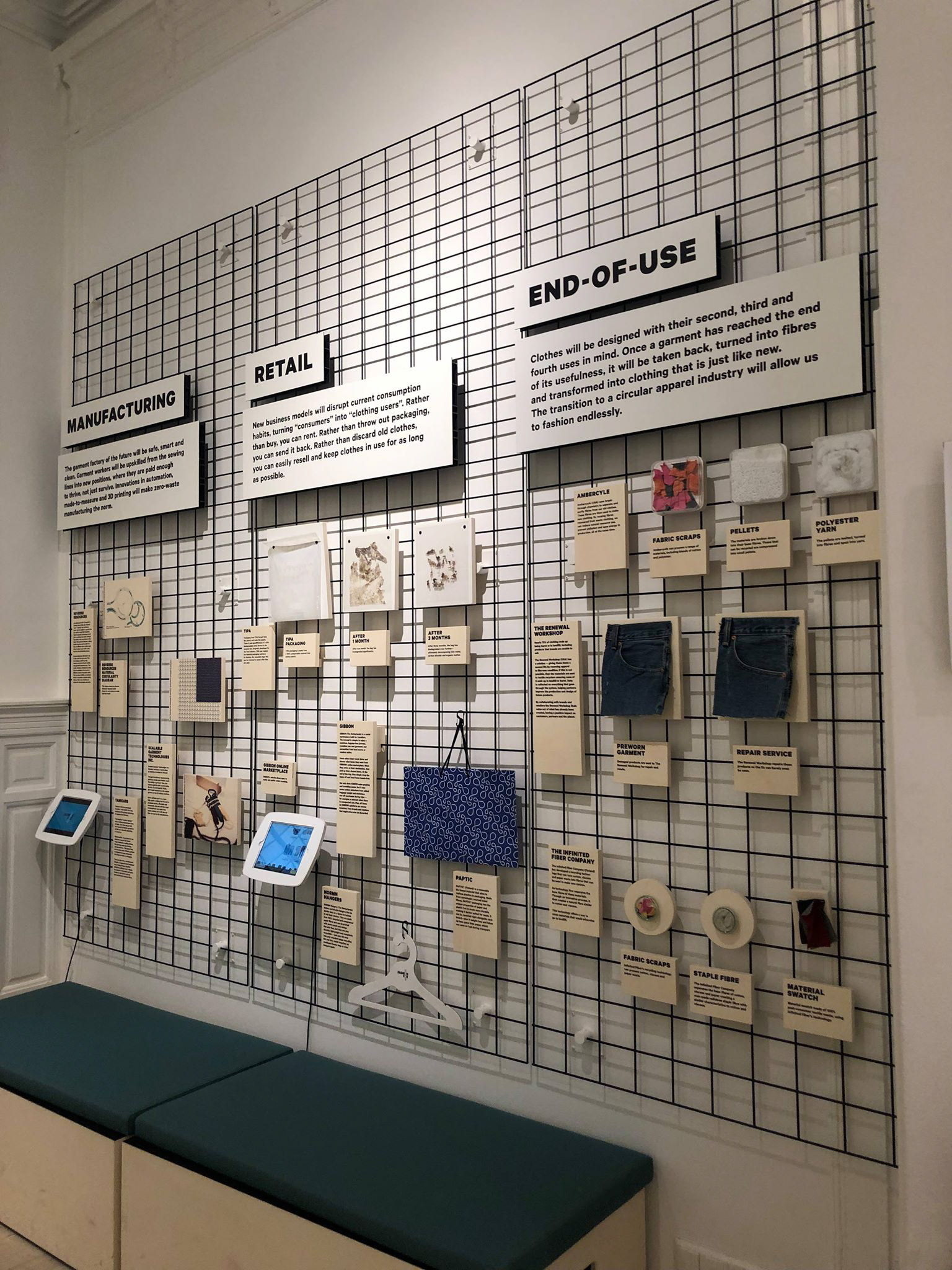
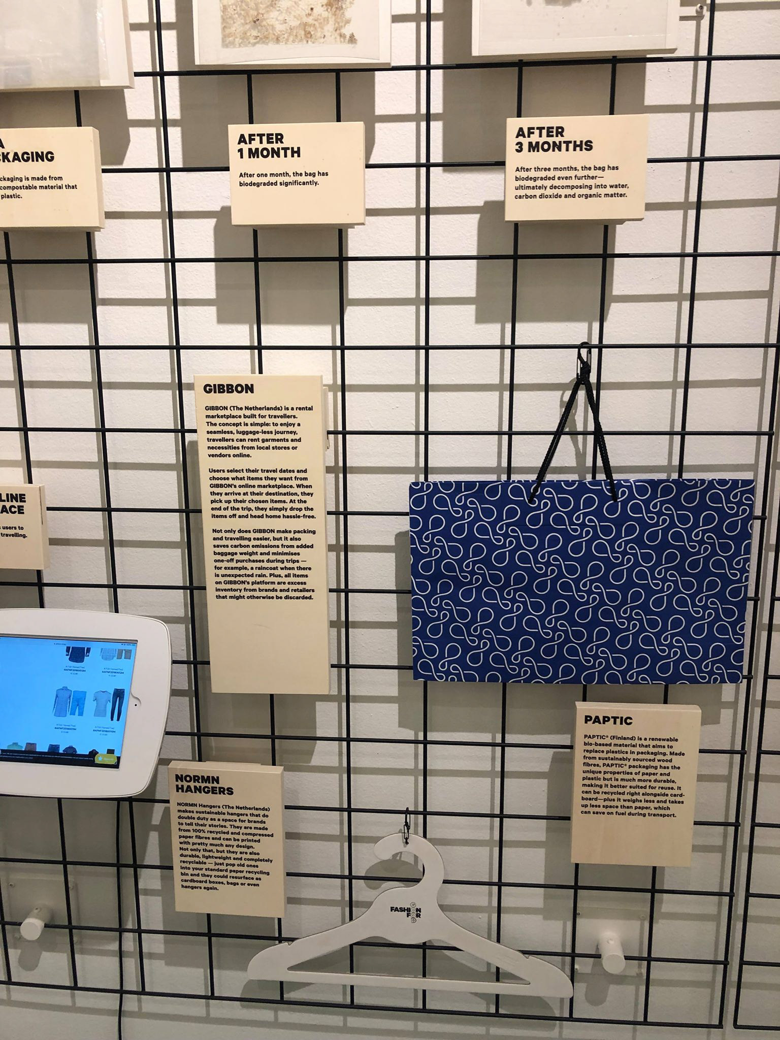
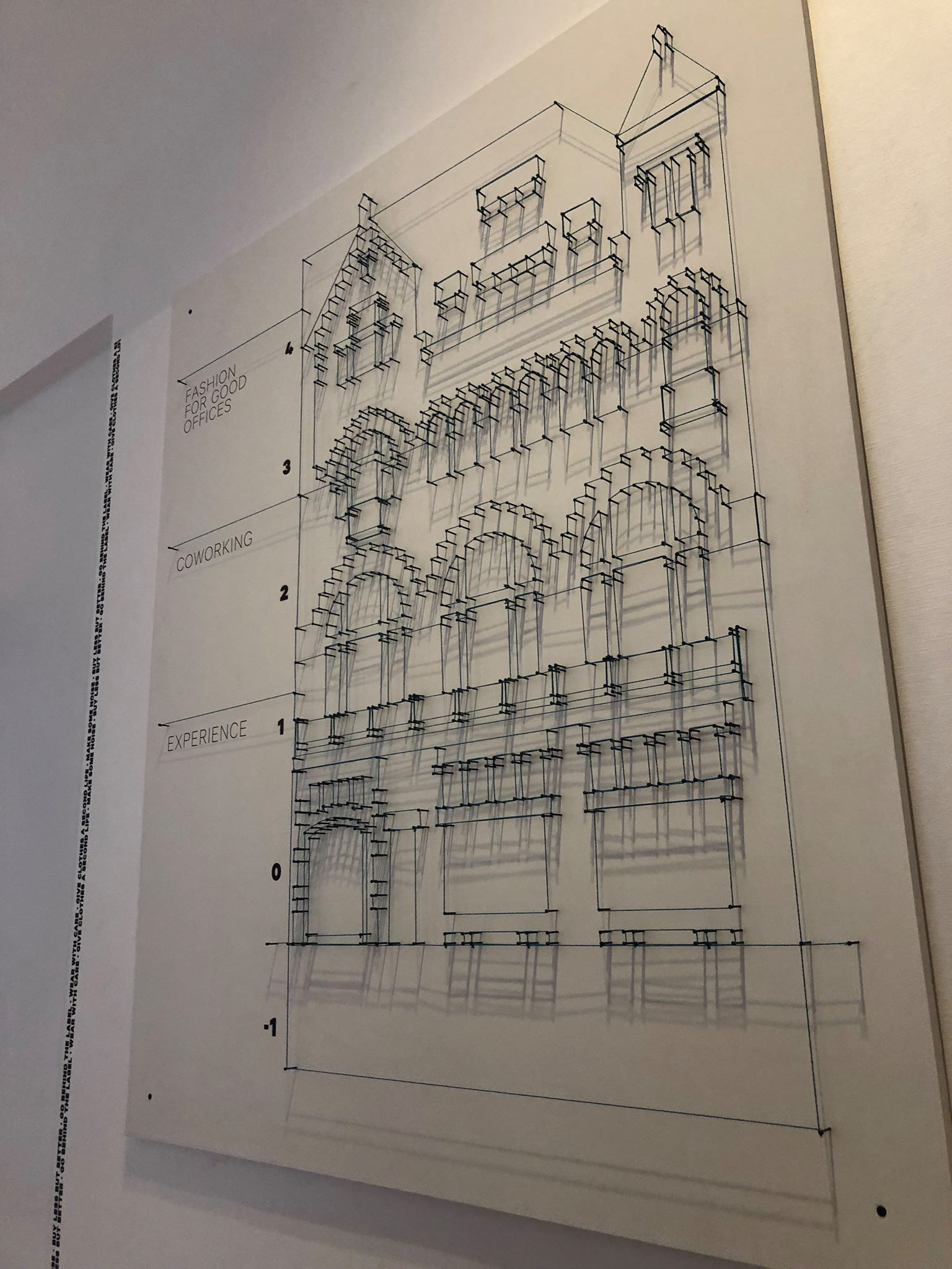
I found that the simple plaques with small paragraphs of information layered on top of a cage was really intriguing to the eye and made me want to read more. The information is also surrounded by small artefacts that are relevant to the information to help the audience understand what they are reading. These are both really good ways of encouraging people to read and both quite easy and cheap yet effective methods of displaying infographics.

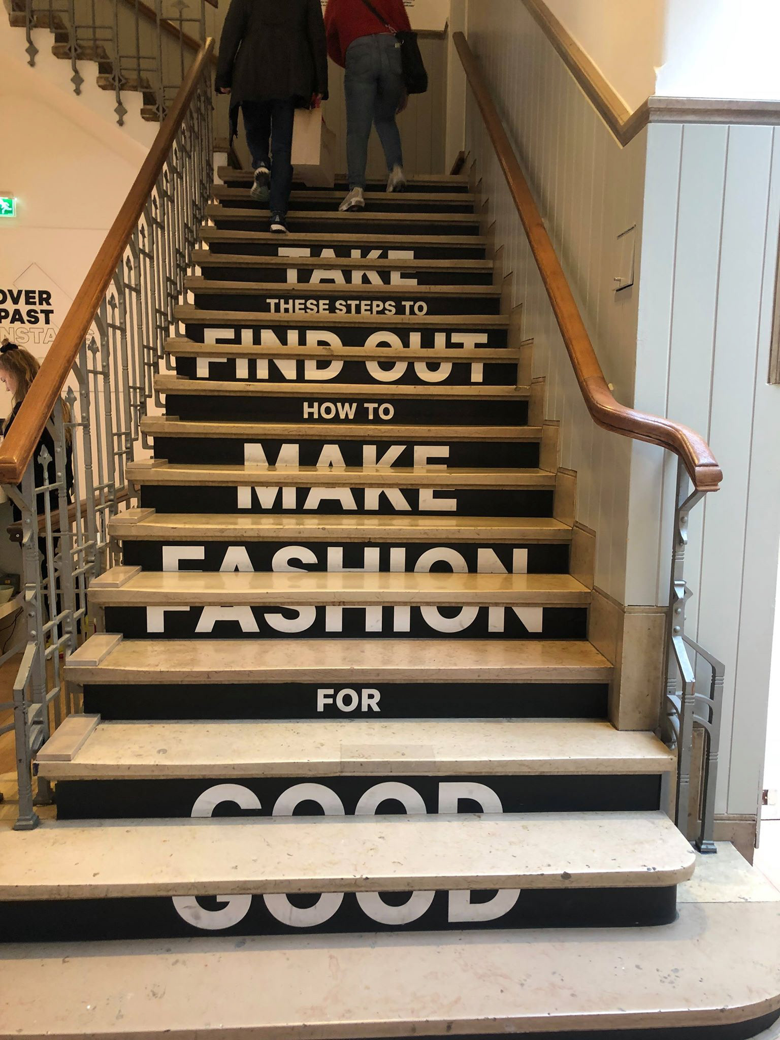
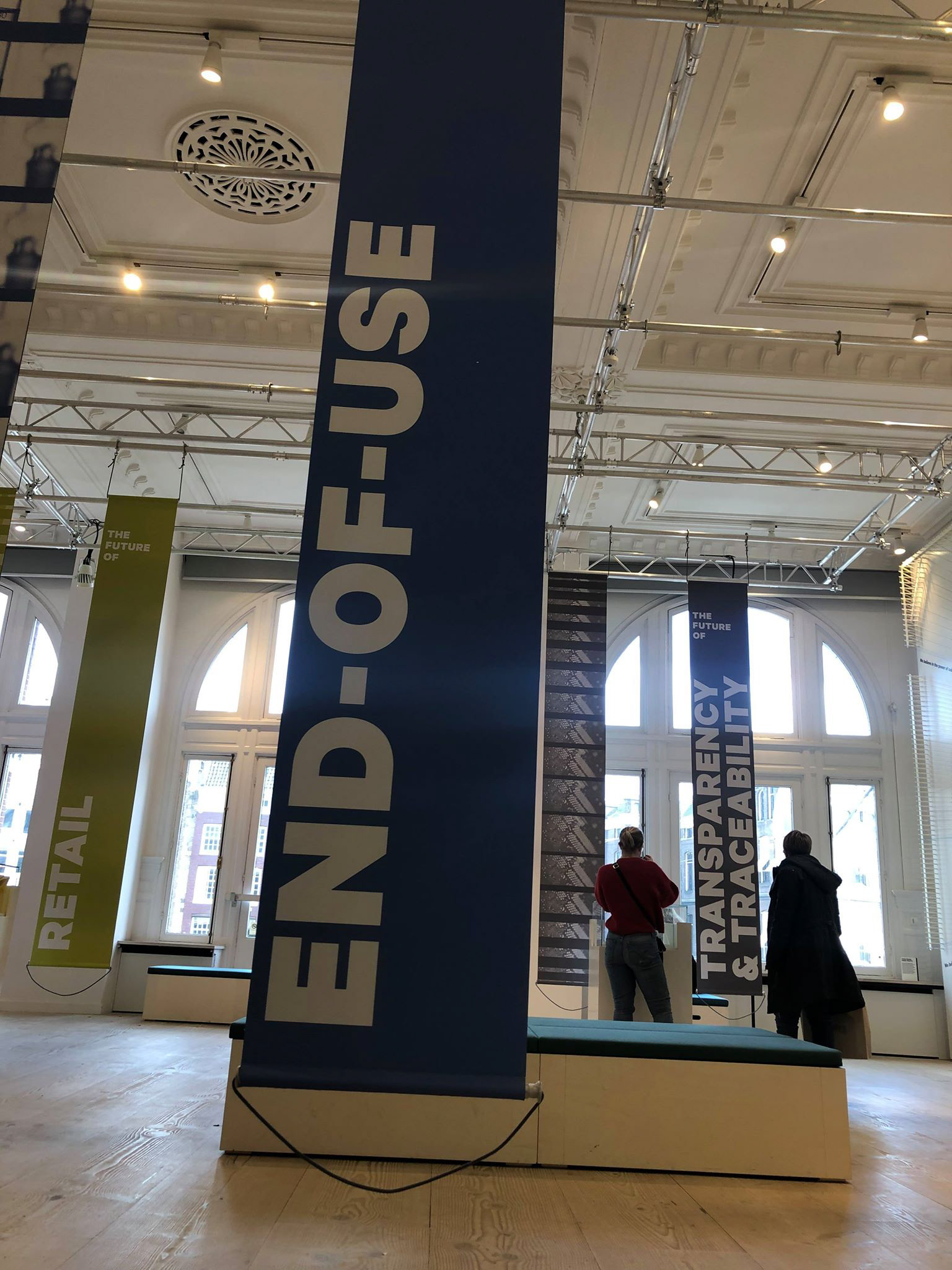
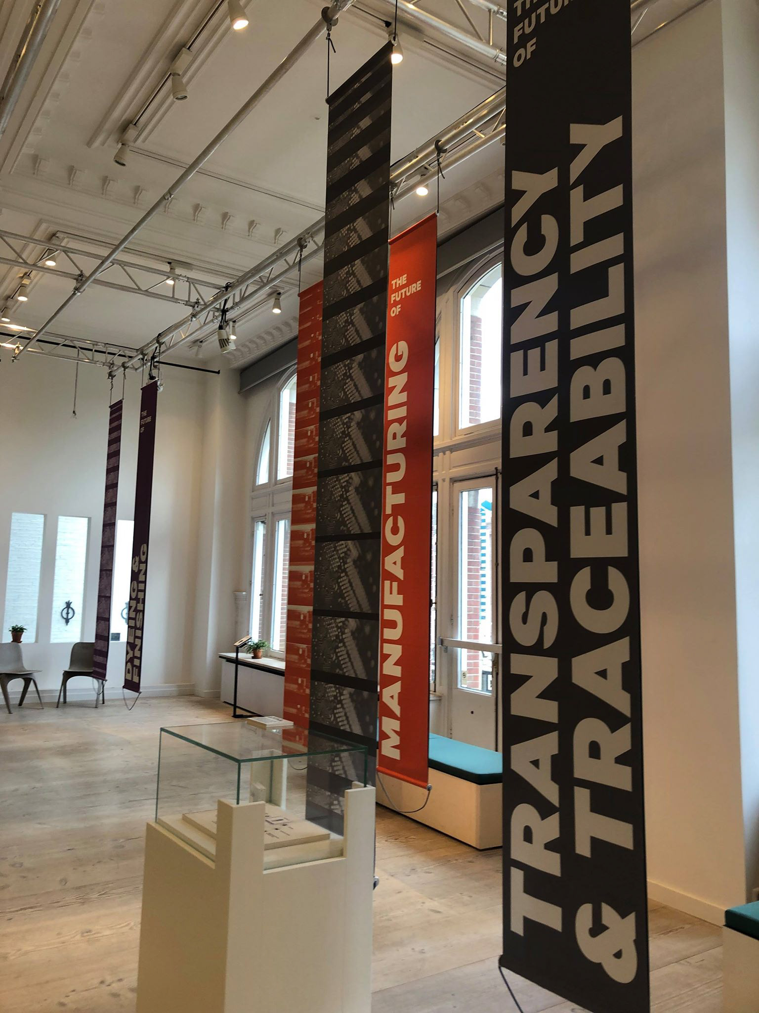
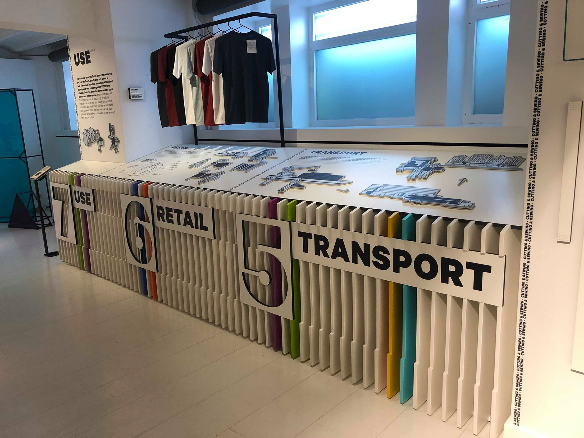
Other than interpretation boards, the museum also used other forms of information graphics around the building. They had small plaques elevated on a pole to a height where you were able to view and focus on the artwork then look down to read about the work. They also had very large banners hanging from the ceiling so that the audience were able to see what they say from a distance which would work well in a busy environment where you weren't able to get close to read small information. The museum also made use of the stairs to reinforce their slogan which is interesting and unique to the audience. The typeface is clear and easy to read which allows it to be legible even when the stairs create the text to be broken.
Effective infographics:
-Use no more than two typefaces: This allows the audience to easily read and take in information without struggle and confusion.
-Consider feint background (or) bolder side patterns or areas based on a ref from the room.
-Can lighting enhance what people see - consider downliaghters/lighting effects.
-Glass or perspex clear layers over the top of things/walls still means that artifacts can be seen but allows designs/diagrams etc to seemingly go 'on top' or around key objects on walls etc.
-Use simplified diagrams of artifacts where possible - the public understand simplified diagrams.
-Use bullet points to allow clear lists of small points linked to your work.
-Try to keep info 'bite-sized' so it's easily read - long passages of text aren't popular with the public.
-Consider using colours to help show specific areas or rooms.
-If using colours then don't over complicate with lots and lots.
-Use pictograms with signage and wayfinding where possible - it's a visual version of words.
-Consider multimedia screens or digital projections for adding dynamism and additional content.
-Simple floorplans are common in museums and galleries to help show what's where - the public understand these.
Things to consider:
1: Audience.
My target audience for this brief is predominately families with children and retired couples. Therefore, I need to consider things such as legible text and forms of entertainment to encourage the interest of children.
2:Find out the most important and interesting information, facts, data or trends that you want to shout about.
This way, I will be able to include all the information the museum wants to share but be able to create focal points and enhance key facts so the audience aren't overwhelmed with information.
Within the room I have chosen, it is currently very cluttered so moving forward I would like to focus on this idea and chose key points that I believe are relevant and interesting for people to learn and understand.
3:Choose the best way of telling it using the elements and templates provided. If you have numbers, use a graph or chart. If you have locations, use a map. If you have dates, use a timeline. If not, use icons, arrows or short text.
I would like to use the power of texture to encourage people's interest in my room designs. I feel that this would allow the information to be legible to adults but also interesting to the children.
4: Colour;Stick to two or three colours and try to match it to your branding/logo.
Text;Break up text by highlighting important words and numbers with varying font size and boldness. Layout;Place emphasis on key information to instantly grab and maintain the readers attention. Also, dont force too much information on - less is more.
http://southeastmuseums.org/domains/southeastmuseums.org/local/media/images/medium/infographic_toolkit.pdf
World War II Room


I have decided to focus on redesigning this area of the room. The information and artefacts shown are so interesting but I feel that the way they are presented makes them appear old and boring. Information is printed onto plain white laminated paper swell as the notes for each artefact which seems very basic and doesn't encourage people to want to read the big paragraphs of information. The information needs to be split into smaller digestible paragraphs and put into a better order of reading. One issue I have is also that there aren't any headings or titles so people could potentially be unsure of what they are reading.
Concept Ideas

My first concept idea is to have a large flag pinned onto the wall, with a mixture of information and imagery printed onto it. The fact the flag would be large would interest the attention of children and younger adults. I also came up with the idea of having miniature flags that could be taken, with one side featuring the flag of a country involved and the other side featuring an interesting fact about the war. By doing this, it would interest the children and almost 'trick' them into learning by giving them something fun to play with and read.

My second idea was to place a glass panel over the brick with information and illustrations (rather than photos) printed on. This, although not as child targeted, will bring a modern and clean feel to the room that is currently quite full. The information placed onto glass will allow it to be both interesting and legible to read.

My third idea was to try and incorporate as many of the artefacts currently in the room but in a more interesting and less cluttered way so that people can really experience the room. The way I thought this could be done was to replace the current felt and wooden board hanging with a metal wire board. By doing this, it wouldn't require anything being nailed into the delicate walls and it would also allow information printed onto plaques to be interchangeable as they would hook onto the wire as would mounted artefacts. I also thought, for it to interest children, there could be hooks with items such as an army jacket and hat that they could try on.
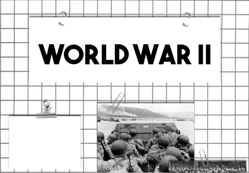
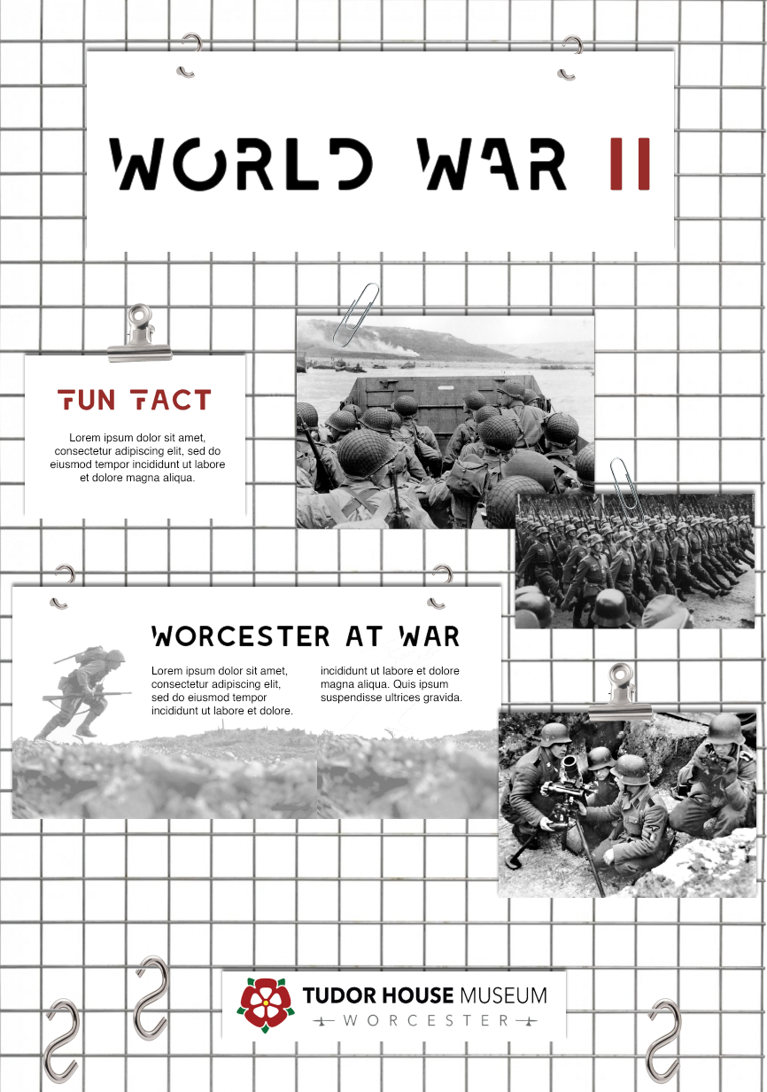
Interpretation Board
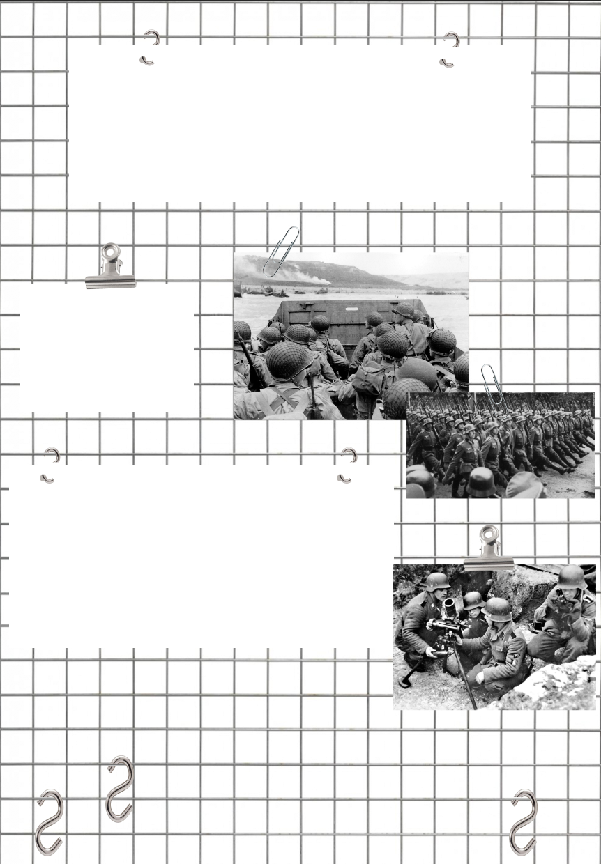
Initial basic design of the overall look of the wall.
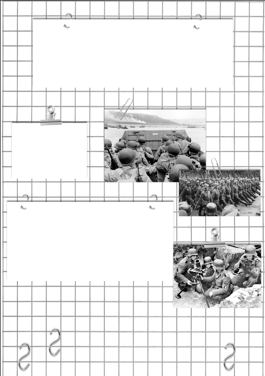
Drop-shadow added to create visual 3D effect.
Bold Typefaces
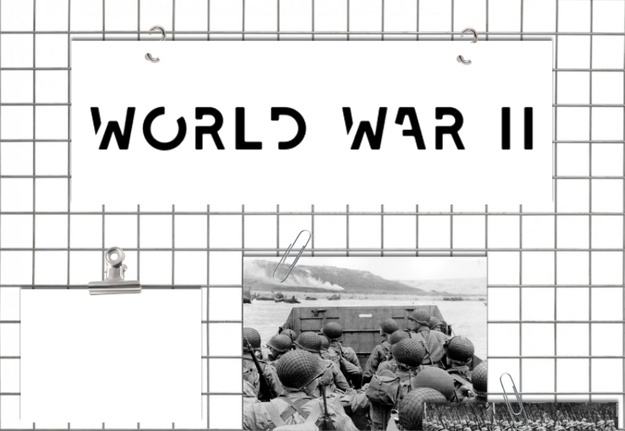
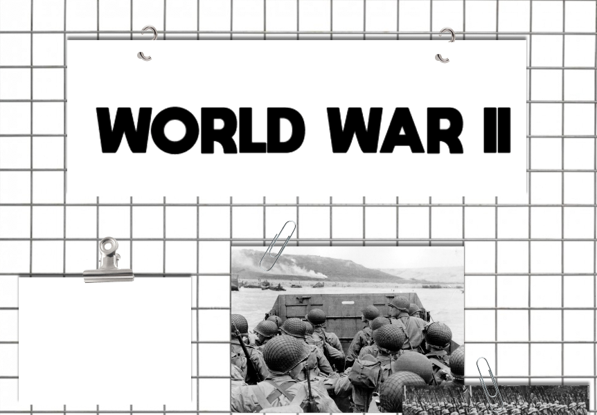
I experimented with a few different bold, sans-serf typefaces as I felt that these would work well for headings and subheadings to create a clear understanding to the audience of the information on the page, allowing the headings to be clear and stand out from any part of the room. Although I want the typeface to be clear and legible as a priority, I also wanted a typeface with a personality that depicts the theme of the rest of the board as well as the theme of WW2.
Colour
For my boards, I have decided to design them just shades of black, white and grey as I have left space on the designs for where artefacts, items of clothing etc would be hung on the display which would add colour. As my main concept for my designs was to create a less cluttered and messy way of presenting the information alongside all their artefacts, I decided that keeping the information and photographs black and white would separate them from the coloured elements allowing the visitors to be able to not get confused.
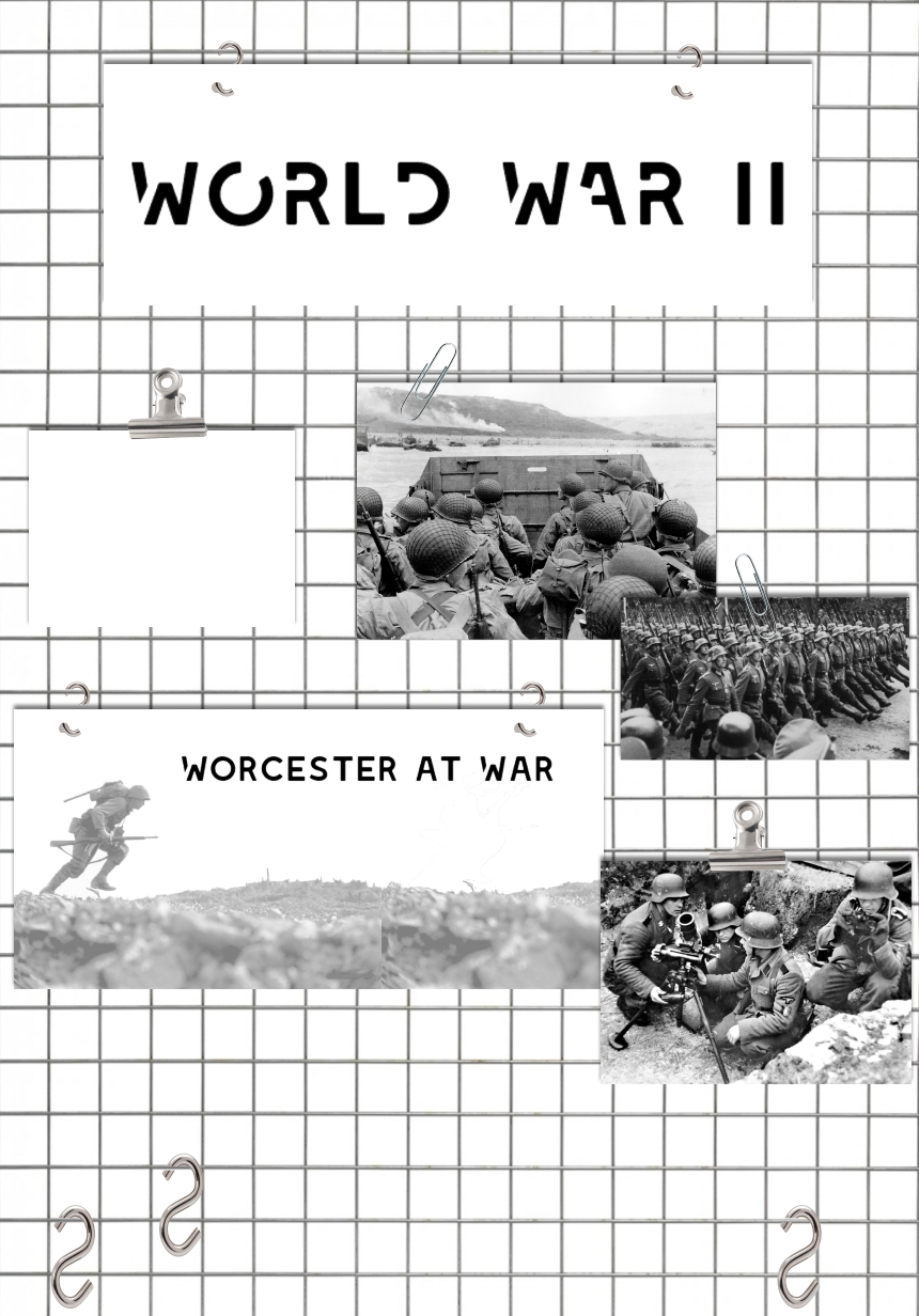
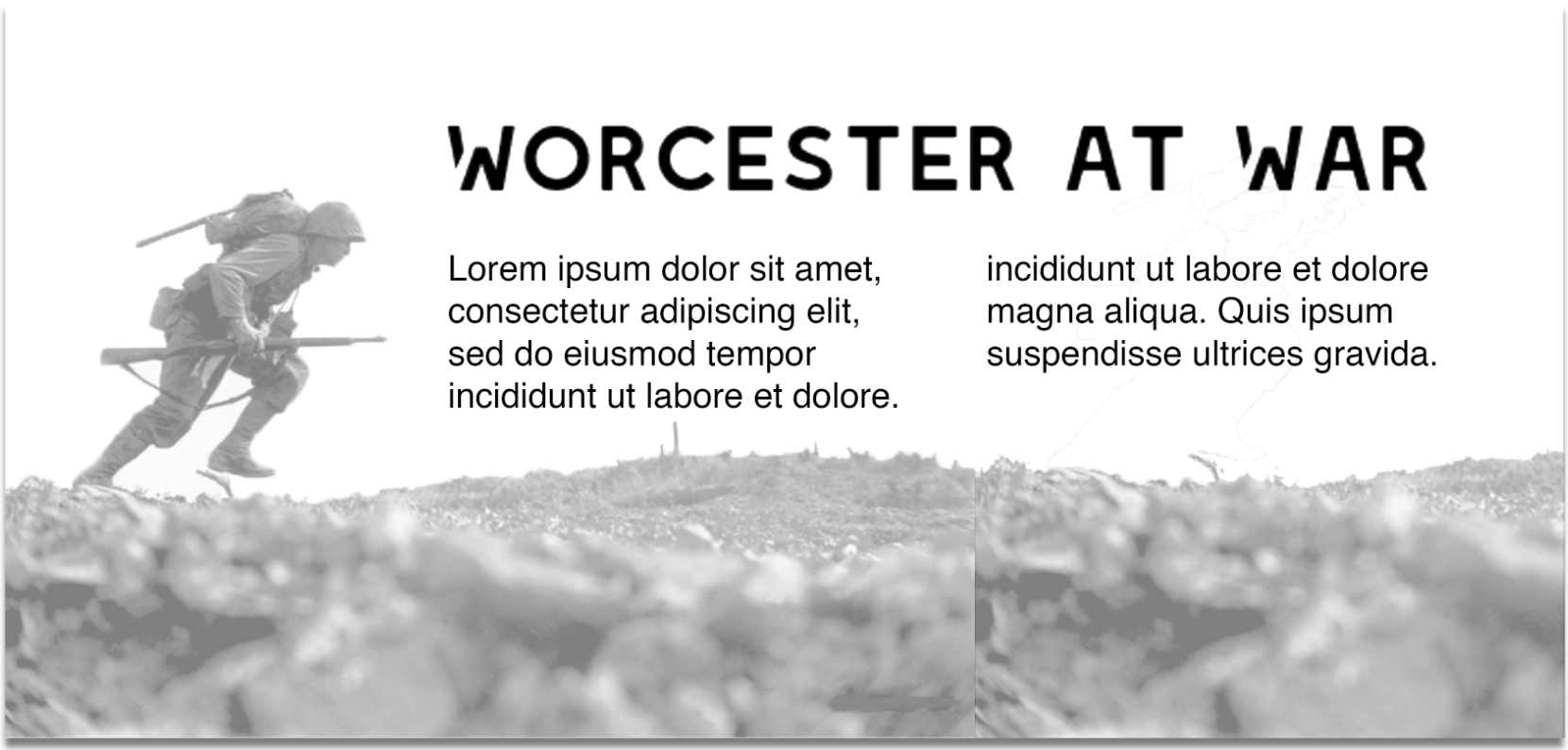
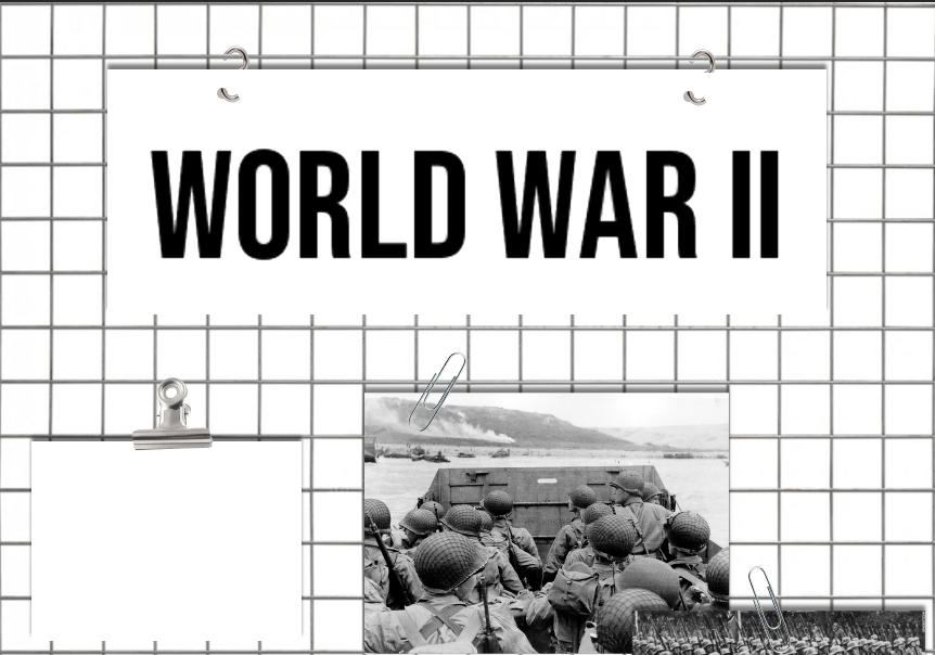
Final Design
The typefaces I have decided to use are 'Leixo' for the headings as it is bold and sans-serif which is what I originally wanted but it also has character, whilst still being legible, creates an atmosphere which I feel suits the war themed room.
I have also designed the paragraphs into small, digestible bits of information, split onto different plaques, one with information and the other could include a fun fact to appeal to both the younger audience and the elder.
The hooks at the bottom would be to hang artefacts or clothing that the children could hold and feel to involve a sensory learning. The design of this board is very versatile, plaques can be moved or renewed easily as they only hook onto the wire frame. The wire frame also creates a lot of atmosphere to the room as in the World War, resources were slim, everything had to be used.

After reviewing my work with my peers, one point in my feedback was to experiment with using a bit of colour, so in my final design I added small hints of the dark red from the current logo into the typography of my work and I think it works quite well.
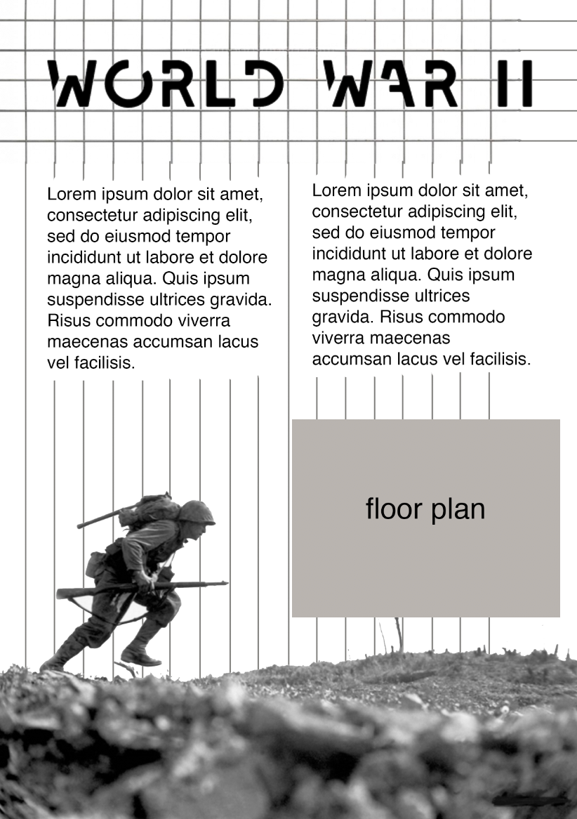
A4 hand out
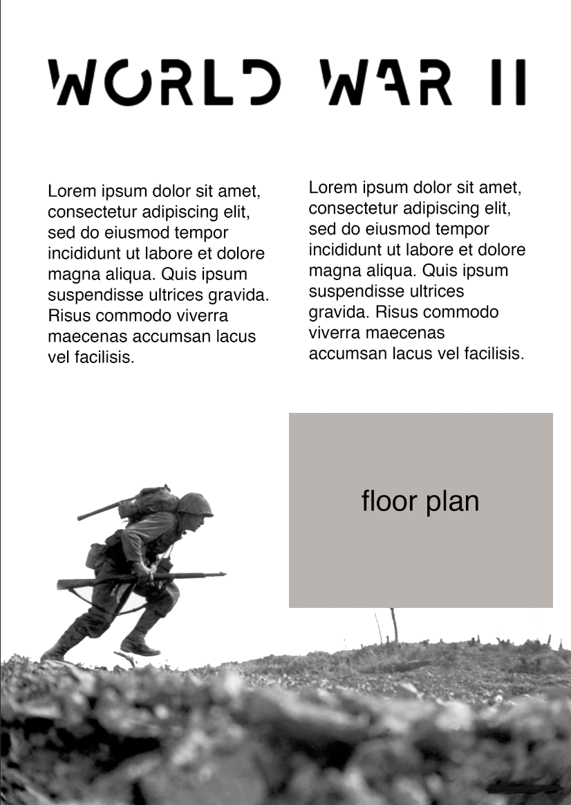
For my A4 hand out concept idea, I would like to carry on the same theme as my interpretation board, with a relevant image as the background, losing colour towards the top so that the information is clear and legible. The room header will be in the same typeface as the interpretation board to allow the customers to be able to identify which room they are in. I would like to ideally put a floor plan on the sheet but unlike the other rooms, the room is more information based rather than the layout being inspired by the theme so I am not sure wether putting more information on the sheet rather than a plan would be more beneficial.
Background ideas
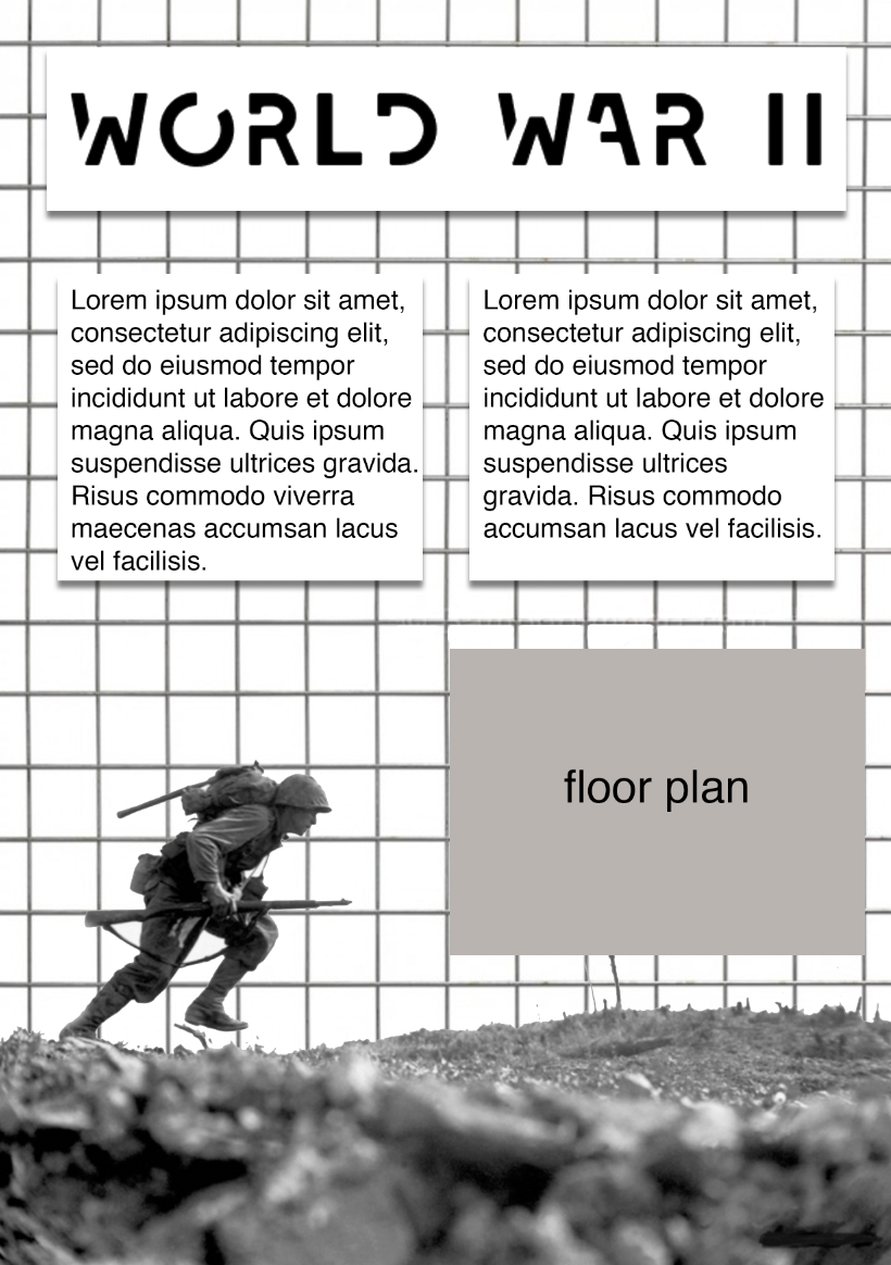

In my A4 handout , I would like to incorporate the wire frame from my interpretation board to identify a link between the sheet and the room in reference. I also added a drop shadow on the boxes behind the text to create a three-dimensional effect like the interpretation board would be like.
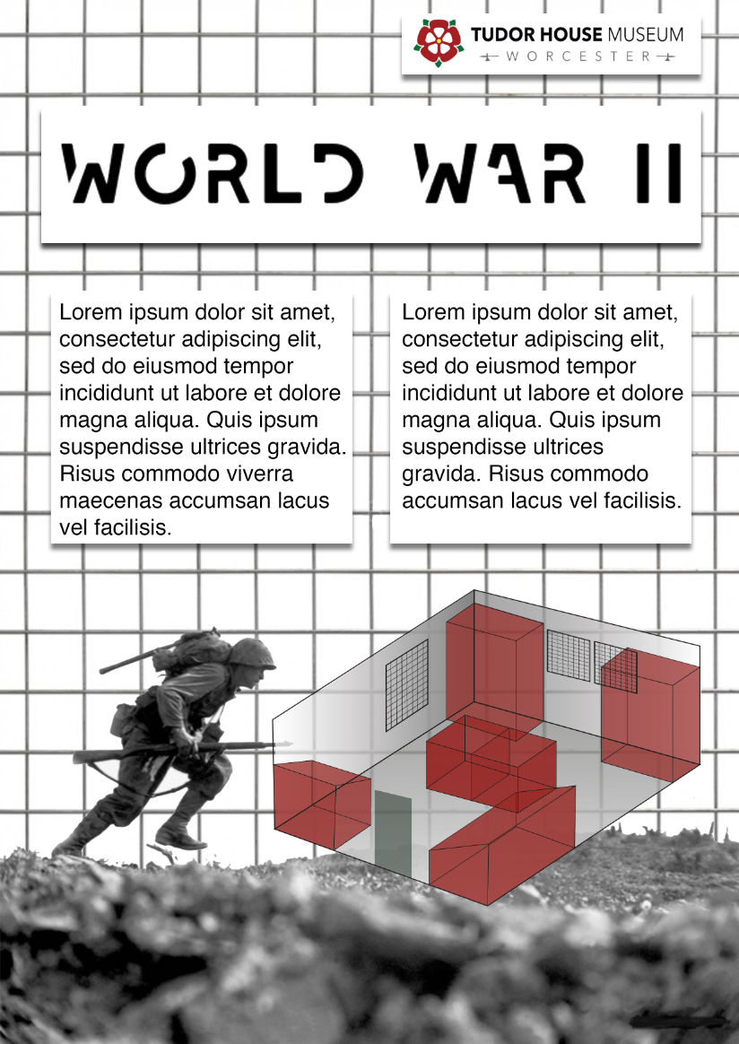
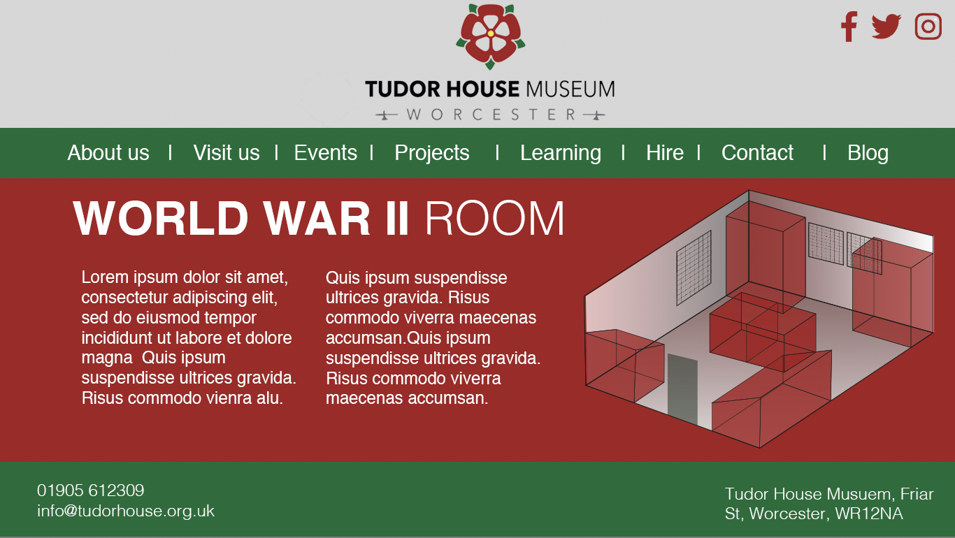
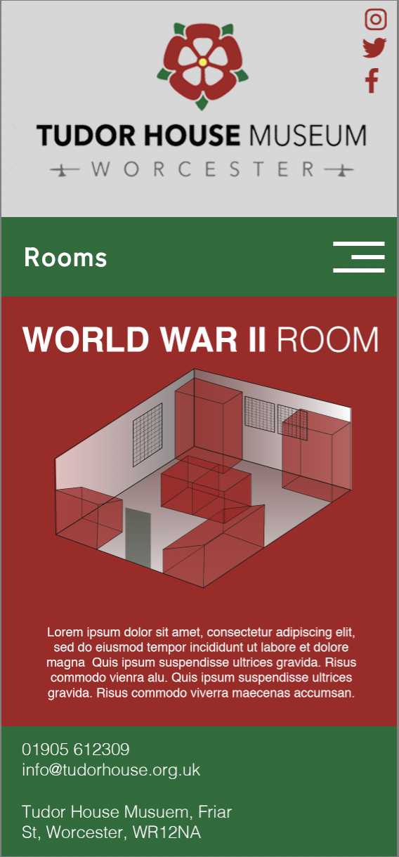
Final A4 Handout design
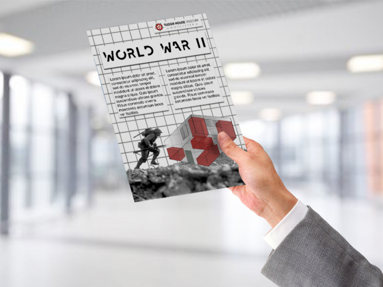
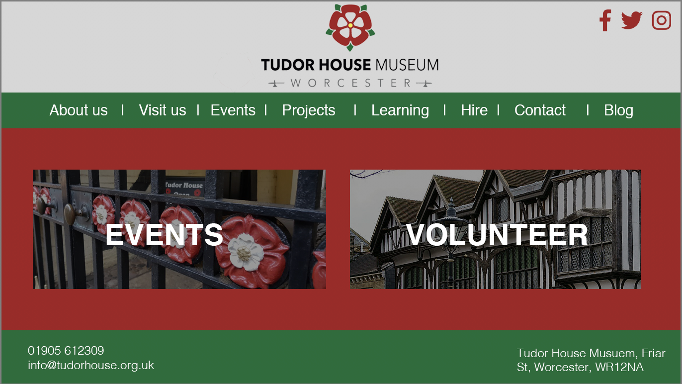
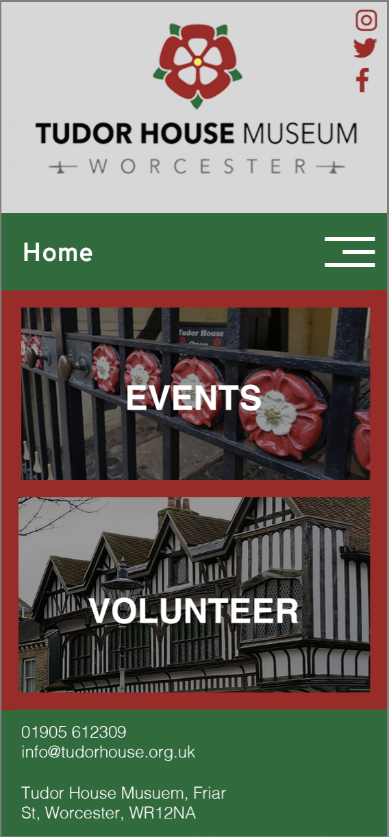
Webpage mock ups
Bibliography
https://designmuseum.org/discover-design/all-stories/british-road-signs. http://www.wearemsd.com/blog/the-psychology-behind-road-signs https://tfl.gov.uk/corporate/about-tfl/culture-and-heritage/art-and-design/harry-becks-tube-map. http://www.bbc.com/culture/story/20150720-the-london-underground-map-the-design-that-shaped-a-city https://www.designbyccd.com/thinking/science-psychology-of-wayfinding/ https://www.nationaltrust.org.uk/lists/tudor-interior-design---building-and-houses https://www.tudorhouse.org.uk