Task 1 - Sustainable Graphic Design Firms
Thomas.matthews
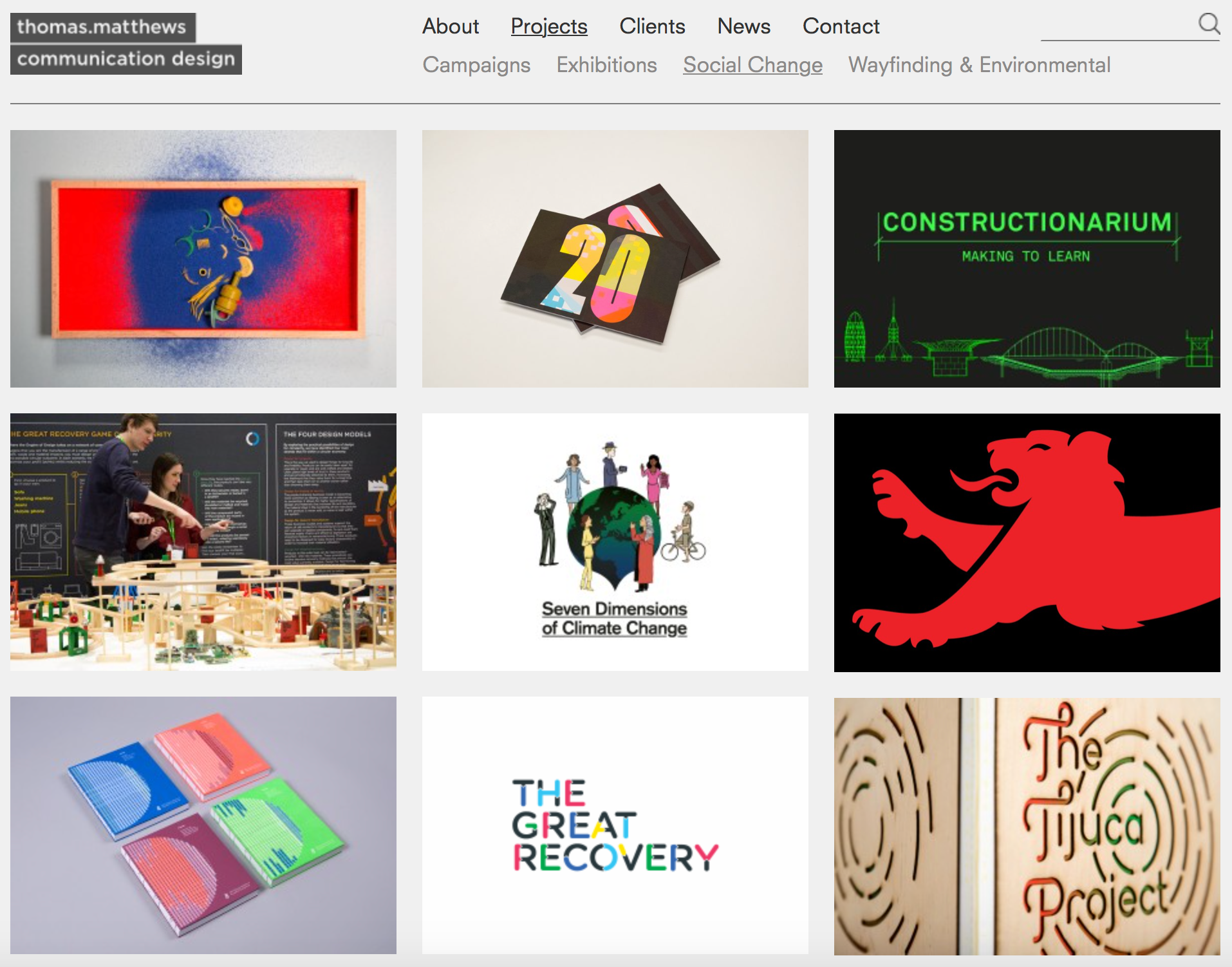
Thomas.matthews is an award-winning communication design agency creating work that has sustainability at its heart.
They believe that by putting sustainability at the top level of their thinking will inform design for the better. They deliver design that has environmental and social integrity. Ensuring all their projects are initiated with the matter of sustainability enforced from the outset allows them to avoid the roadblocks to creating authentic design that makes sense for the brief and gives environmental consideration for future generations.
“Sustainability in business should give integrity, not greenwash. It should inspire change from your employees, consumers and clients." - Sophie Thomas, Founding Director
Greengaged
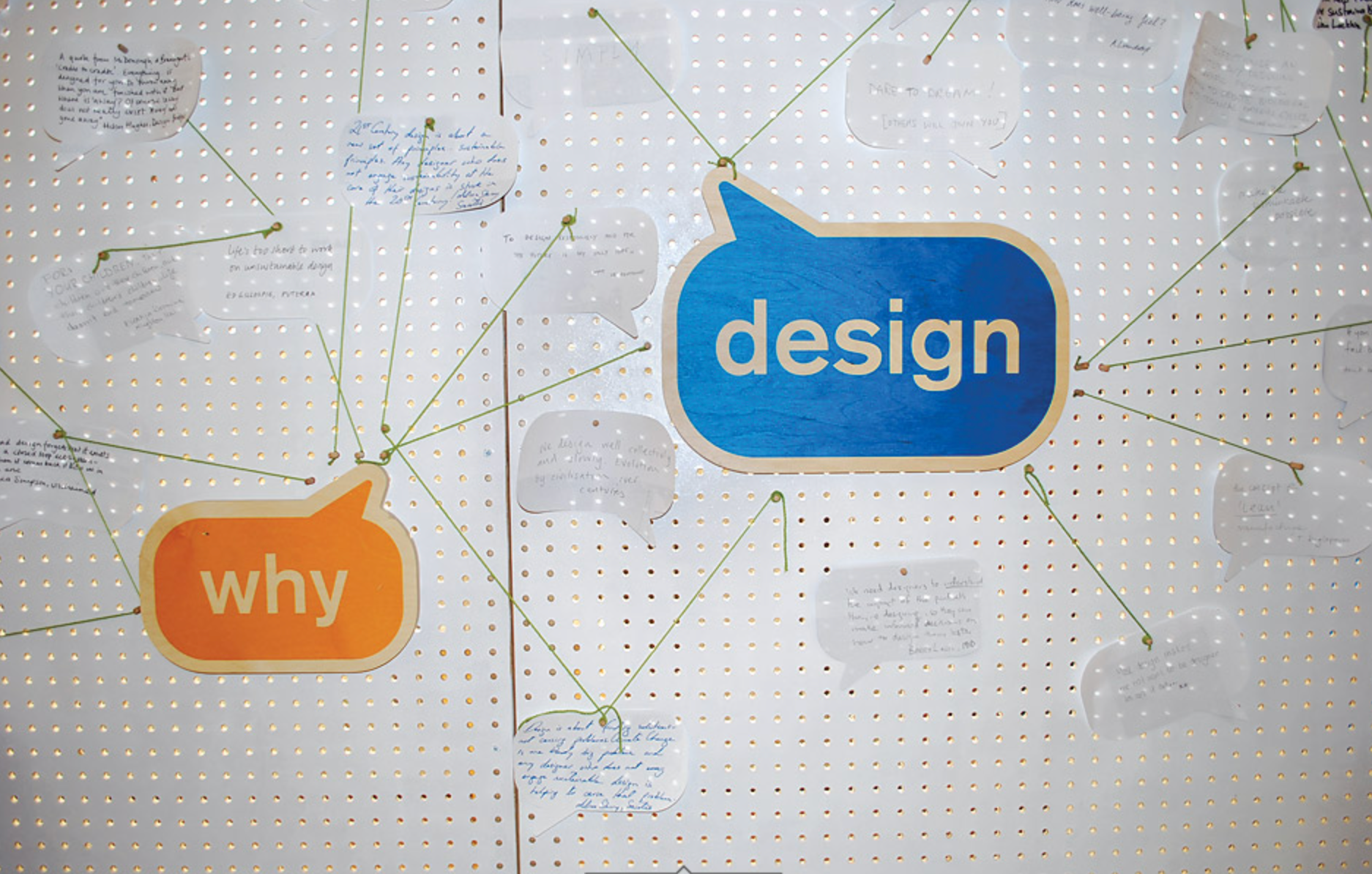
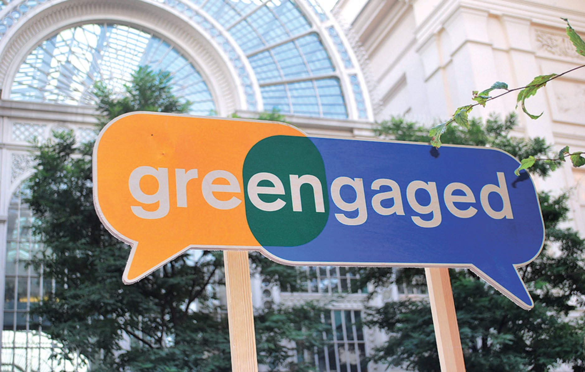
In 2008 the London Design Festival saw the launch of the sustainability design organisation, greengaged – a concept developed and delivered by Sophie Thomas and two other curators from industry and education, Anne Chick and Sarah Johnson.
The first programme consisted of a diverse and comprehensive selection of debates, workshops, master classes and excursions running for a week with an incredibly broad spectrum of over 70 speakers from around the globe
Communication and identity was key when talking to a design heavy audience. The studio developed a simple iconic logo that could become a vehicle to assist dialogue and networking, both key parts of the programme.
The logo is very easy to identify what the concept is all about. I first spotted the campaign by its logo and knew instantly it was an informative of sustainability. The name itself is really affective, combining words 'Green' and 'Engaged' help identify the key issue alongside the logo being in quotation bubbles depicts the idea of having to talk and learn to face these issues.
Think 2008
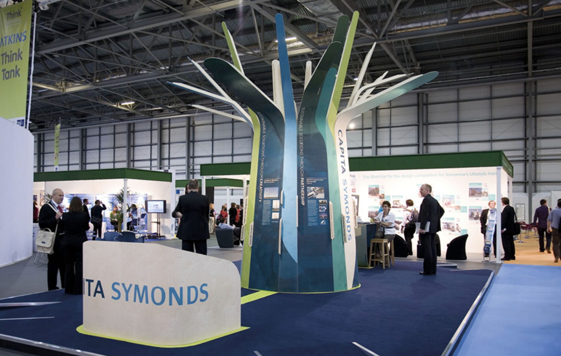
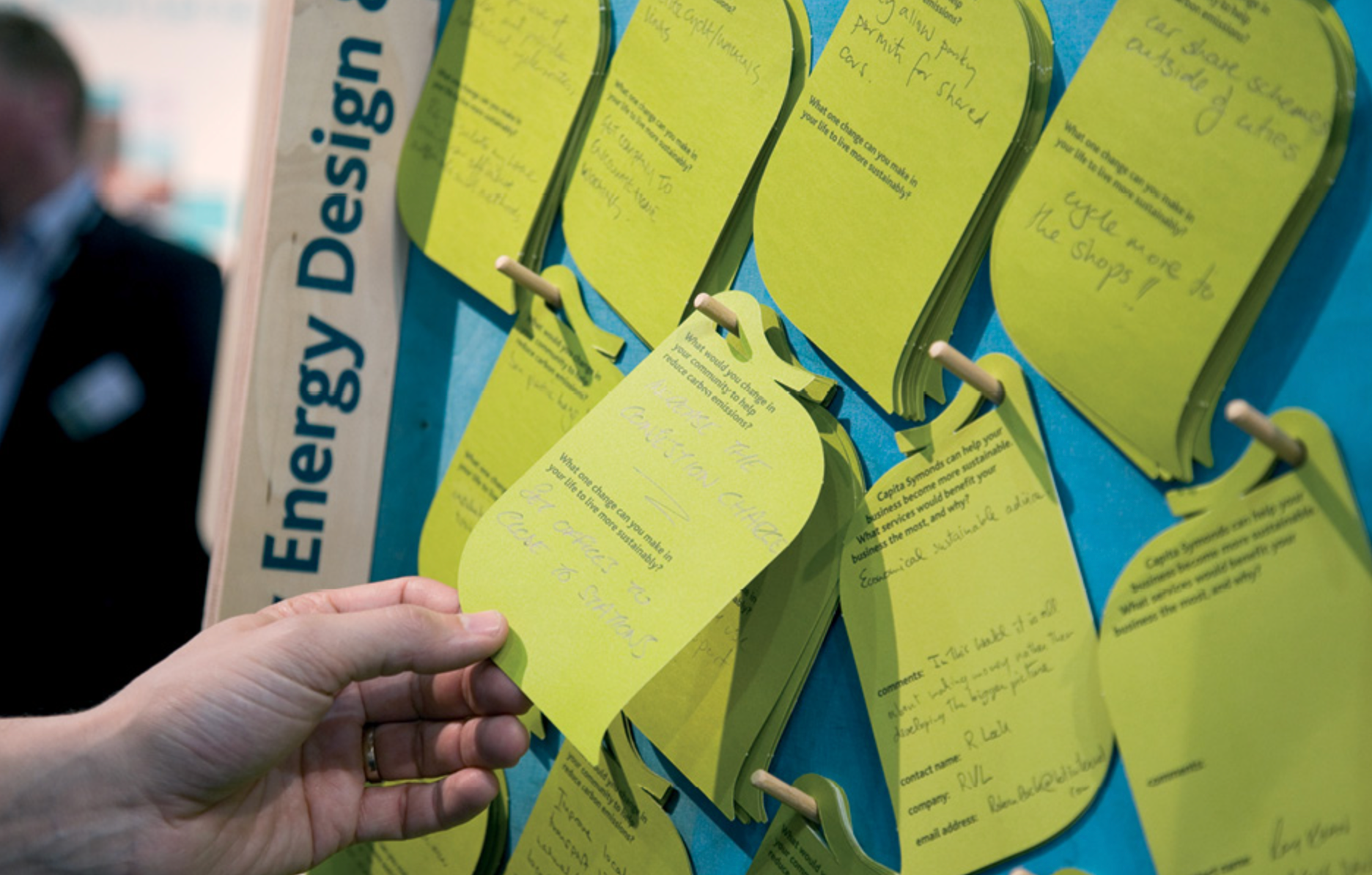
Think 2008 was a sustainable exhibition stand designed for Capita Symonds for a tradeshow focused on the built environment. The tree represented the different organisational branches working together with a shared approach to sustainable design and construction.
The stand was built from FSC certified plywood, direct to surface printing and even included recycled flooring. The small amount of energy used was offset through an appropriate donation to the organisation Trees for Cities, making this a truly carbon positive stand.
The life-size tree is a very good way of depicting their concept without the use of word and information. It catches peoples eyes to then encourages them to get closer and read all about the issues. The design of the tree then supports the issues conveyed on it by being made solely with sustainable materials that aren't harming the trees and supporting the campaign. This is a good idea as alongside educating the audience of the issues, it also shows how easy it can be to eliminate the issues just by changing certain materials.
Task 2- Design A Poster That Encourages Your Peers (Students) To Reduce Their Consumption of Beef
The Brief: Design Cross Media Visuals as Part of a ‘Community Action Pack’ to Support The Promotion of ‘Zero Carbon Britain’ in the UK
Centre of Alternative Technology (CAT) Context & Background
CAT was founded in 1973 on a disused slate quarry in Mid Wales. It has since evolved from a community into a visitor centre and educational charity exploring practical solutions for a sustainable lifestyle. CAT is an educational charity dedicated to researching and communicating positive solutions for environmental change. Visitors are encouraged to explore their many interactive displays which reflect ways in which the world can change and live a sustainable life whilst also depicting the importance of us doing this. Rather than just providing the information, CAT provides practical help, concepts and support on us achieving sustainability. They also have their own Graduate School, alongside short courses in a wide range of topics, providing training in practical skills for sustainable living.
Zero Carbon Britain (ZCB)
CAT produced its first ‘Alternative Energy Strategy for the UK in 1977, as a response to resource depletion and greenhouse gas emissions. From much scientific research, it has become apparent that the issue of climate change is a lot more serious than we had thought. ZCB was created to create the urgency the UK are missing to act upon this issue and quickly. It aims to stimulate debate by showing we have all the tools and technologies needed to rise to the challenge, and that there are ways to overcome political and cultural barriers. Their research shows that we can reduce our greenhouse gas emissions rapidly to zero (Zero Carbon: Rethinking the Future, Centre of Alternative Technology, 2013).
What is Climate Change?
Dictionary Definition: Climate Change [NOUN]
a change in global or regional climate patterns, in particular a change apparent from the mid to late 20th century onwards and attributed largely to the increased levels of atmospheric carbon dioxide produced by the use of fossil fuels.
According to the Met Office, In the 11,000 years before the Industrial Revolution, the average temperature across the world was stable at around 14°C. During the 1800s, people then started to burn fossil fuels such as coal, oil, and gas for fuel to produce energy. However, they also releases greenhouse gases such as carbon dioxide, methane, and nitrous monoxide into the air. Over time, large quantities of these gases have built up in the atmosphere which creates a blanket and traps the heat from the sun and warms up the earth which has consequently caused a changed in the climate.
"Urgent action to stop and reverse the over-exploitation of land resources would buffer the negative impacts of multiple pressures, including climate change, on ecosystems and society" -Climate change and Land, Intergovernmental Panel on Climate Change (IPCC), 2019
The Intergovernmental Panel on Climate Change is the United Nations body for assessing the science related to climate change. It provides regular assessments of the scientific basis of climate change, its impacts and future risks, and options for adaptation and migration. It was created in 1988 by World Meteorological Organization (WMO) and the United Nations Environment Programme (UNEP) with the objective to provide the government with scientific information that they can use to develop climate policies.
Elements & Solutions
Project Drawdown is a world-class research organization that reviews, analyses, and identifies the most viable global climate solutions with the vision and mission to stop global warming with solutions that exist today and as quickly as possible. Project Drawdown was founded in 2014 by environmentalist Paul Hawkento measure and model the most substantive solutions to stop global warming, and to communicate those findings to the world.
According to Project Drawdown, these are a few sectors that contribute to climate change and existing solutions to try to eliminate them.
Electricity Generation
According to Project Drawdown, approximately 40% of the annual greenhouse gas emissions to the atmosphere is due to the power sector, making it the highest emitting sector. There are many solutions, some more popular and well established than others.
Wind turbines : Wind turbines can be both onshore and offshore. Wind turbines use wind to make electricity. Wind turns the propeller-like blades of a turbine around a rotor, which spins a generator, which creates electricity. As it uses wind to create the electricity, once the turbines are running, operational costs are close to zero.
Solar Energy : Installing solar panels onto roofs is a good solution. They harvest the sun's light and make it into electricity and like wind turbines, once they have been fitted, the operational costs are low. They can be installed in remote areas as long as they are in sunlight.
Wave & Tidal : According to RenewableUK.com, the Government estimates that wave & tidal stream energy combined has the potential to deliver around 20 per cent of the UK’s current electricity needs which equates to an installed capacity of around 30 – 50GW
Waste-to-Energy : A waste-to-energy plant converts solid waste into electricity and/or heat - an ecological, cost-effective way of energy recovery. As well as being a renewable energy source, is a vital part of a sustainable waste management chain and is fully complementary to recycling.
Food
The Food Sector includes agricultural production (crops and livestock) as well as food preparation, consumption, and waste. This essential human activity is responsible for a major share of greenhouse gas emissions today. Solutions to reduce carbon footprint caused by the food sector could include:
Eating Locally Sourced Food : Reducing the distance between the point of production and the point of consumption to thus reduce the carbon footprint caused by the transportation.
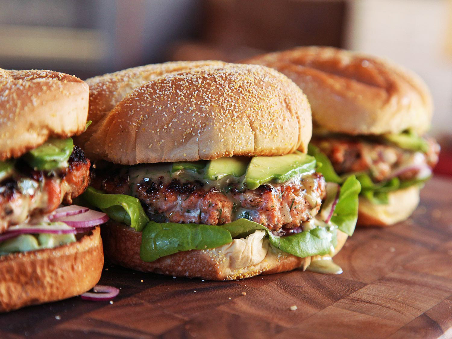
Reduce overconsumption of protein by reducing consumption of animal-based foods : Now a huge variety of plant-based meat substitutes are available which do not emit as much greenhouse gases.
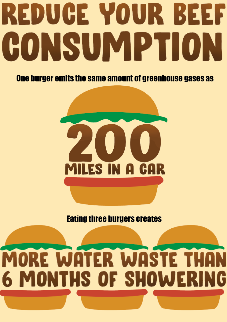
Reduce consumption of beef specifically : not only does the production beef alone have a big impact on our carbon footprint but also the quantity of land needed for the animals to live and graze has an impact.
Transport
According to Project Drawdown, "Transport produces 7 gigatons of carbon dioxide-equivalent greenhouse gas emissions annually, or 23 percent of energy-related emissions, which is around 14 percent of all emissions...". In order for us to achieve a zero carbon footprint we will need to reduce our transport caused emissions, for example;
Cars: Car shares or taking the bus would be a way forward in reducing our carbon footprint.
Planes : Flying is still the best way for us to get to most locations in regards to carbon footprint however we need to reduce how much we fly, stop unnecessary travel.
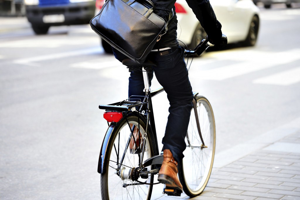
Ride Bikes Or Walking : Best way of travelling in regard to climate change however isn't always possible.
Previous Student Work Analysis
Live Project No. 1: Friends of the Earth - Sustainable Comms Brief
For this brief, I chose to analyse Georgi's work.
A. Having read the 'In a nutshell' summary of the brief that relates to your picture choice, how successfully (or otherwise) do you feel this solution fits the brief? Please explain your answer.
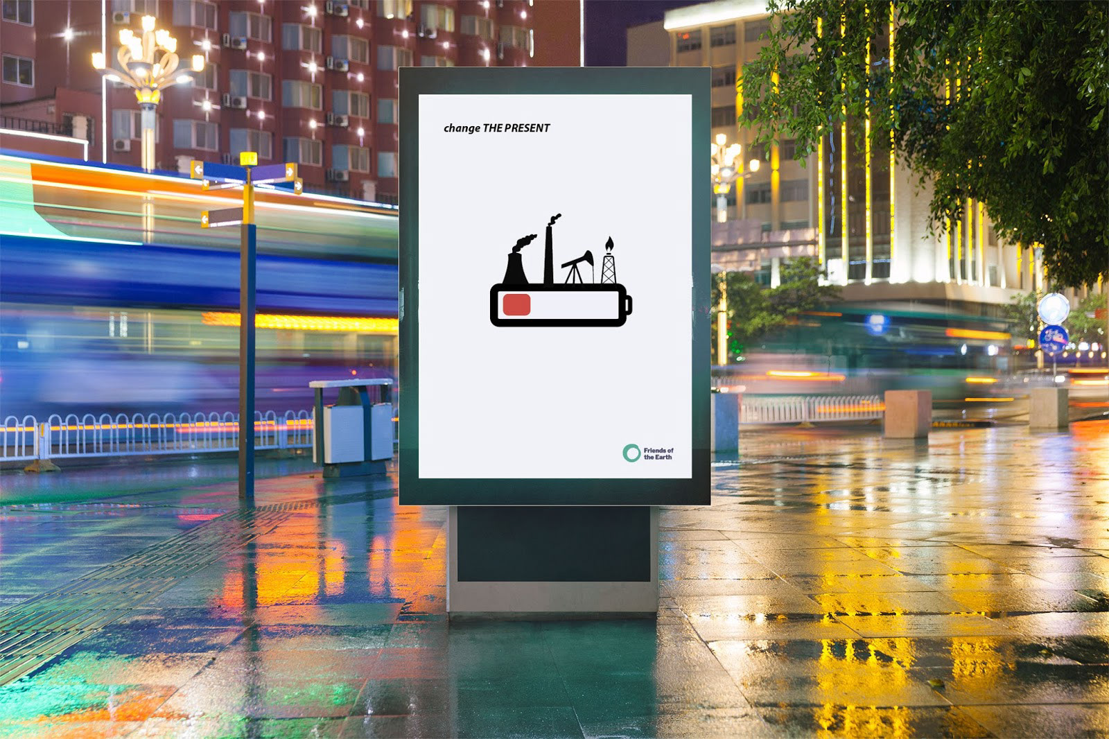
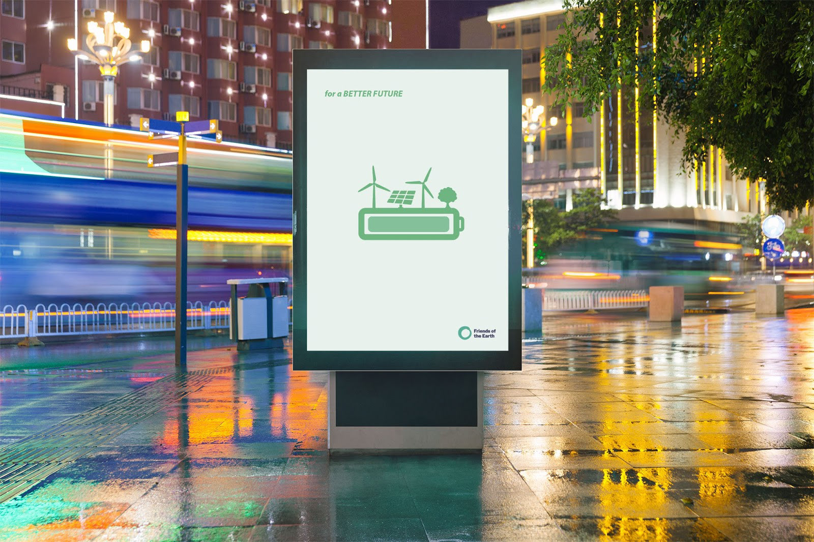
I strongly believe that these posters fit their brief well. They effectively use visual communications, focusing on the imagery and connotations around a battery and how batteries have a lifeline, one of which (the fossil fuel lifestyle) is dying. The clear difference in lifestyles allow the posters to fit the brief of providing 'proactive ideas or phrases to help solve these.'
B. What colourschemes have been used in this solution, why do you think this is? Please explain your answer.
The colour scheme for these posters is fairly simple, using black red and green as the only featured colours. I feel that by doing this, it has kept the simplicity of the posters also creating an impact through the black and red of the one poster, conveying a negative view on fossil fuels then the bright green, happy lifestyle of renewable energy use. The minimalism of colour really helps to make this contrast have a big impact.
C. What visual 'art style' or treatment has been used here (i.e. diagrammatic, pictograms, loose illustrations and/or maybe photographic, vector/flat colour or template mockups maybe)? Do you feel these are appropriate (?) - please explain your answer.
Georgi has used pictograms to fulfil this brief. I think this is effective as this allows the posters to achieve the minimalism whilst still conveying a clear message, using no informative text to support the images.
D. What type styles have been used here? Do you feel these are appropriate (?) - please explain your answer.
There is very minimal text on these posters which allows focus on the pictograms, however each poster does feature one sentence which links both posters together 'Change THE PRESENT', 'For a BETTER FUTURE'. I really like how the sentences make sense on their own, on their own poster but when read together also make sense. Georgi has used capitalisation on 'The present' and 'Better future' to create focus on what each poster is showing however I think that with the simplicity of the posters, the focus using capitalisation is unneeded.
E. Each solution chosen will have a form of corporate ID across the various elements normally. These may be 'given' ID's or colourschemes/refs as part of the brief (or) ones developed as part of the brief by the students. Do you feel these are appropriate (?) - please explain your answer.
I think that the colour scheme used is a common colour scheme used within posters relative to climate change, the earth and renewable energy therefore is appropriate to this brief.
F. Elements on the page or design board.. Some solutions are better as simple but effective solutions, looking at your chosen item do you feel it's 'complexity' of visual elements is appropriate, too complicated or maybe too simplistic? Please explain your answer.
I think that as a world we are struggling to combat climate change due to a majority of people not fully understanding the issue, the critical state we are in and how they can do something to help. By creating this very simple poster concept, it depicts this issue in a simple way people can relate to. We all use batteries and understand that they have a short lifeline, by using this battery as a metaphor of the world, it creates a scare that people need to understand that we now have a lifeline unless we change our way of living. Due to this, I think that the simplicity of the poster was a good way to go and has created a strong poster that I believe would work.
G. Does your chosen element or design board use a mockup or photoshop template to help show it in different scenarios in the real world? These can often help best present visuals and (depending on source used) can either be freely aquired or for a small fee. If 'yes' then please explain how these are used and how effective you feel them to be, if 'no' then do you think using these might improve the overall presentation of the final student work?
Yes, the posters have been presented as a mock up on an electronic street display. This works well for these posters due to their quite simple approach of a poster. It shows how the posters would look in the real world rather than the client having to try to picture this.
H. Improvements. Looking at the work and having a summary of the brief, do you feel that your chosen element or board could be further improved still? If 'yes' then please suggest how this might be. If 'no' then please explain why you think they've supplied the optimum solution(s).
I think that not much time has been spent on the typography element of these posters. Although I think the final outcomes of the posters are effective and work well, the text element could be developed further to create a bigger impact.
Live Project No. 2: Worcester eBike System Information Manuals & Supportive Artifacts
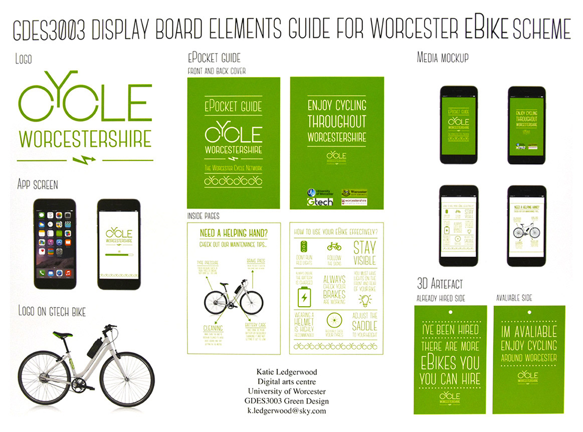
For this brief, I chose to analyse Katie's work.
A. Having read the 'In a nutshell' summary of the brief that relates to your picture choice, how successfully (or otherwise) do you feel this solution fits the brief? Please explain your answer.
Katie has created a strong brand identity and used that to develop all key elements asked for in the brief. Part of the brief however, was to put all elements onto a presentation board to be 'easily reviewed' but I think that she could have presented her work in a more effective way, it feels a bit confusing of what everything is.
B. What colourschemes have been used in this solution, why do you think this is? Please explain your answer.
The colour scheme consists of one colour; Green, which is a common colour choice in themes such as environmental identity which bike riding fits into well due to being a sustainable way of transport, not hurting the environment. However, the decision to use one single colour I do not think is effective. I feel that this then creates confusion of what everything is; the Pocket guide and 3D artefact both just look like posters as they haven't been displayed well to depict what they are.
C. What visual 'art style' or treatment has been used here (i.e. diagrammatic, pictograms, loose illustrations and/or maybe photographic, vector/flat colour or template mockups maybe)? Do you feel these are appropriate (?) - please explain your answer.
The common art style used here would be vector/flat colour which I do not think compliments Katie's work. I feel that this creates confusion on some aspects of her work, creating more mock ups and visual elements may help sell her work.
D. What type styles have been used here? Do you feel these are appropriate (?) - please explain your answer.
The type style is a key factor in Katies brand identity. The brand is very type heavy therefore the typeface chosen for this brief is very expressive. I think the typeface chosen works well and suits the project well. It connects well with the Logo designed.
E. Each solution chosen will have a form of corporate ID across the various elements normally. These may be 'given' ID's or colourschemes/refs as part of the brief (or) ones developed as part of the brief by the students. Do you feel these are appropriate (?) - please explain your answer.
The key elements to create corporate ID here would be the colour choice and the imagery of a bike. They are both strong visuals and work together well to brand a Ebike hire scheme.
F. Elements on the page or design board.. Some solutions are better as simple but effective solutions, looking at your chosen item do you feel it's 'complexity' of visual elements is appropriate, too complicated or maybe too simplistic? Please explain your answer.
I think that the simplicity of the brief works well however more imagery could have been used to break up the type heavy designs.
G. Does your chosen element or design board use a mockup or photoshop template to help show it in different scenarios in the real world? These can often help best present visuals and (depending on source used) can either be freely aquired or for a small fee. If 'yes' then please explain how these are used and how effective you feel them to be, if 'no' then do you think using these might improve the overall presentation of the final student work?
Katie has used mock ups to present some of her designs however hasn't done this for all of her designs which creates a certain amount of confusion of what some designs are. The 3D Artefact and Epocket Guide are both flat designs and both look quite similar and don't depict well what they are. This shows the importance of using mockups when presenting final designs.
H. Improvements. Looking at the work and having a summary of the brief, do you feel that your chosen element or board could be further improved still? If 'yes' then please suggest how this might be. If 'no' then please explain why you think they've supplied the optimum solution(s).
I think that there is a strong brand identity throughout this brief however the key element that needs to be improved is the final presentation of her work and using more visual elements.
Poster Research


Colour Palette Research
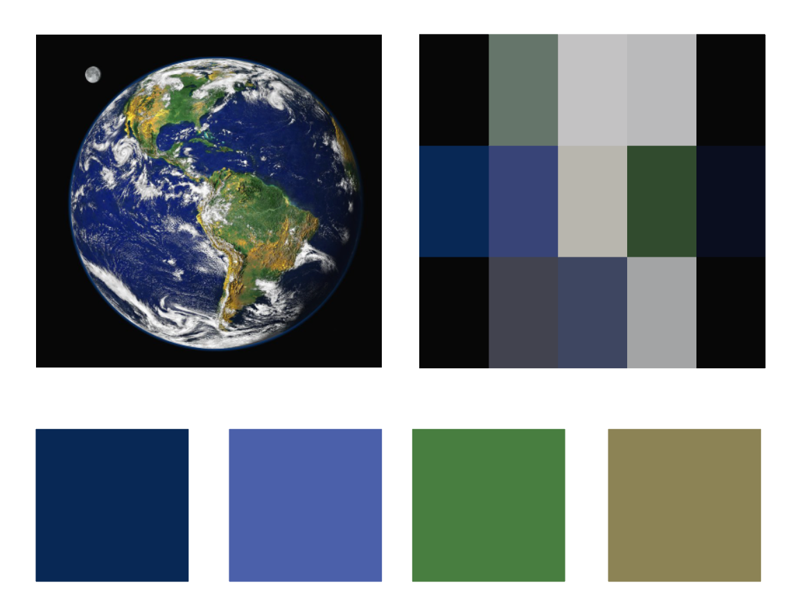
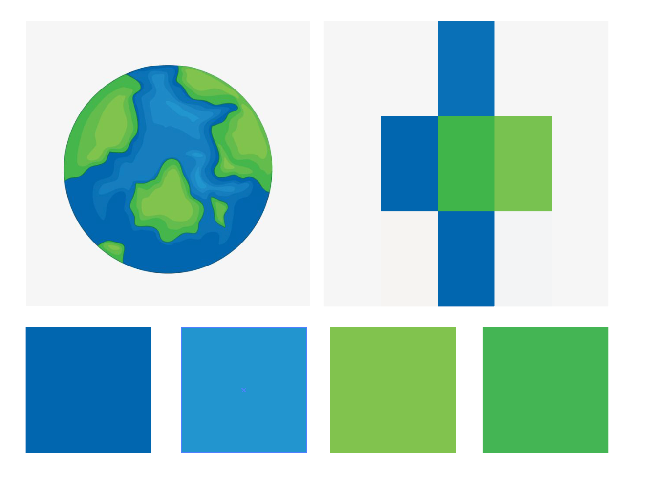
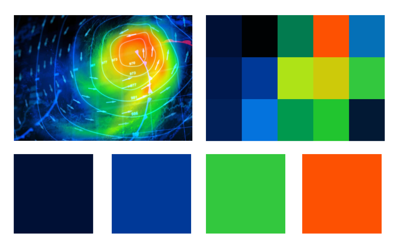
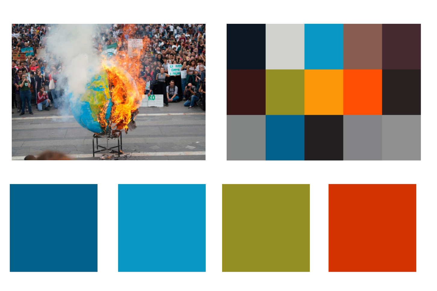
I have found that most existing posters use a green, blue and red colour palette, the blue and green resembling the earth and red connoting danger.
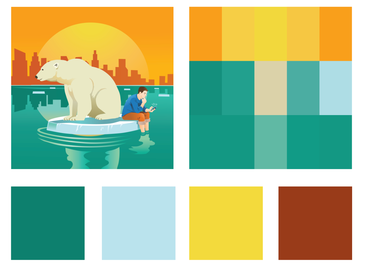
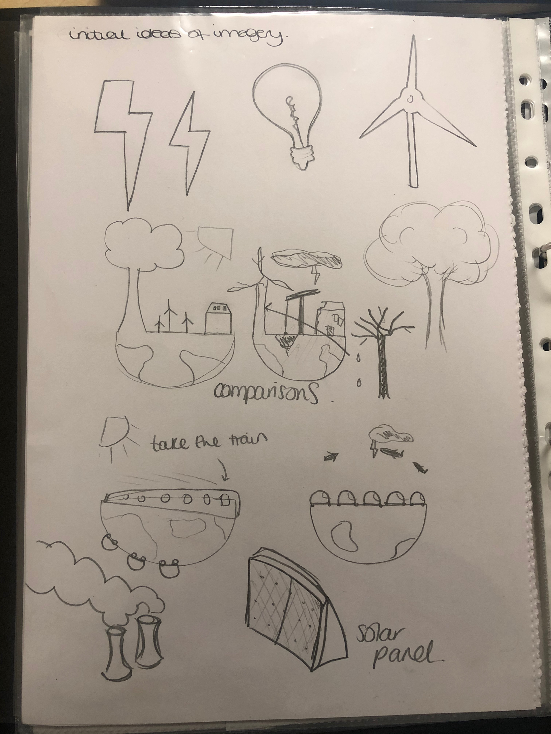
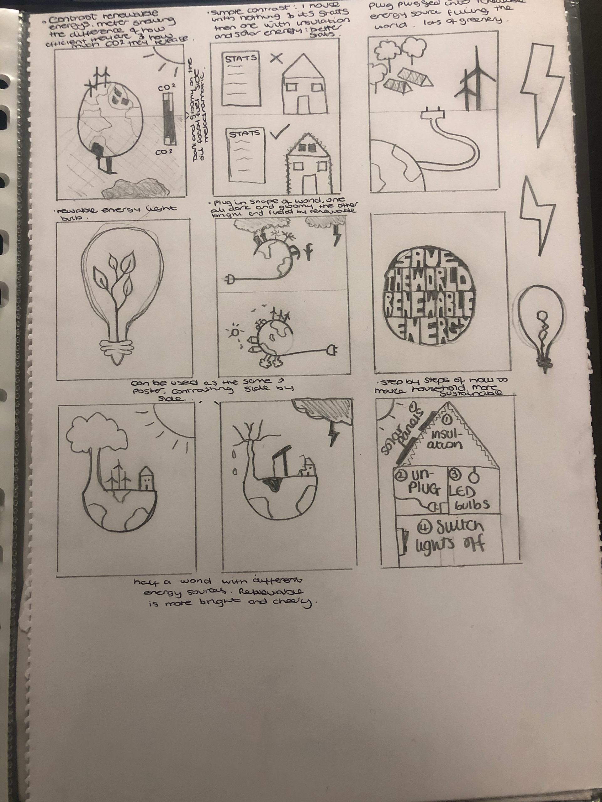
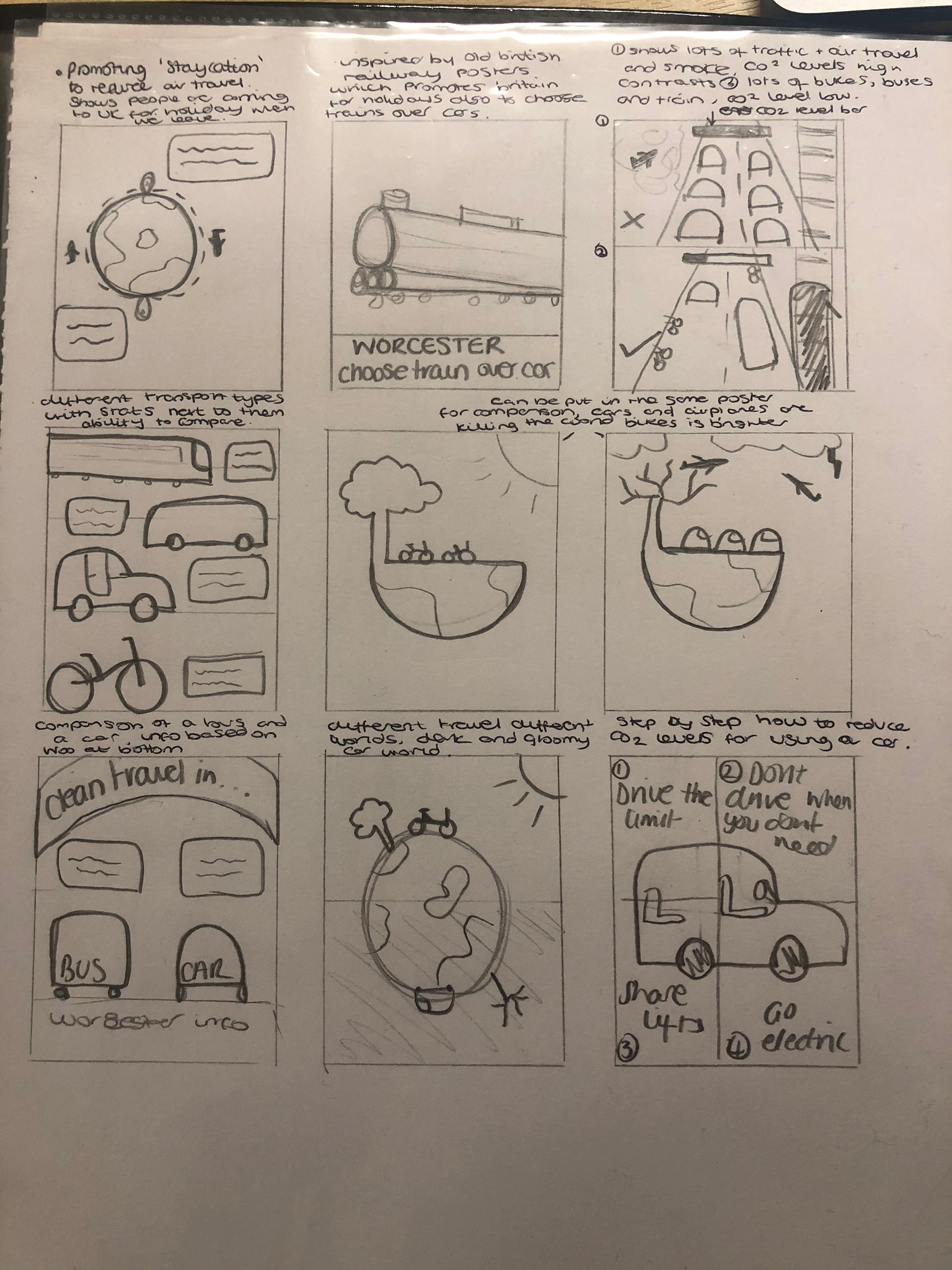
POSTER INITIAL CONCEPTS
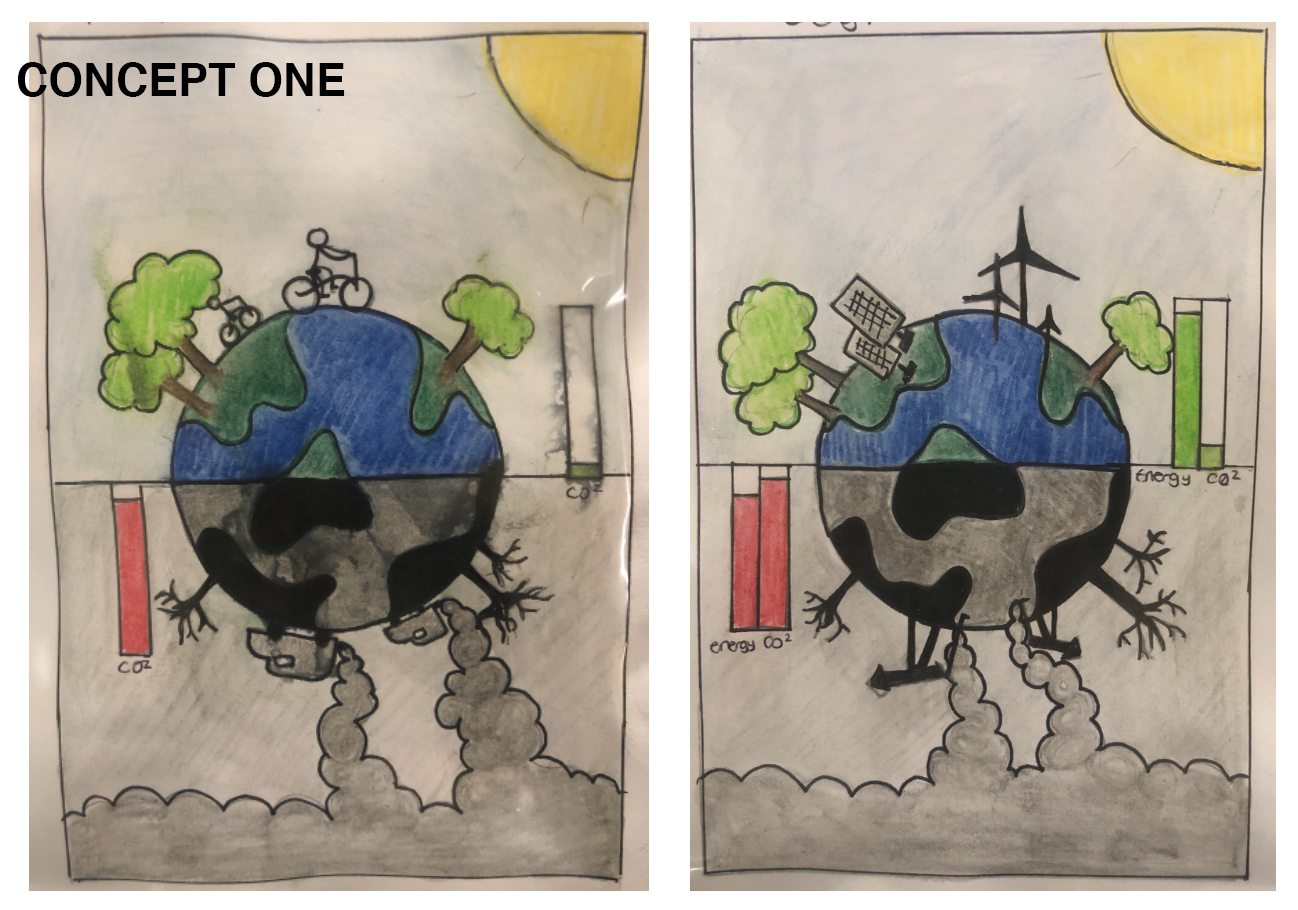
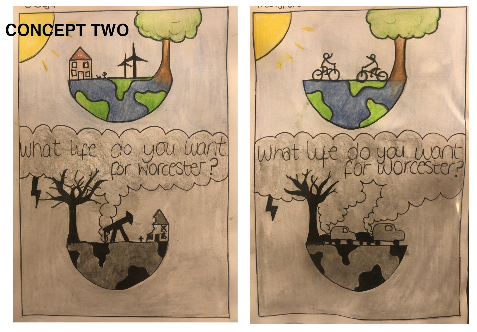
Developed concepts
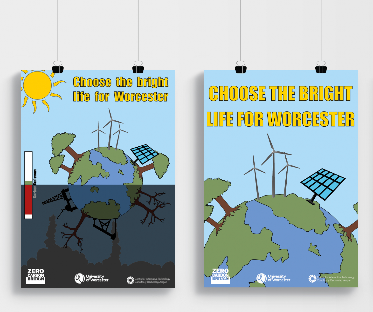
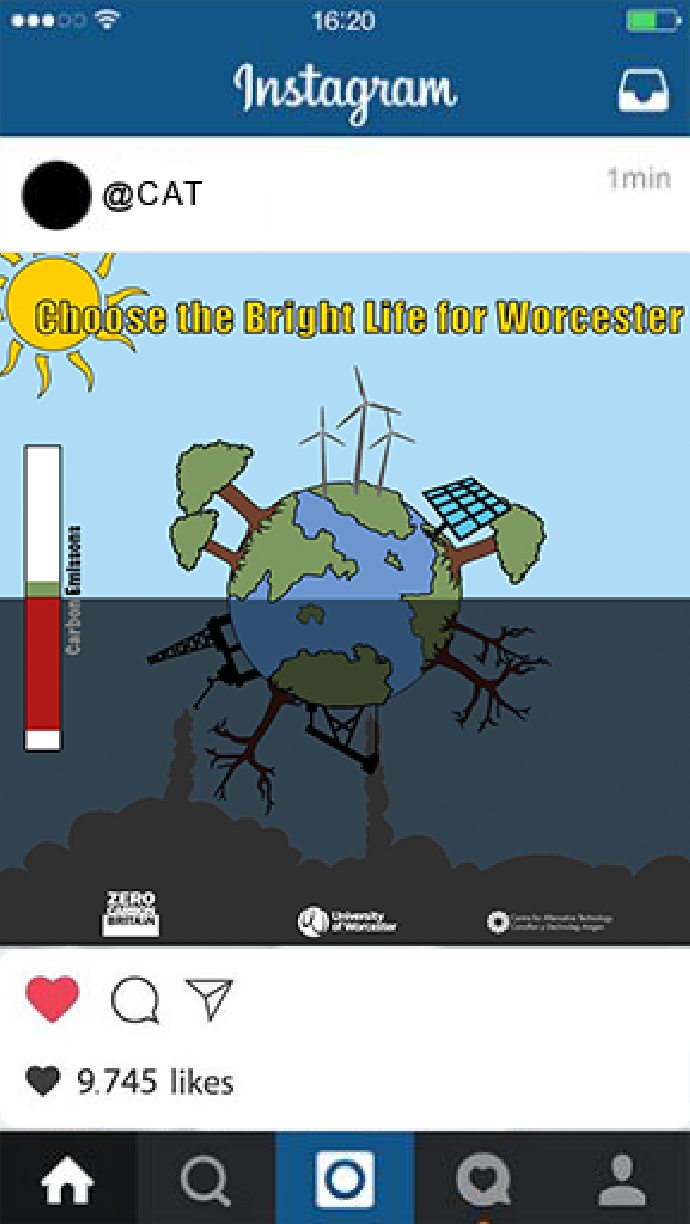
After designing some initial concepts, I developed two by adding colour and more in-depth illustrations to depict how the poster would look when finally created so that I could see which poster people preferred.
User Testing
I created a survey to find out which concept people preferred and to receive constructive feedback on how I can improve them.
Which of the two sets of images do you think conveys the message better? why?
Respondent 1: "I like the one with the whole earth as its more relatable as the actual earth but it needs some text."
Respondent 4: "concept one. It just feels like it gives a more 'full' picture of it. And it does not ''split'' the world it kinda shows that it is possible to be better in the same world we just need to change"
Respondent 6: "Concept one because it highlights the fumes and how cars are affecting our world. And how climate change is becoming more serious than people may realise."
Do you think these images fulfil their purpose of inspiring better futures by improving our sustainability? If yes, how. If no, why?
Respondent 1: "Yes because it shows a dramatic side of the earth if we dont change how we are."
Respondent 2: "Yes, it’s planting a seed and making a statement of the seriousness of the climate crisis."
Respondent 3: "Yes, you can tell that they are trying to show the negative impact of society. "
Is there anything you would change about these prototypes?
Respondent 1: "more text or a header."
Respondent 3: "Maybe make it a little realistic"
Digital Concepts
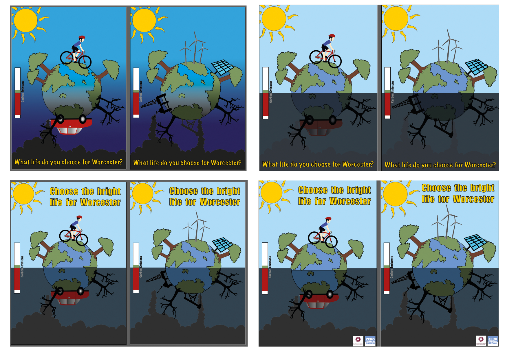
Experimenting with gradients, depth & opacity, placement of text and logos to find the best poster design for this brief.
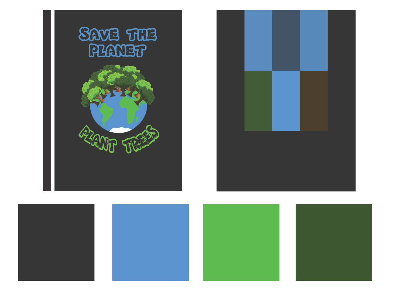
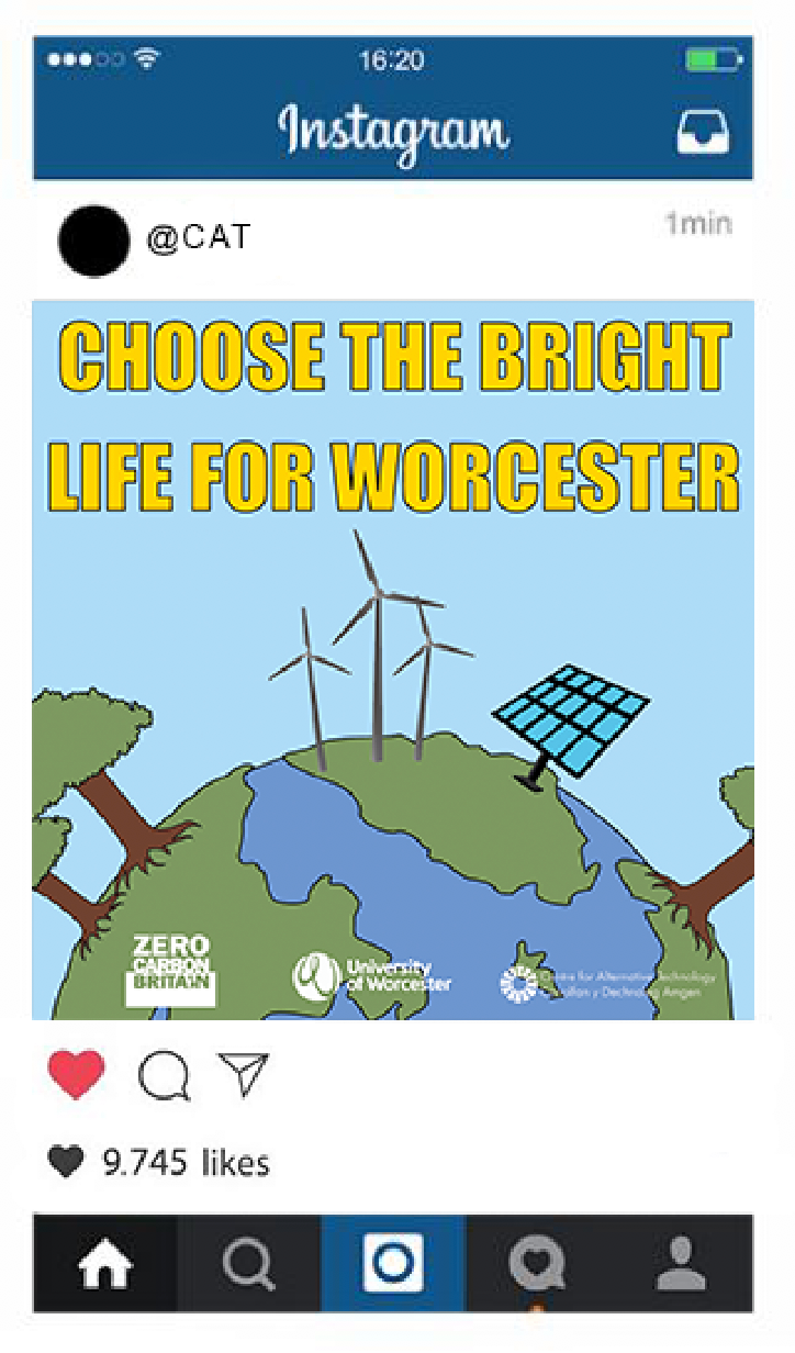
Chosen Designs


Final User Testing
As part of our final lecture, we had a peer review where my peers gave me feedback on my work and how I can improve on them so I can develop them to their best standards. My main feedback were:
- Experiment with text placement
-Make the two posters more different as they are very similar.
-illustrations could be smaller
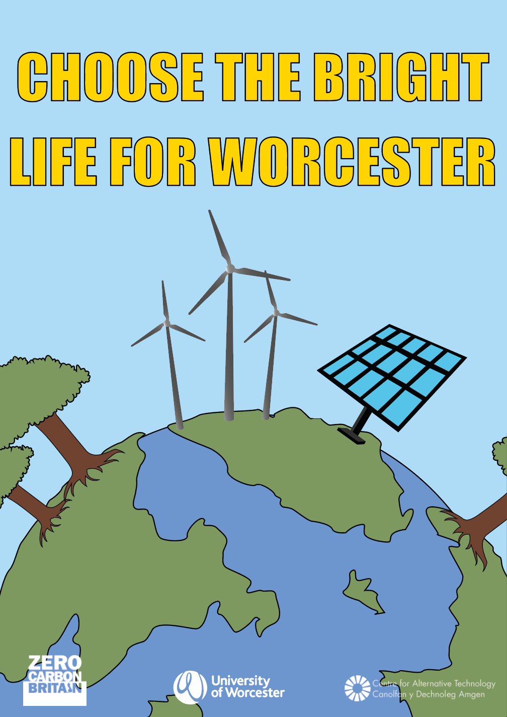
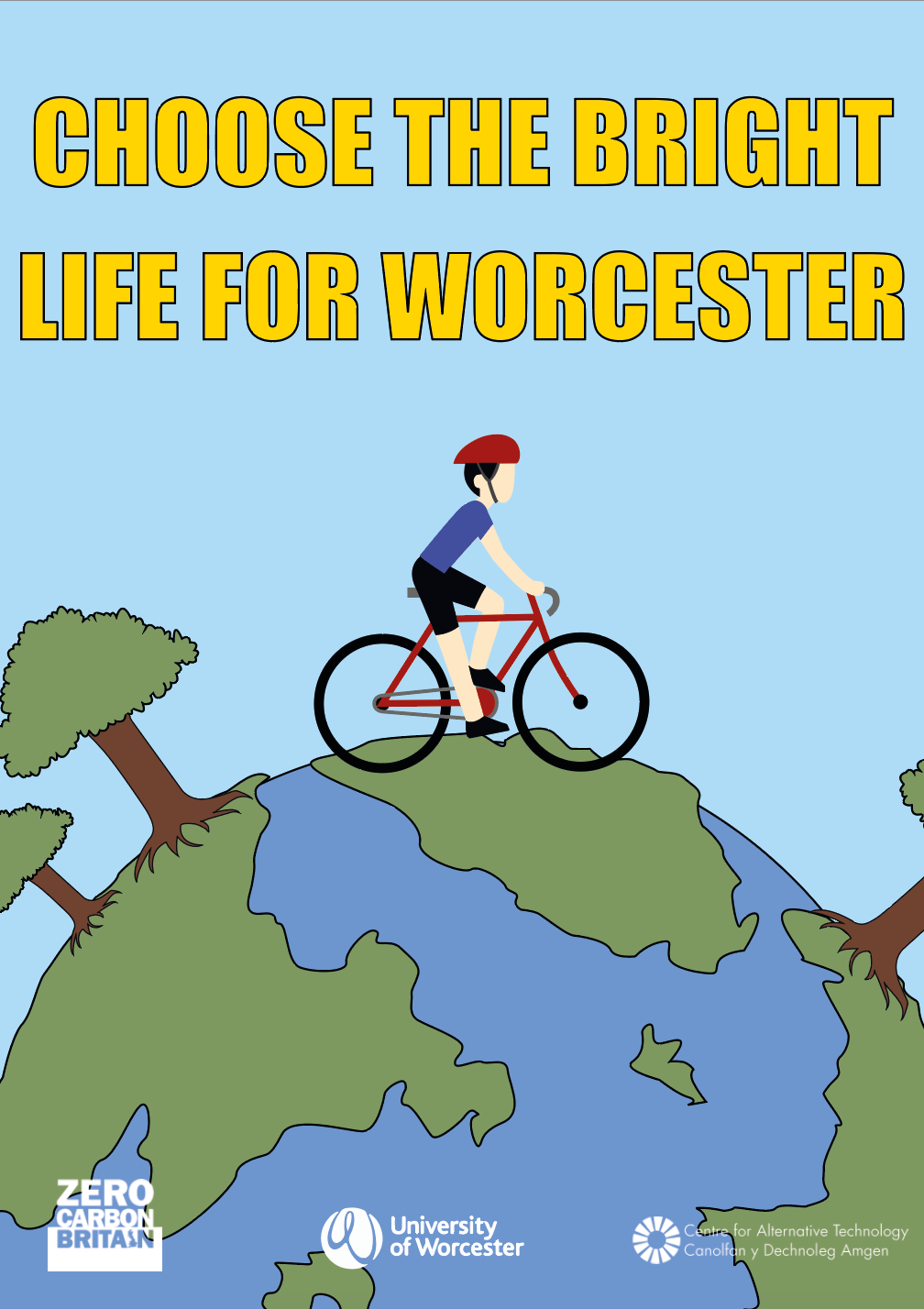
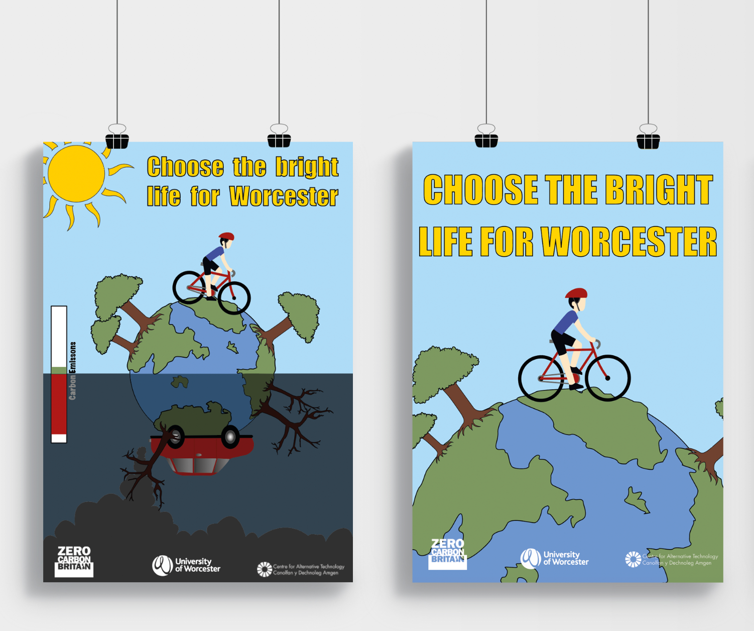
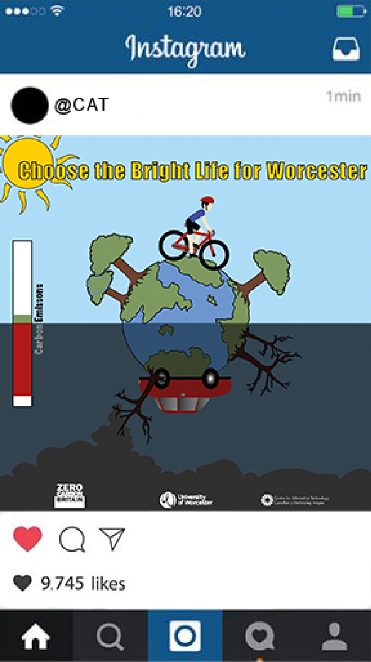
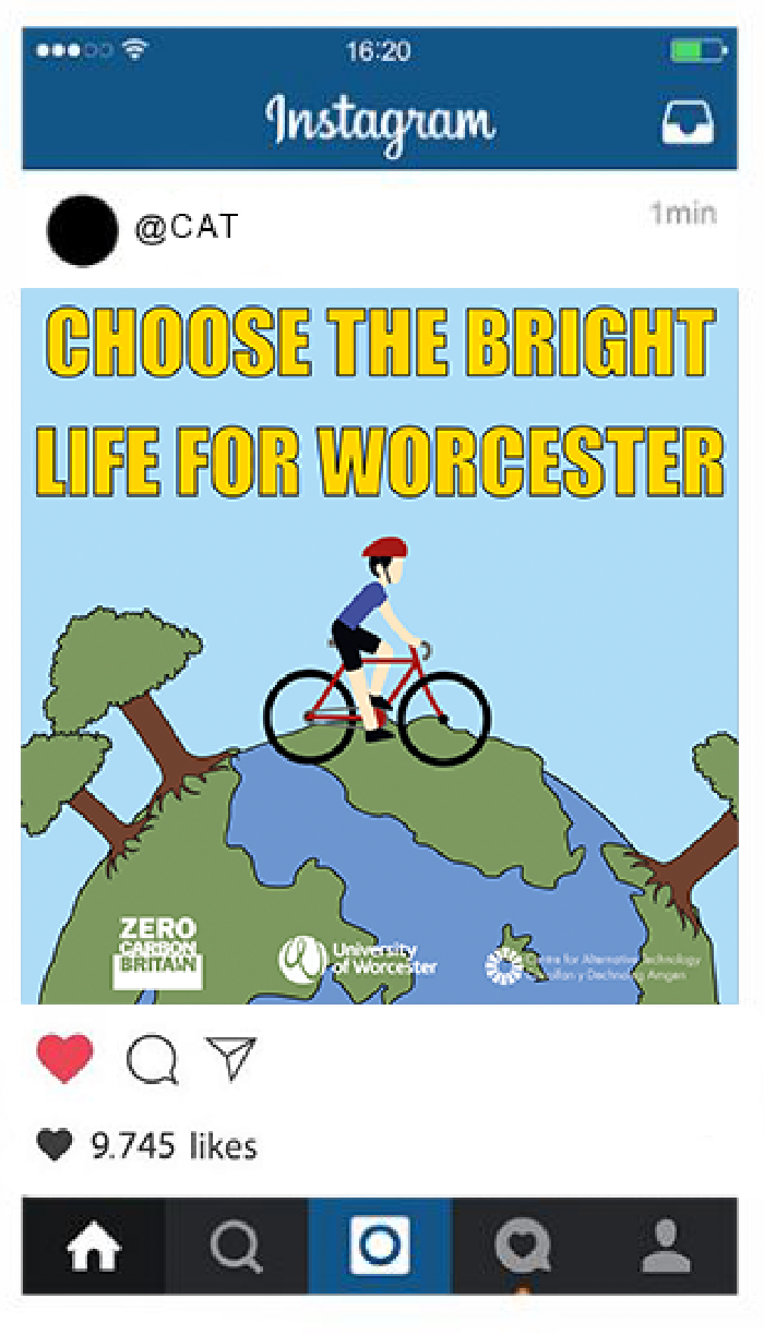
Final Designs
After receiving my final feedback from my peers I made the final touches to my designs.
As I was recommended to make a bigger difference in the two posters, I decided to create a new, similar poster with a bigger illustration of the earth. I decided to do this as I didn't want to get rid of one of the original designs as I personally felt they were effective thus I designed two new posters to go along with them. I also lightened the bottom section and made the illustrations a darker shade of colour instead to make the bottom half easier to see.
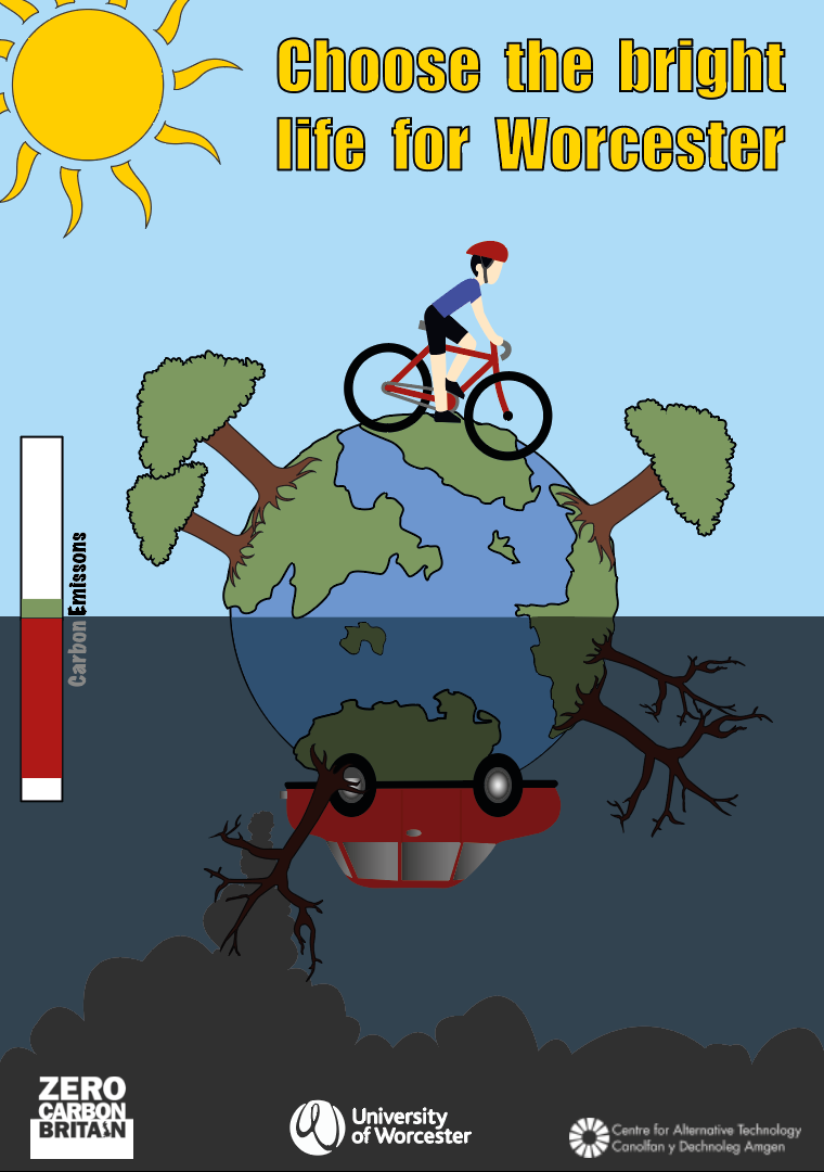
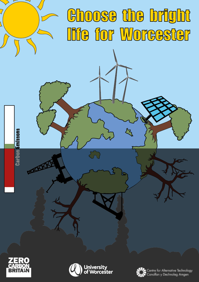
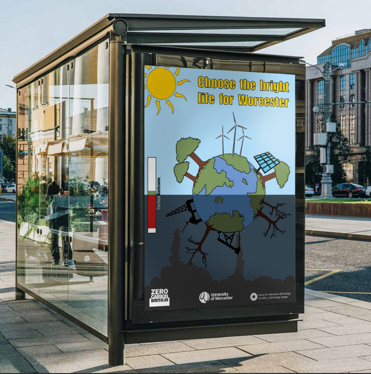
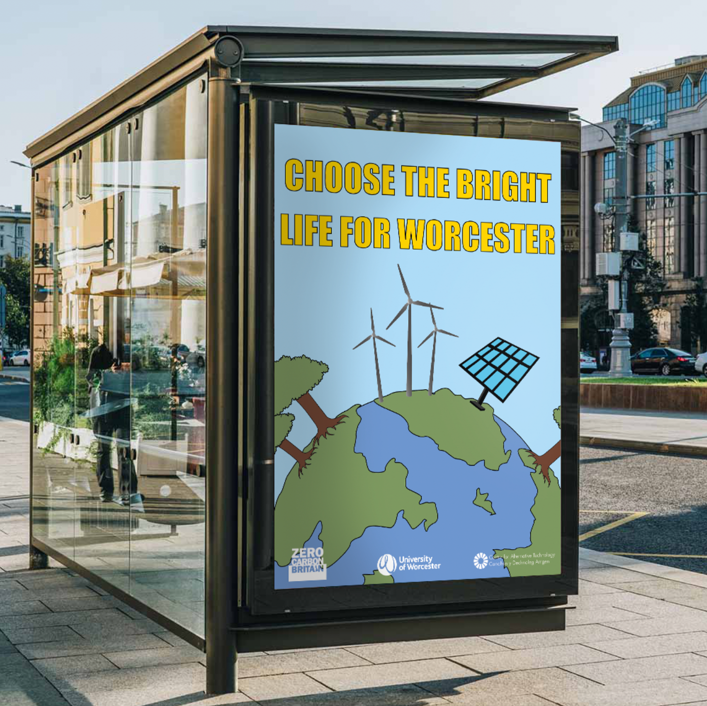
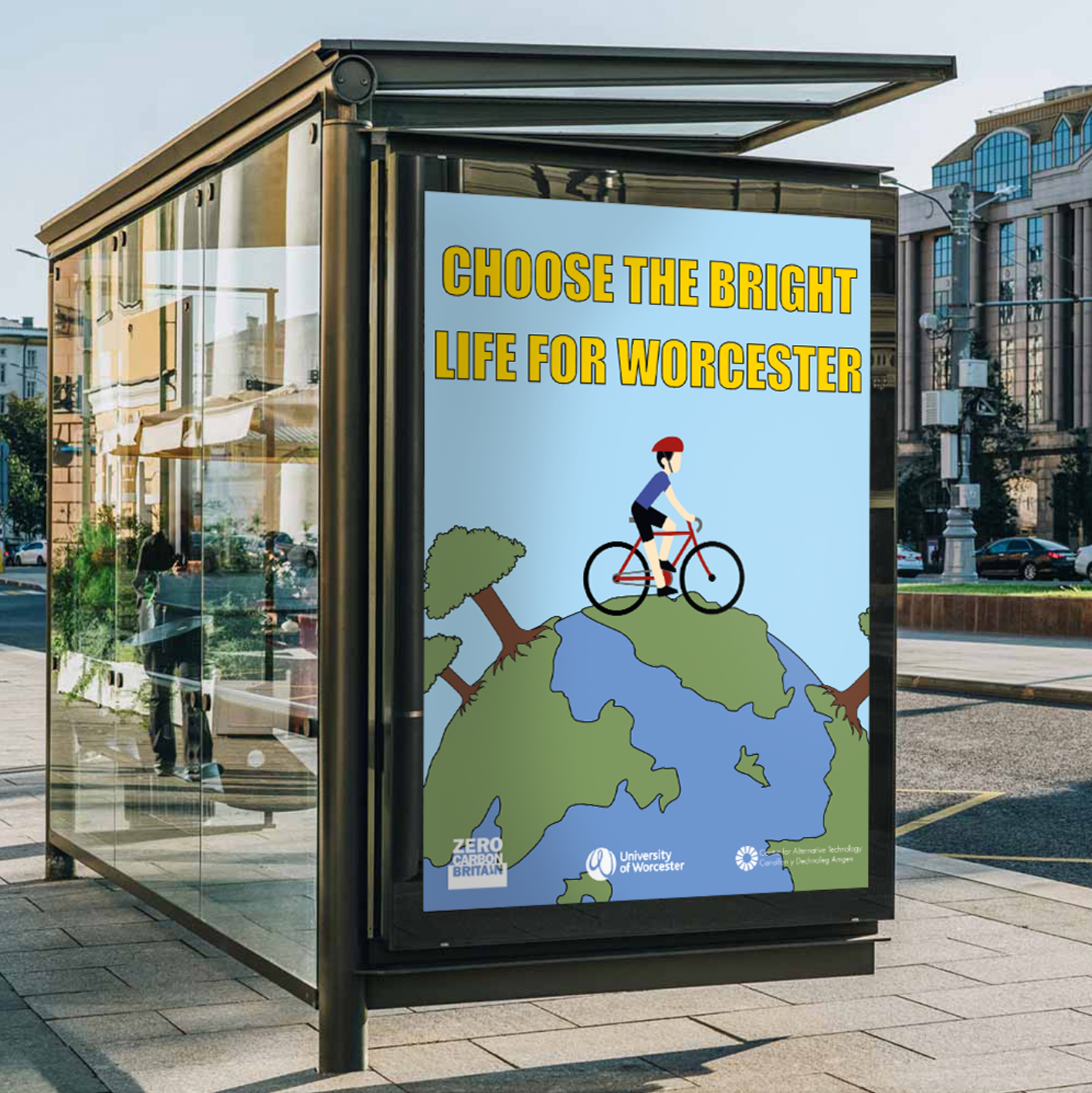
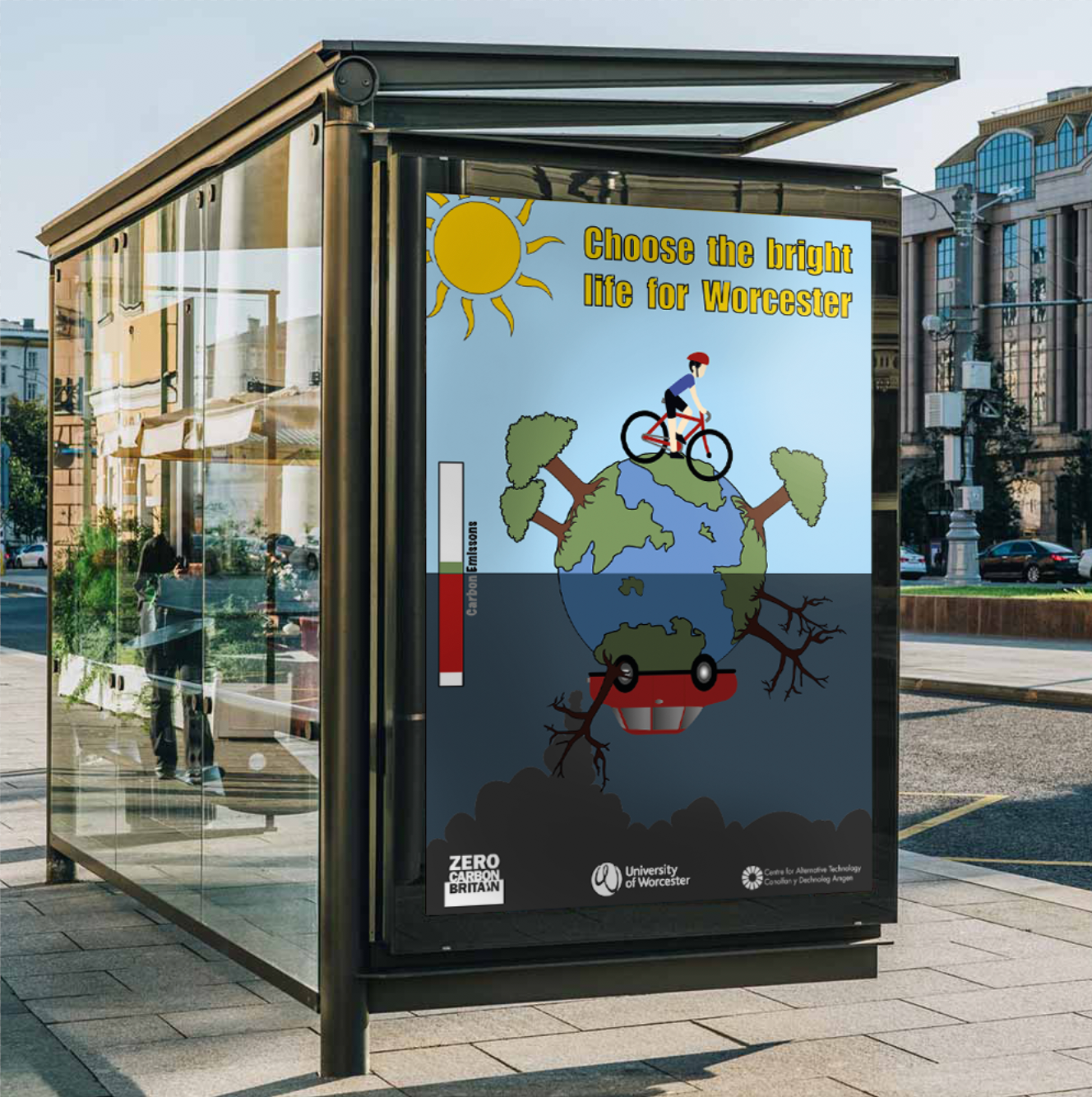
Mock Ups
bibliography/references
https://www.drawdown.org
https://www.metoffice.gov.uk
https://www.ipcc.ch
http://foodsystemprimer.org
https://www.californiabicyclesafety.com/stop-using-5-excuses-not-ride-bike-work/
https://wriorg.s3.amazonaws.com/s3fs-public/Shifting_Diets_for_a_Sustainable_Food_Future_1.pdf
https://www.transport.gov.scot/our-approach/environment/climate-change/
Jane E. Miller., Preparing and Presenting Effective Research Posters., Health Research Service, June 2016.