Final Website designs
The Brief
The University of Worcester Communications department has asked you to design a website for the new Art House, which will work both locally and internationally to showcase current exhibitions and upcoming events.
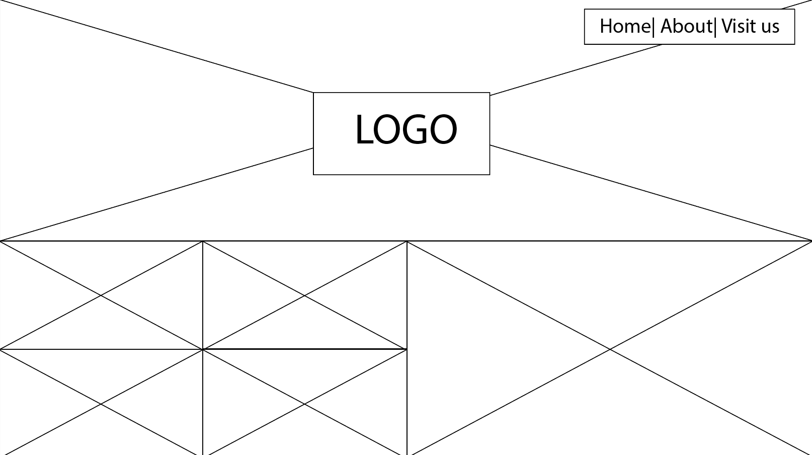
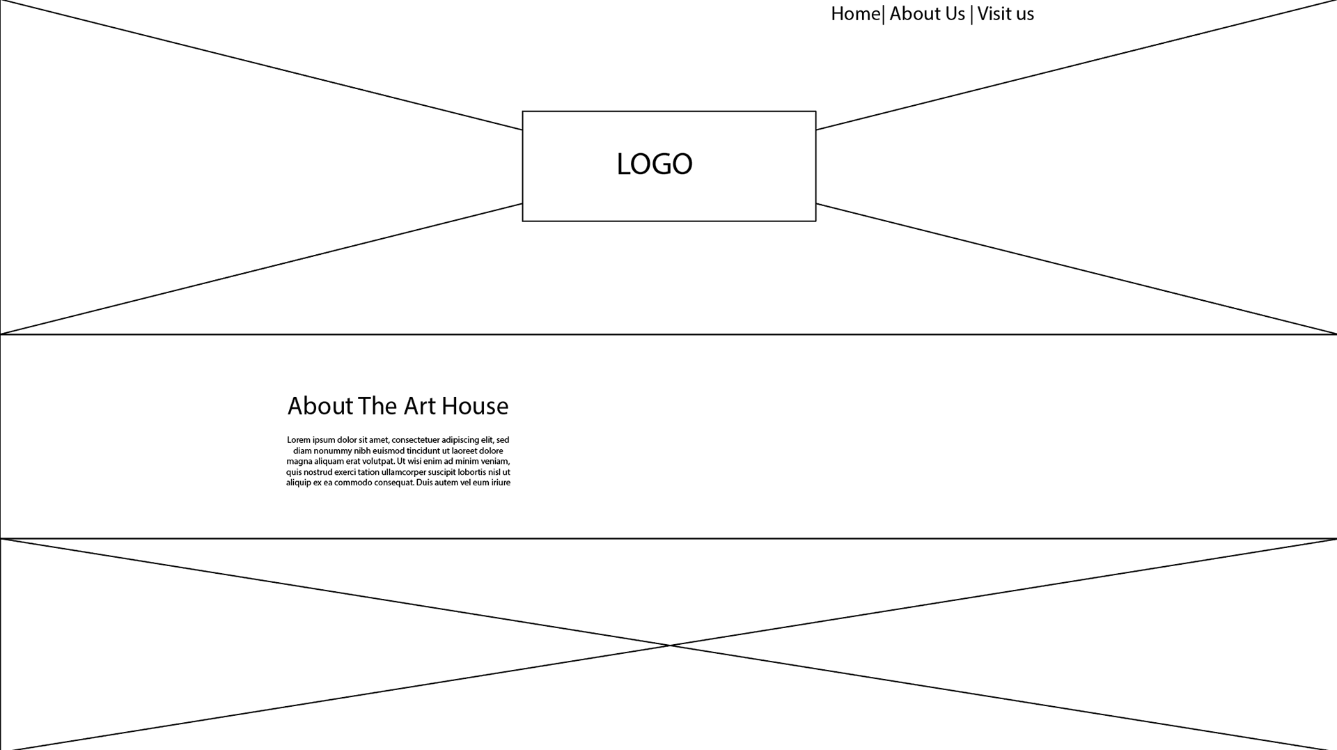
Working individually at first, then in teams, develop concepts and build a meaningful relationship with the client. Deliver complete designs for all key pages and understand how you would brief a developer to bring your ideas to life.
Although the brief is primarily website focused, you should also consider identity, literature & promotional items in your teams.
The Art House
The Art House is a new building in Worcester, as part of the University of Worcester. As well as a place for art students to produce work, it is also used as a gallery to showcase to beautiful work of the university students.
To initiate this brief, we met with our clients in the art house to allow us to see inside the building and be able to see what has been done with it and what style is has taken as well as talk to the clients about what their visions are for the designs the website.
One question we asked our clients was .
They followed with key points such as but also .
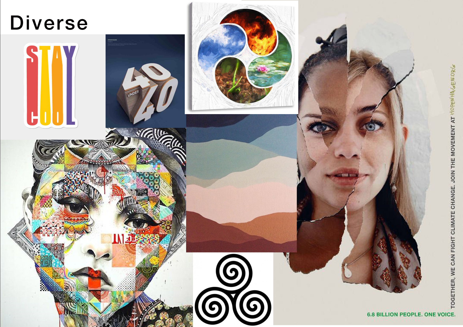
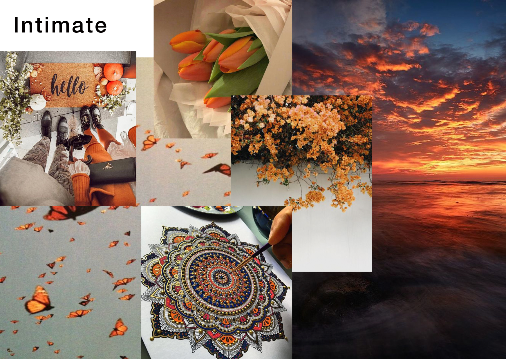
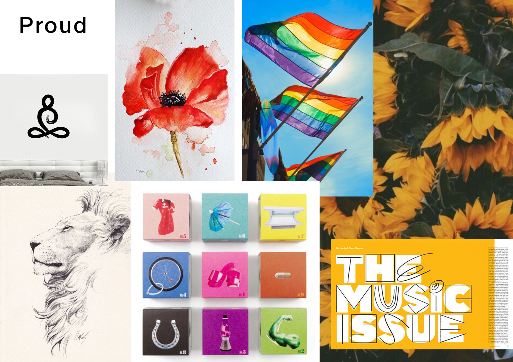
They want the Art House to be a place people come to see their artwork and showcases and encourage people that aren't part of the university to come and visit and feel welcomed whilst keeping the and sentiment. In regards to their looks, they used the words and whilst depicting the playful vibe that typically comes with art and its freedom.
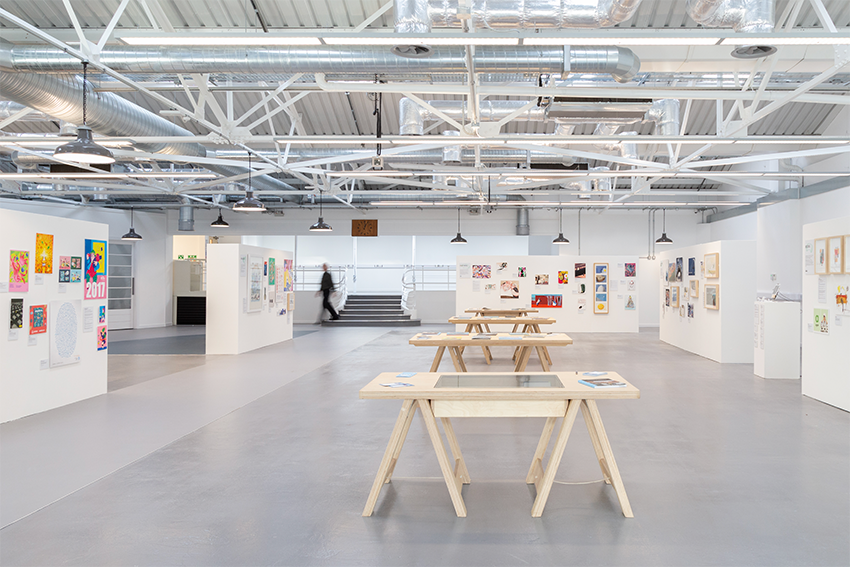


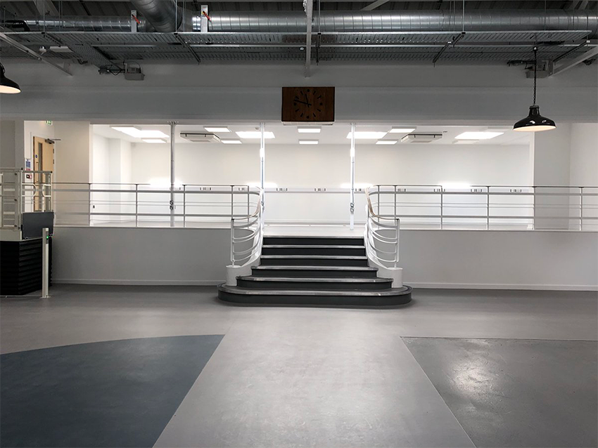

Moodboards


Inspiring Galleries
The V&A
The V&A is the world's leading museum of Art & Design, housing a permanent collection of over 2.3 million objects that span over 5,000 years of human creativity. It holds many UK national collections and some of the greatest resources for the study of architecture, furniture, fashion, textiles, photography, sculpture, painting, jewellery, glass, ceramics, book arts, Asian art and design, theatre and performance.
It's Website
The V&A website is very photography heavy. A different photo is used on each page, usually relevant to the information on the page. I find by doing this, it encourages people to read more and be interested in the project advertised. The image used on the home page is bold and full of vibrant colours which really catches peoples attentions straight away and encourage people to stay on the website and explore more. You scroll through information on the page which is displayed on grey, slightly transparent containers whilst the image in the background remains stationary, the boxes revealing different parts of the image as you scroll up and down. The separation of the background and foreground by one being stationary and the other mobile is a very effective way of creating emphasis on both sections.
Whilst the width remains the same, allowing a flow and creating a visual container, the translucent text boxes vary in height and sometimes even shape. The 'Sign up' element on the home page incorporates their logo by removing it from the container letting the background be seen.