The Brief
Create an Identity for University of Worcester's Sports Therapy Department & create promotional materials for their Injury & Massage Clinics.
Identity of the Sports Therapy Clinics need to relate to University of Worcester.
Materials Required:
-Posters, Leaflets
-Price List
-Additional Marketing materials; Business Cards, Digital Designs for Screens, Materials suitable for Social Media.
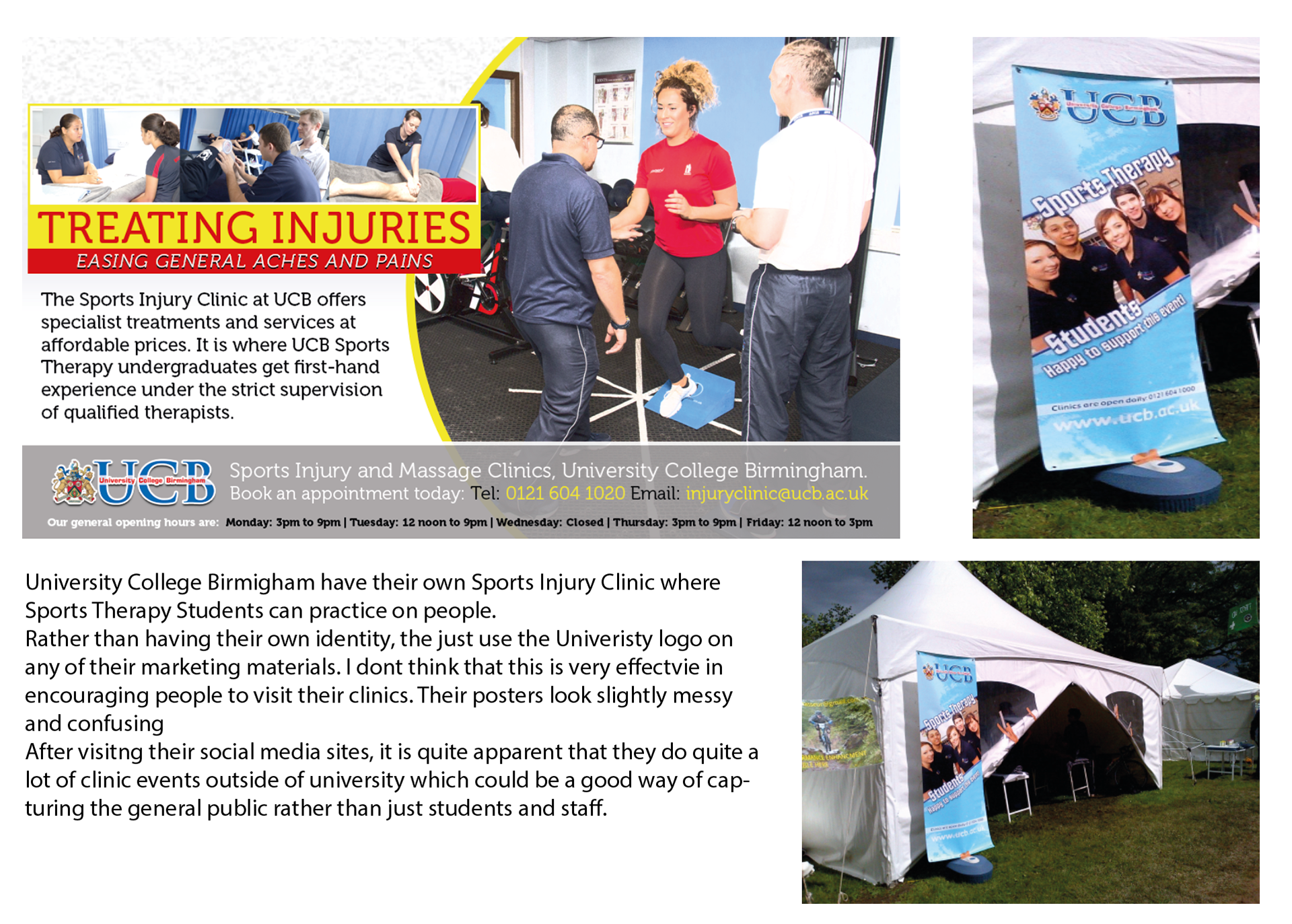
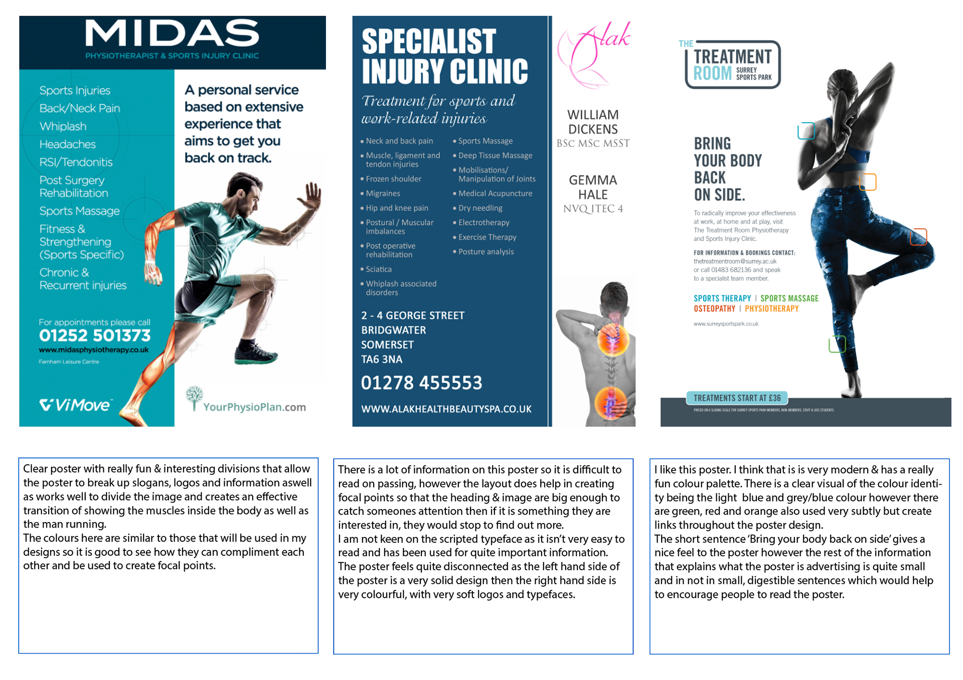
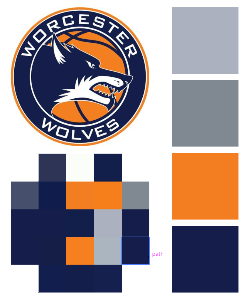
Existing Sport Therapy Clinics
Staffordshire University Sports Therapy Clinc
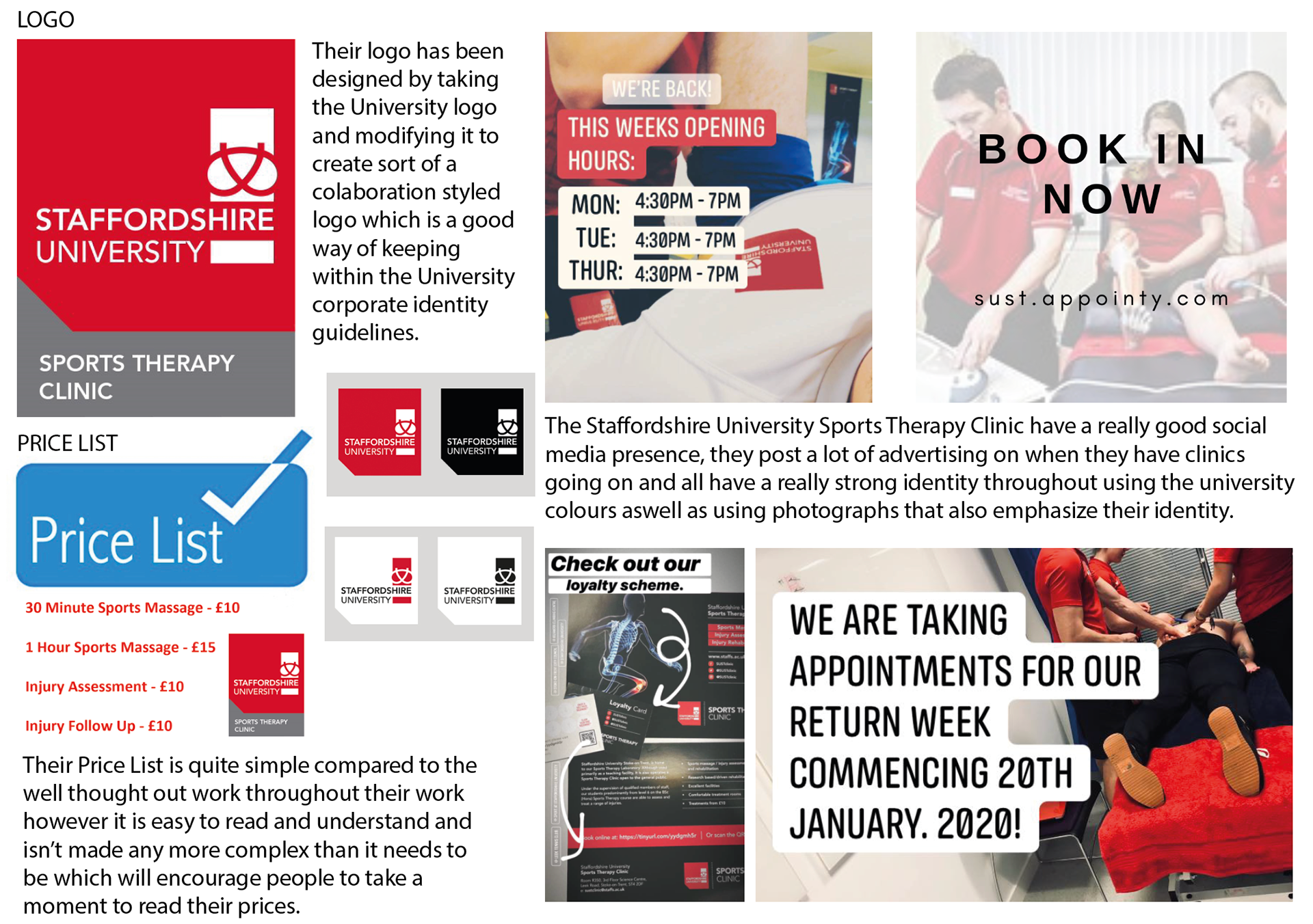
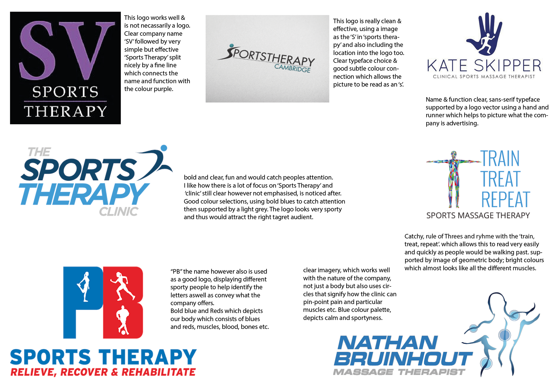
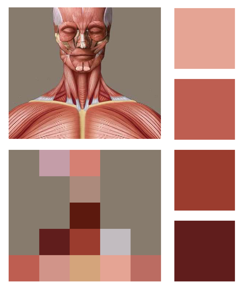
Logo & Identity Analysis
Leaflet Analysis
Target Audience
After a Meeting with Zac, from the Sports Therapy Department, we were able to find out the current Target Audience as well as his future aspirations on who he wants the clinics to appeal to.
-Students : 18-25 Year Olds (Estimated Average)
As the clinics take place and are a part of the University, Students are a easy target audience to reach. The department are able to put posters and leaflets around the University, offering cheaper services to the students which encourage students to visit.
-Staff : 30-50 Year Olds (Estimated Average)
As well as appealing to students with their cheap prices & easy ability to use the university as a good opportunity to market their clinics, Staff are also constantly around the campuses which makes them an easy audience to target.
- Active People
People who live an active lifestyle already, will know the importance of regular use of Sport Therapy clinics. People who may be part of an active club would be encouraged to visit clinics, thus targeting sport clubs would be beneficial as the university clinics could be recommended by people higher up in the club to attract more than just individuals.
- Over 50's
Zac had mentioned in our meeting that a lot of the current customers are of the older age range. People from clubs such as 'Walking Football' & 'Walking Netball' tend to use the clinics to their advantage. The older generation are potentially more prone to injury than the younger audience so would be a good audience to target & reinforce that these clinics are open to the public through the use of marketing materials.
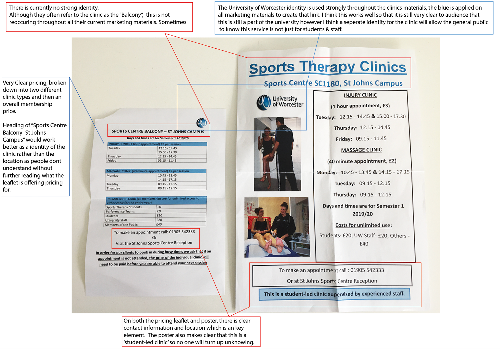
Current Marketing Materials
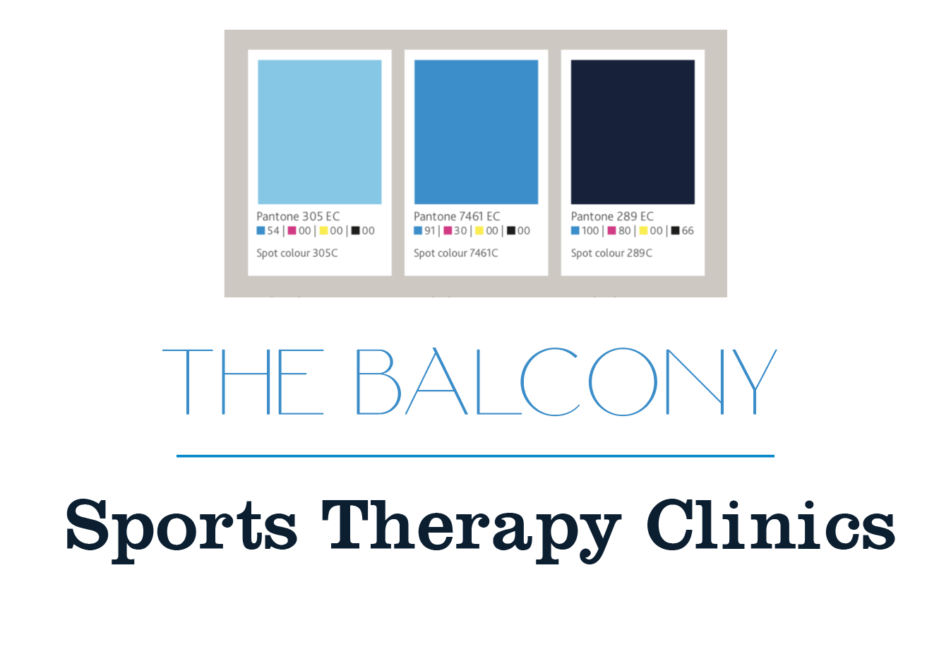
University Colour Palette
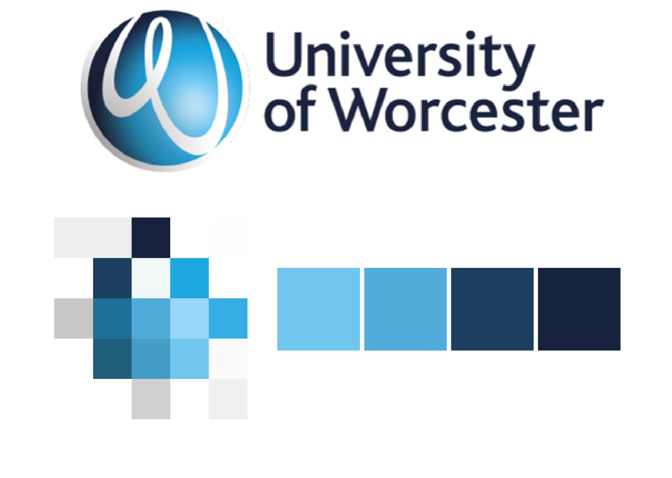
I think that it is important to keep within the University colours as it is still a part of what the University is offering, however a bold, different colour might work well in supporting the Sports Therapy clinics as their own identity too.
Alternative Colour Palettes
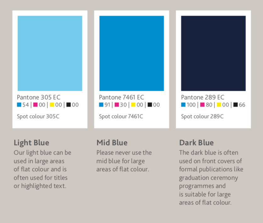
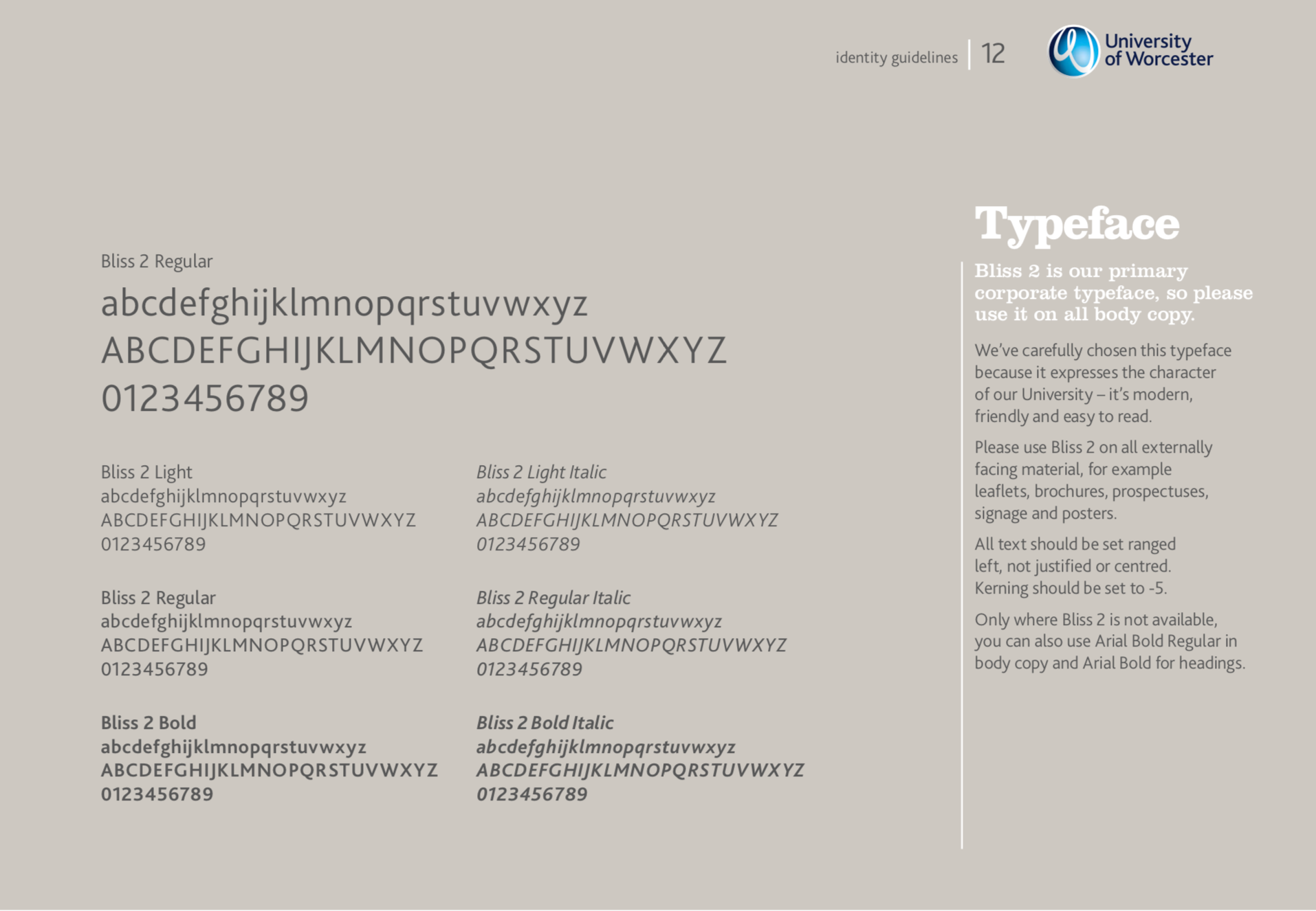
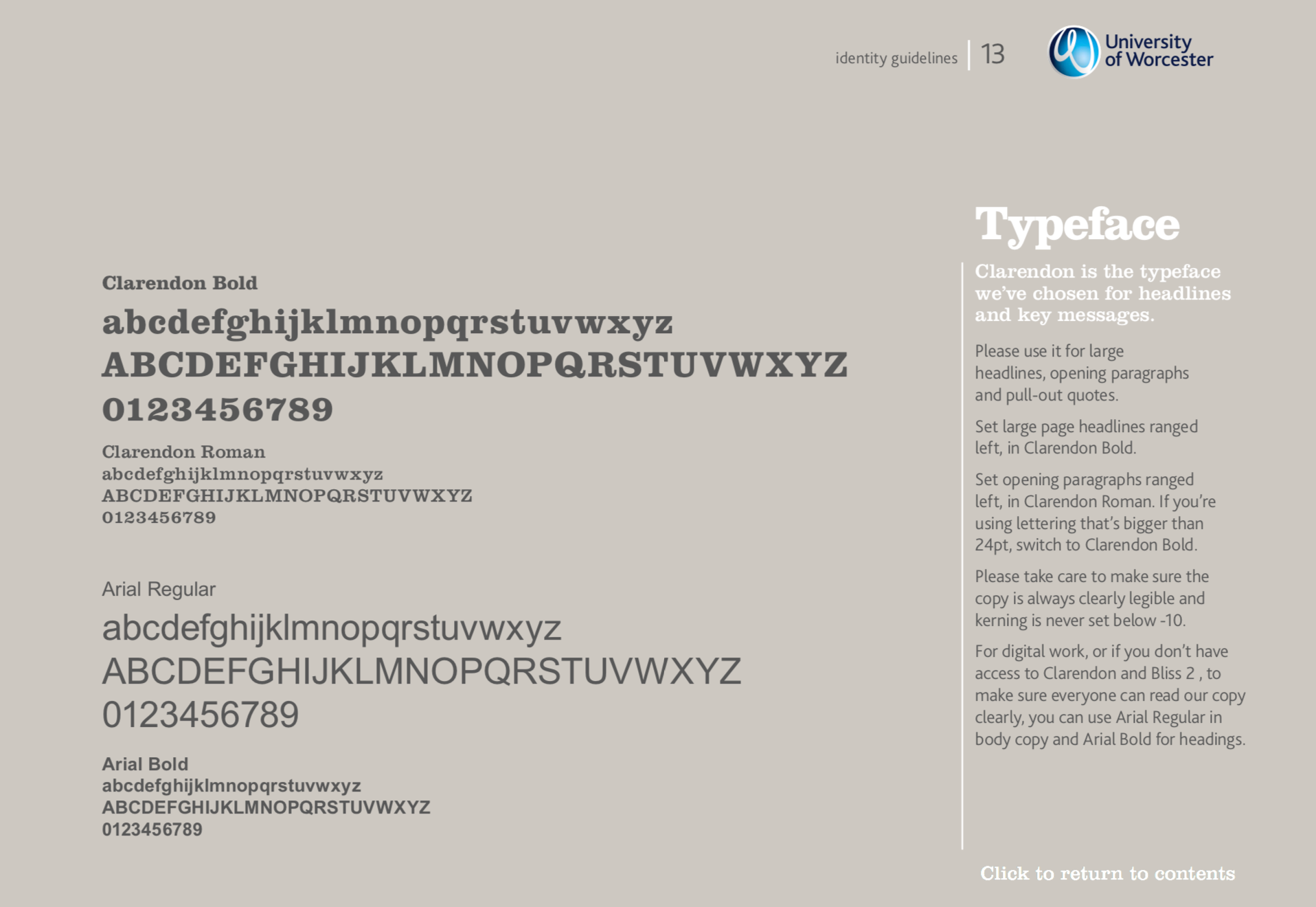
University Of Worcester Corporate Identity Guidelines
Typefaces:
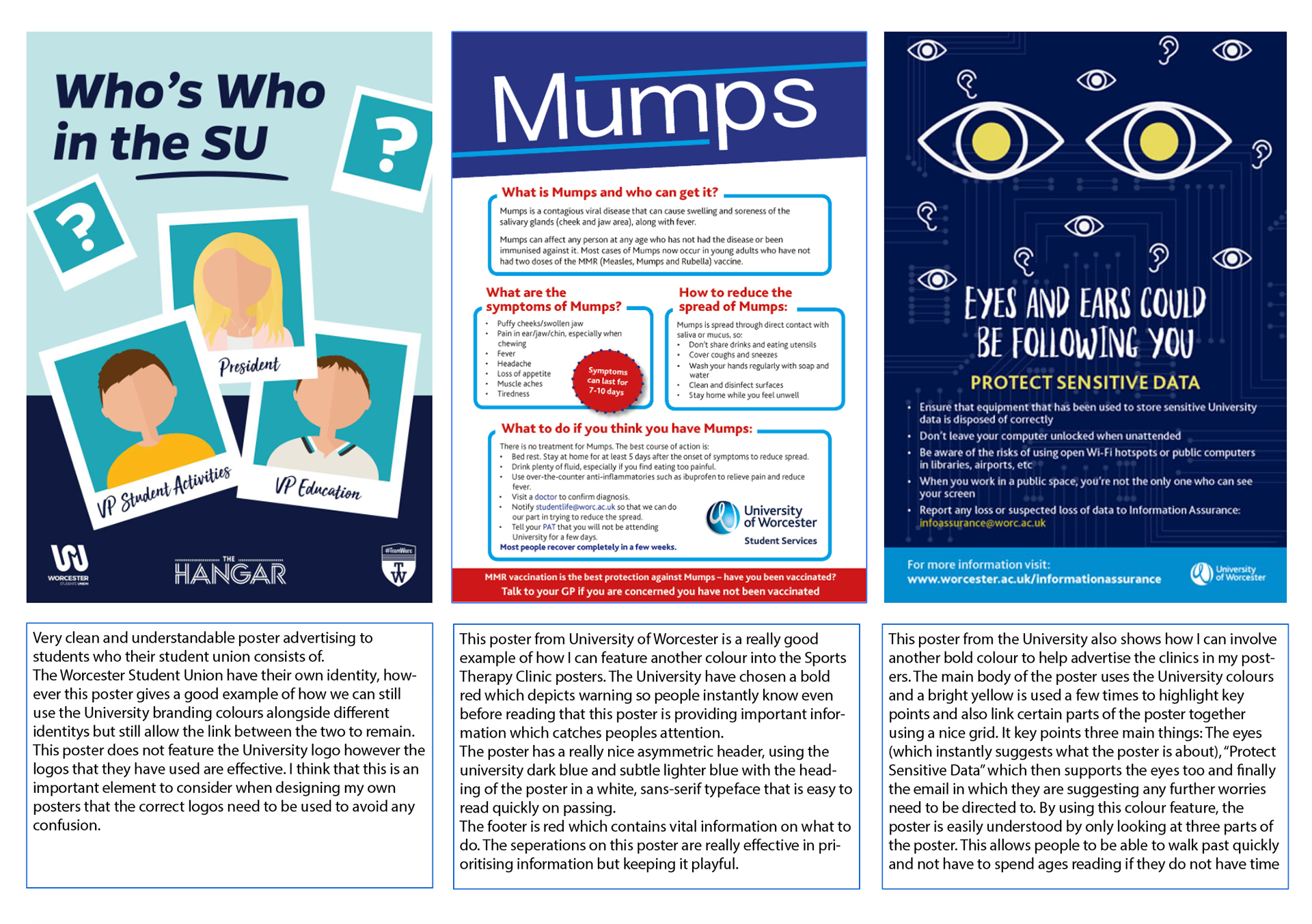
UOW & Worcester SU Poster Research
IDENTITY
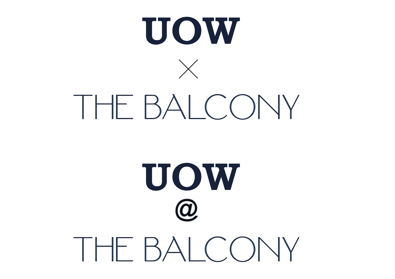
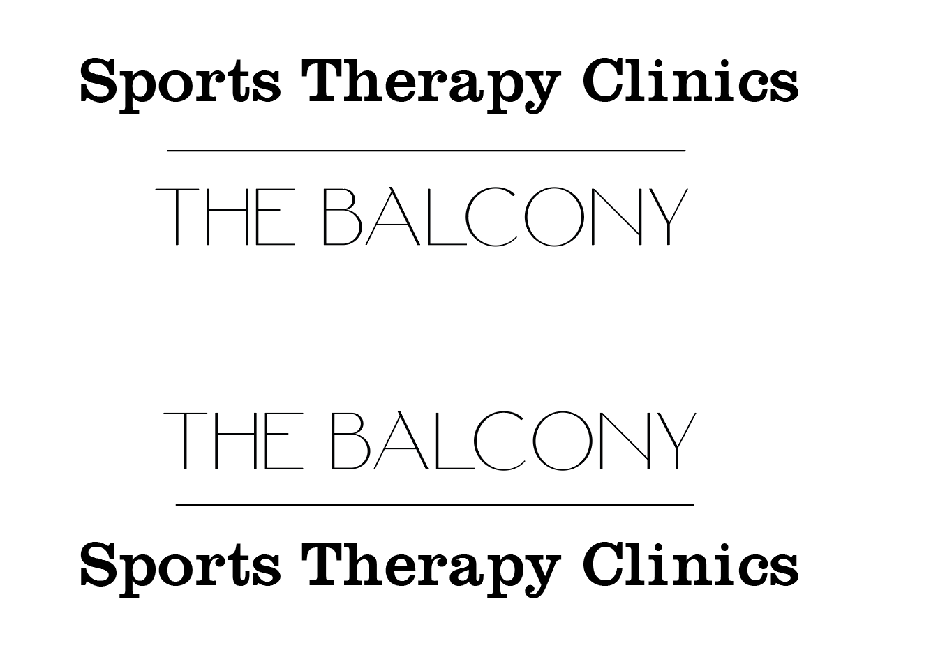
Name ideas:
-Sports Therapy Clinic x UOW
-UOW Sports Therapy Clinic
-UOW x Sports Therapy Clinic
- UOW x The Balcony
-Sports Therapy @ The Balcony
-Clinics @ The Balcony
-The Balcony, University Of Worcester
-The Balcony @ University Of Worcester
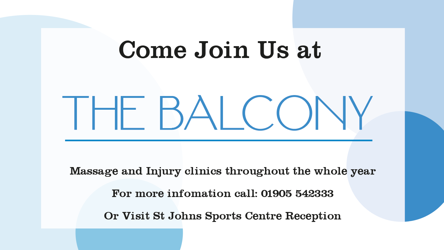
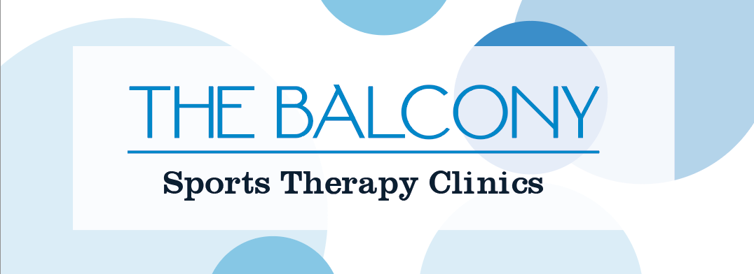
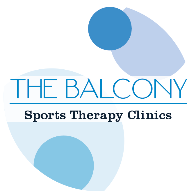
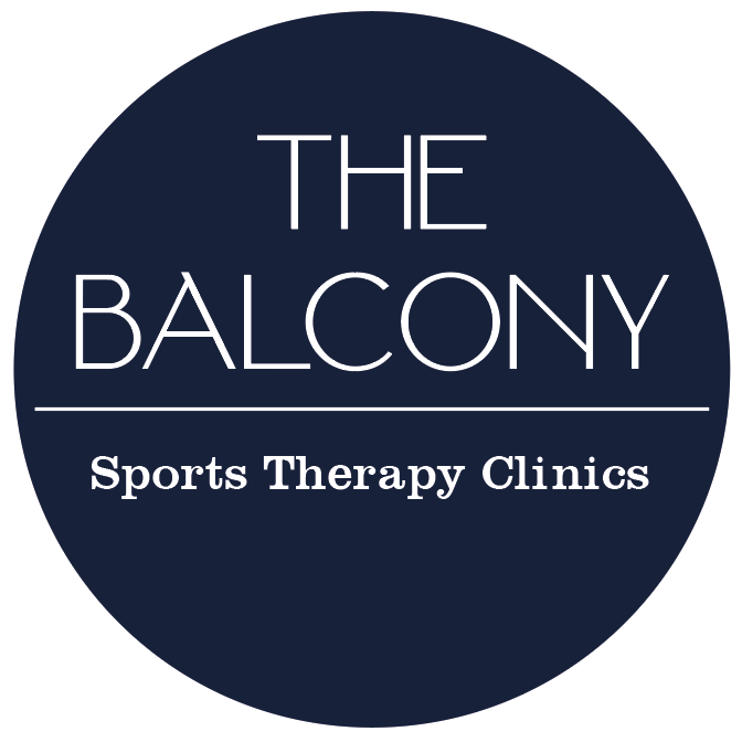
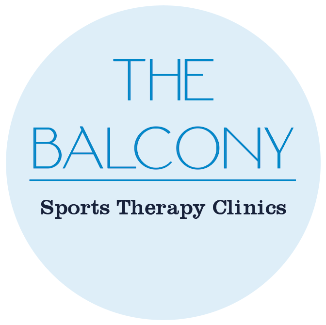
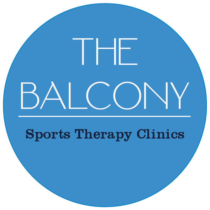
FINAL LOGO
POSTER CONCEPTS
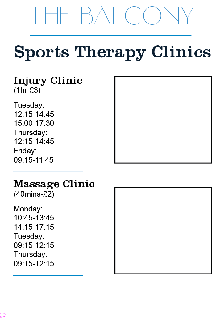
I Like the layout of these posters as it is really easy to read and doesn't over bare with information all in once chunk and is split up. however I feel that they are very bare and need some background.
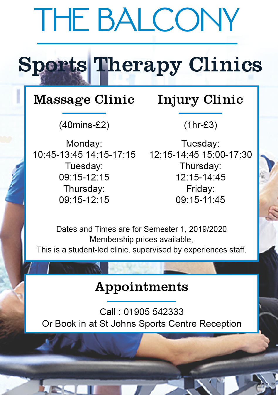
I tried putting a low opacity photograph behind the text however I feel that its too much and makes the information difficult to read.
so I decided to experiment with some solid shaped rather than photography for the poster as I felt that the information on a poster is more important rather than a photo. I feel like the designs went really well with the shapes. I also feel that the circles could represent a more sporty approach to the designs so would like to continue with this concept.
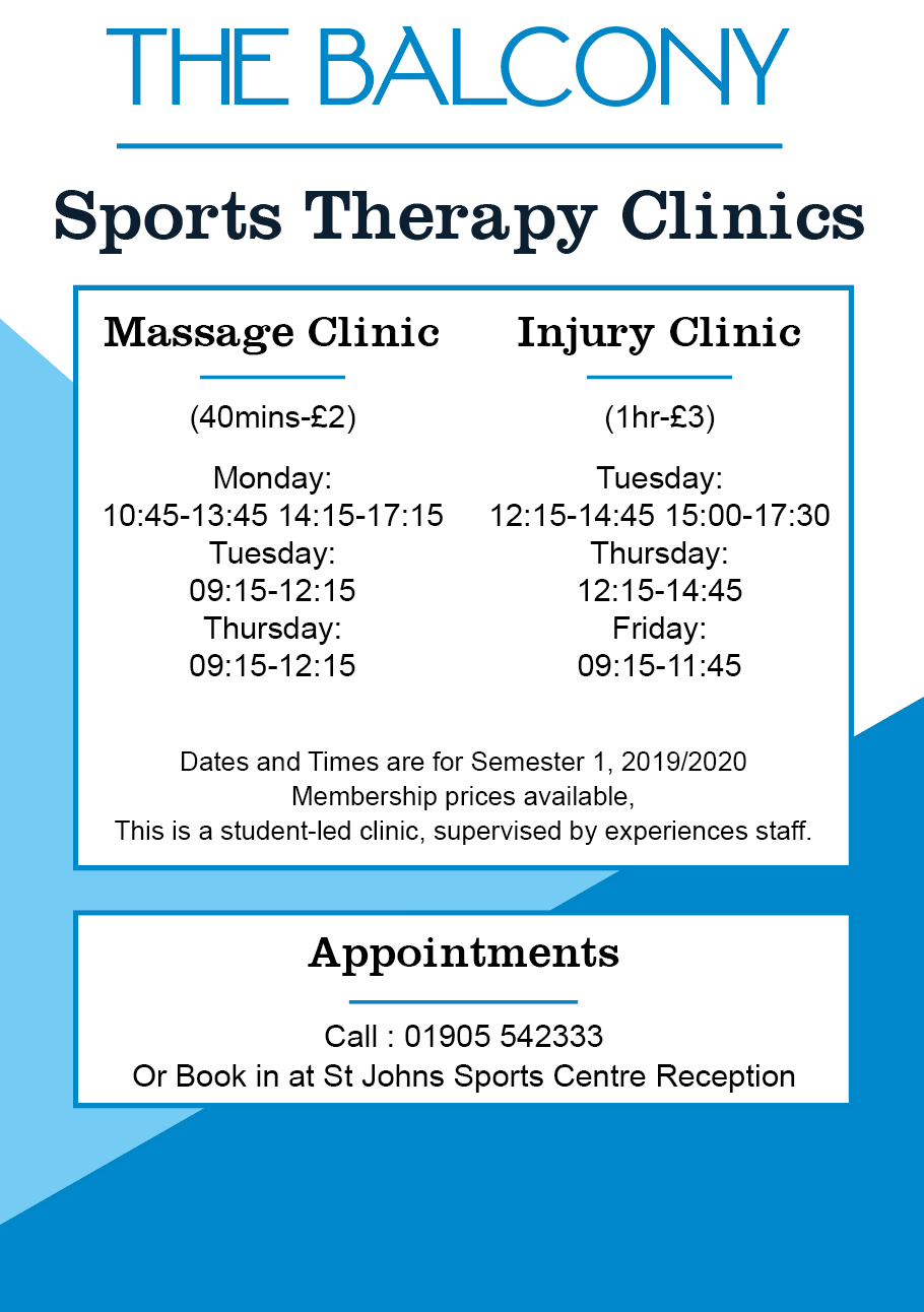
I decided that although I liked the shaped as a background it still felt very bare. I experimented with different sizes and opacities of circles and found that it worked really well to create a playful, sporty background.
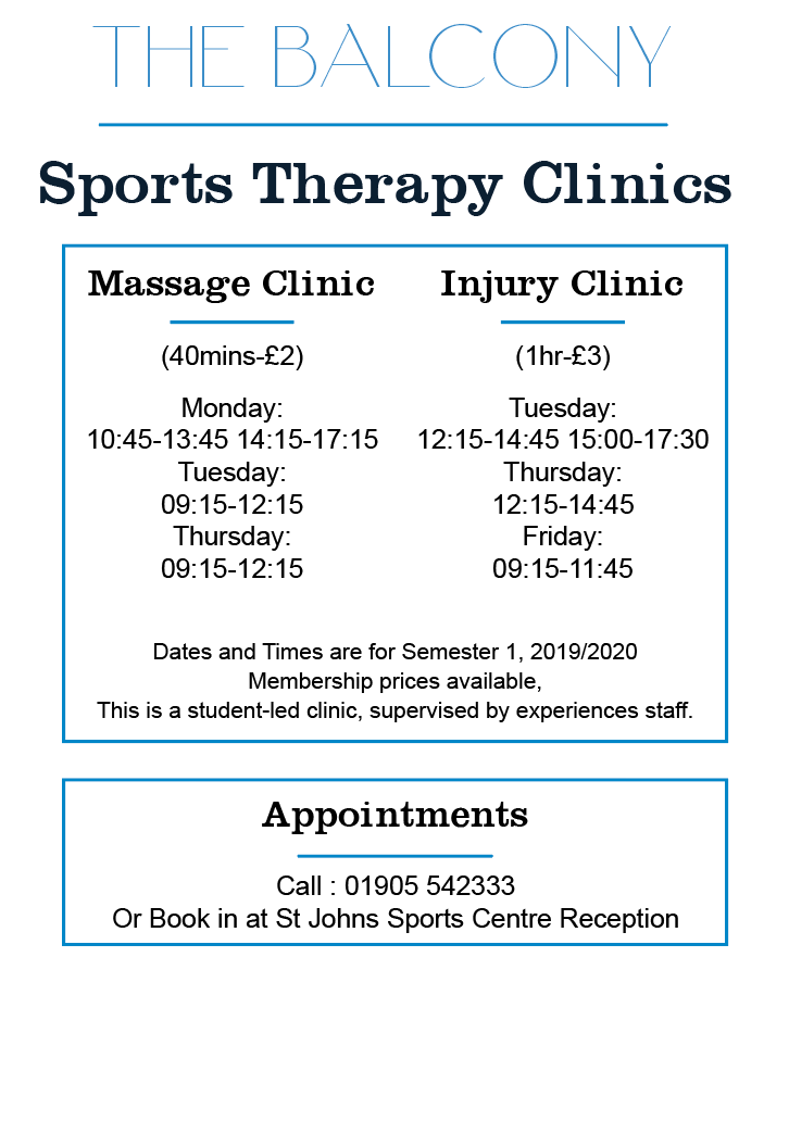
FINAL TOUCHES
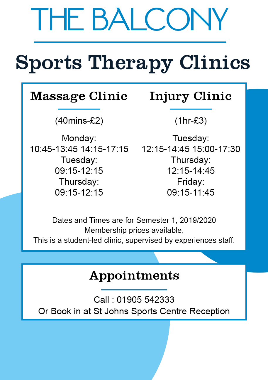
I felt that there were a few things stopping the poster from being really effective.
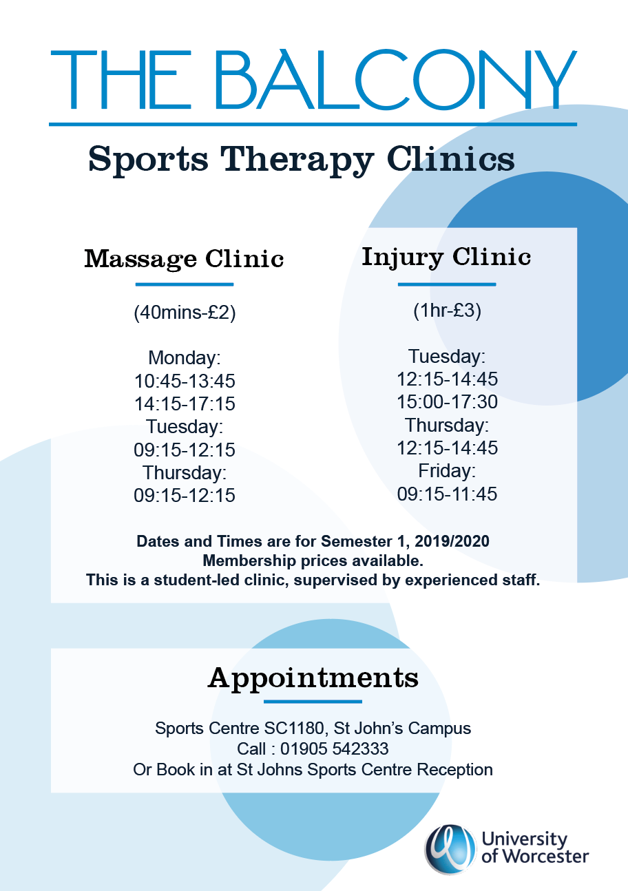
I changed small touches on the text to make it more appealing, I also got rid of the strong outlines around the text containers and found this created a really sleek and appealing design.
I also added the university logo onto the posters and lowered the whole design so there was less space at the bottom and more focus on the heading.
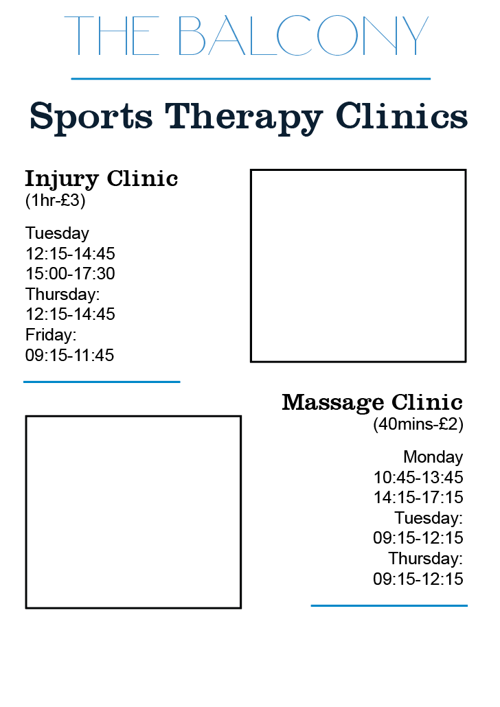
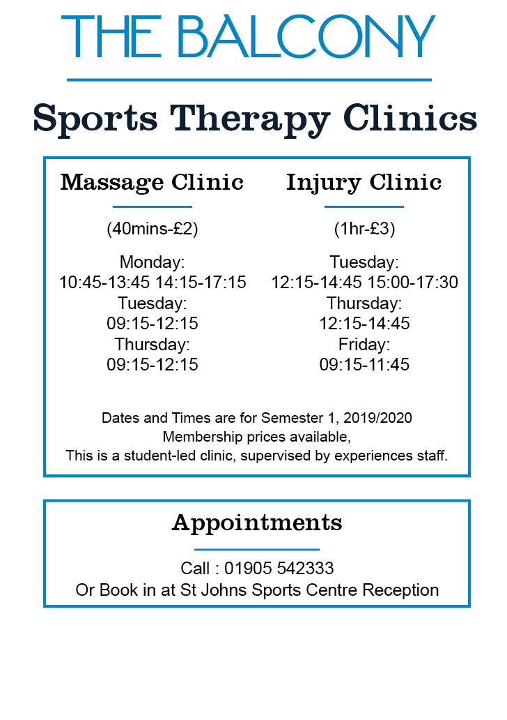
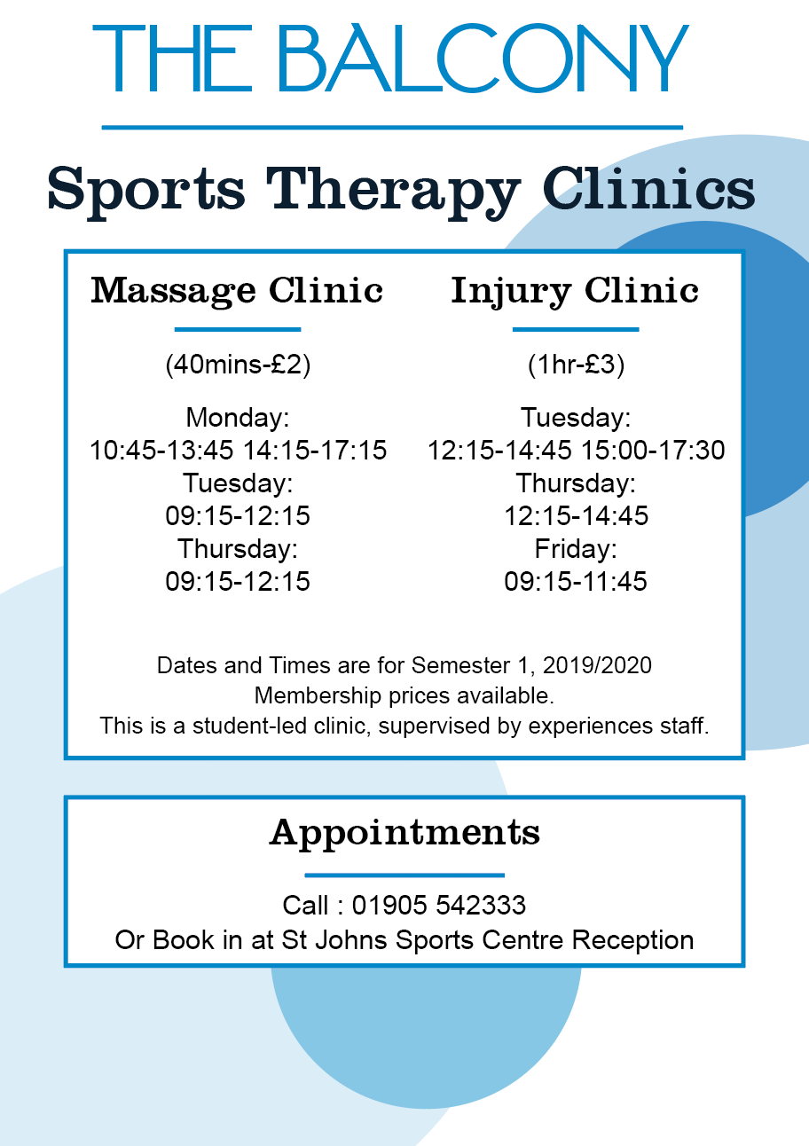
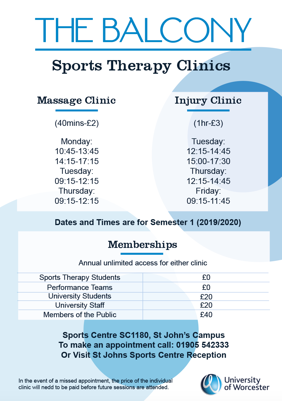
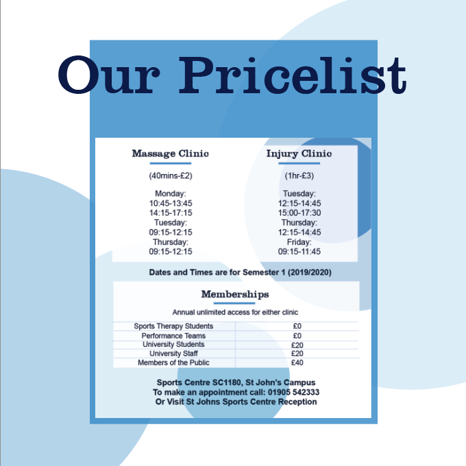
following the same design style regarding the pattern and layout, I then designed the price list to be the same as I felt this would encourage a mental connection between the two and the brand when seen by other people.
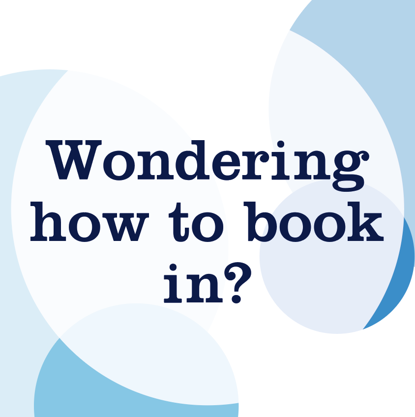
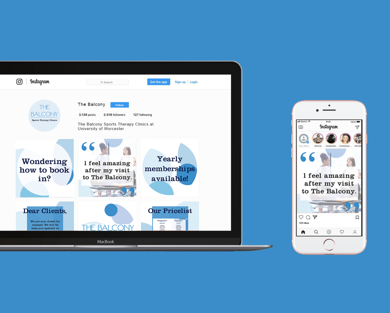
Social Media Banners
These are very simple, just following the same design style elements that occur in my poster and price list, they would change size according to the social media platform.
due to the clients lack of time to spend on posting on social media as often and he should or wants to, I then designed some foundation posts in which follow the brand identity and all that would need to be done would be to type in whatever information he requires.


How they would work...

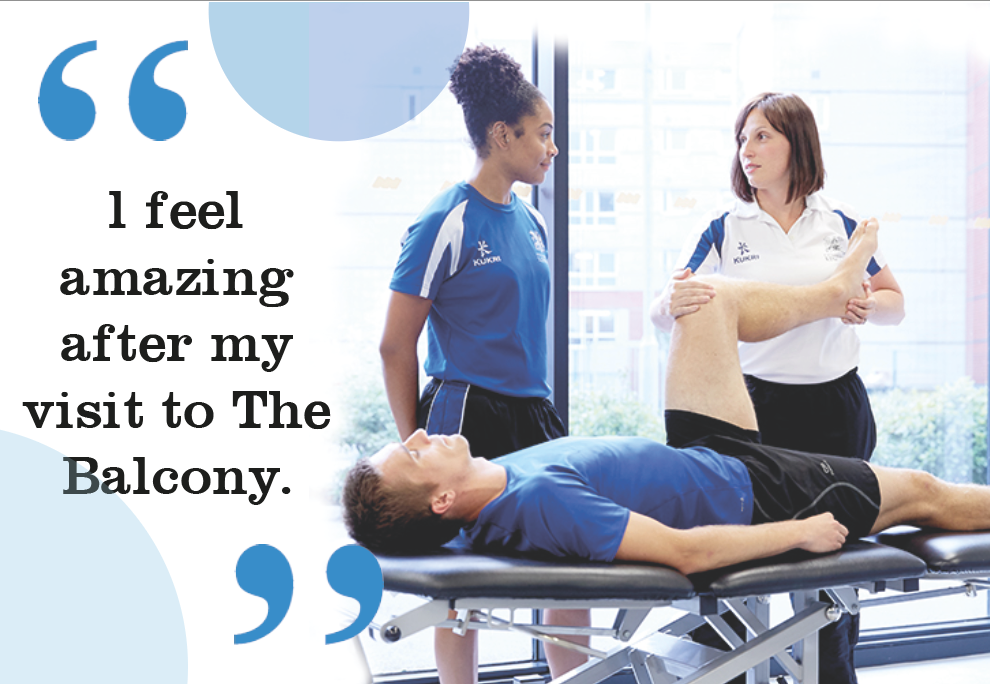
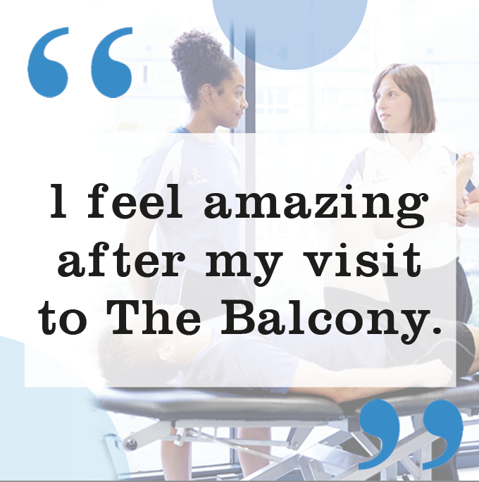
I also then designed a layout where an image could be used as I feel that using photography is the best way of presenting what your company do... this layout cal also be used to show off compliments said etc. I designed two sizes, one in which would work well on any platform and the image is the main focus, the second in a square canvas size which would suit instagram more but the image is more used as a background rather than a main focus.
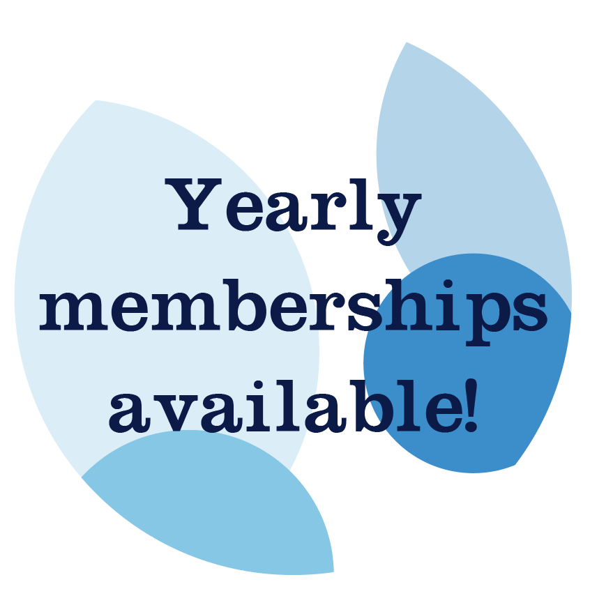
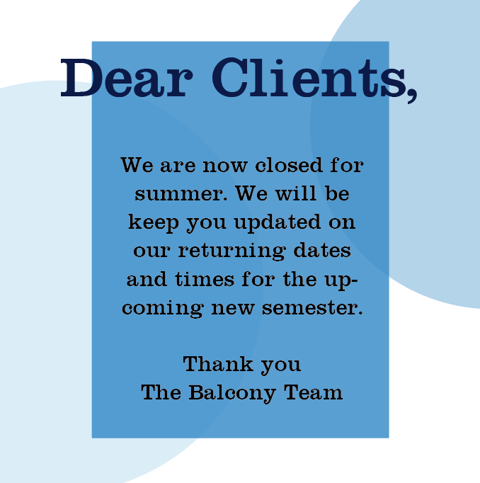
additional designs I thought would work well as templates for notices, text can be changed easily without being time consuming.
possible social media profile icons
Finally, the client wanted to have a design for the university canteen digital screen to encourage students to visit.
I kept the design simple and in keeping with the rest of the design elements. the design works well in that the balls in the background could be really easily animated to create a more appealing and eye catching design for a digital screen whilst the information is still very clear and clean.